In this technique project we’re going to take a close look at drawing in SwiftUI, including creating custom paths and shapes, animating your changes, solving performance problems, and more – it’s a really big topic, and deserves close attention.
Behind the scenes, SwiftUI uses the same drawing system that we have on the rest of Apple’s frameworks: Core Animation and Metal. Most of the time Core Animation is responsible for our drawing, whether that’s custom paths and shapes or UI elements such as TextField, but when things really get complex we can move down to Metal – Apple’s low-level framework that’s optimized for complex drawing. One of the neat features of SwiftUI is that these two are almost interchangeable: we can move from Core Animation to Metal with one small change.
Anyway, we have lots to cover so please create a new App project called Drawing and let’s dive in…
SwiftUI gives us a dedicated Path type for drawing custom shapes. It’s very low level, by which I mean you will usually want to wrap it in something else in order for it to be more useful, but as it’s the building block that underlies other work we’ll do we’re going to start there.
Just like colors, gradients, and shapes, paths are views in their own right. This means we can use them just like text views and images, although as you’ll see it’s a bit clumsy.
Let’s start with a simple shape: drawing a triangle. There are a few ways of creating paths, including one that accepts a closure of drawing instructions. This closure must accept a single parameter, which is the path to draw into. I realize this can be a bit brain-bending at first, because we’re creating a path and inside the initializer for the path we’re getting passed the path to draw into, but think of it like this: SwiftUI is creating an empty path for us, then giving us the chance to add to it as much as we want.
Paths have lots of methods for creating shapes with squares, circles, arcs, and lines. For our triangle we need to move to a starting position, then add three lines like this:
Path { path in
    path.move(to: CGPoint(x: 200, y: 100))
    path.addLine(to: CGPoint(x: 100, y: 300))
    path.addLine(to: CGPoint(x: 300, y: 300))
    path.addLine(to: CGPoint(x: 200, y: 100))
}
.frame(width: 500, height: 500)
.padding(50)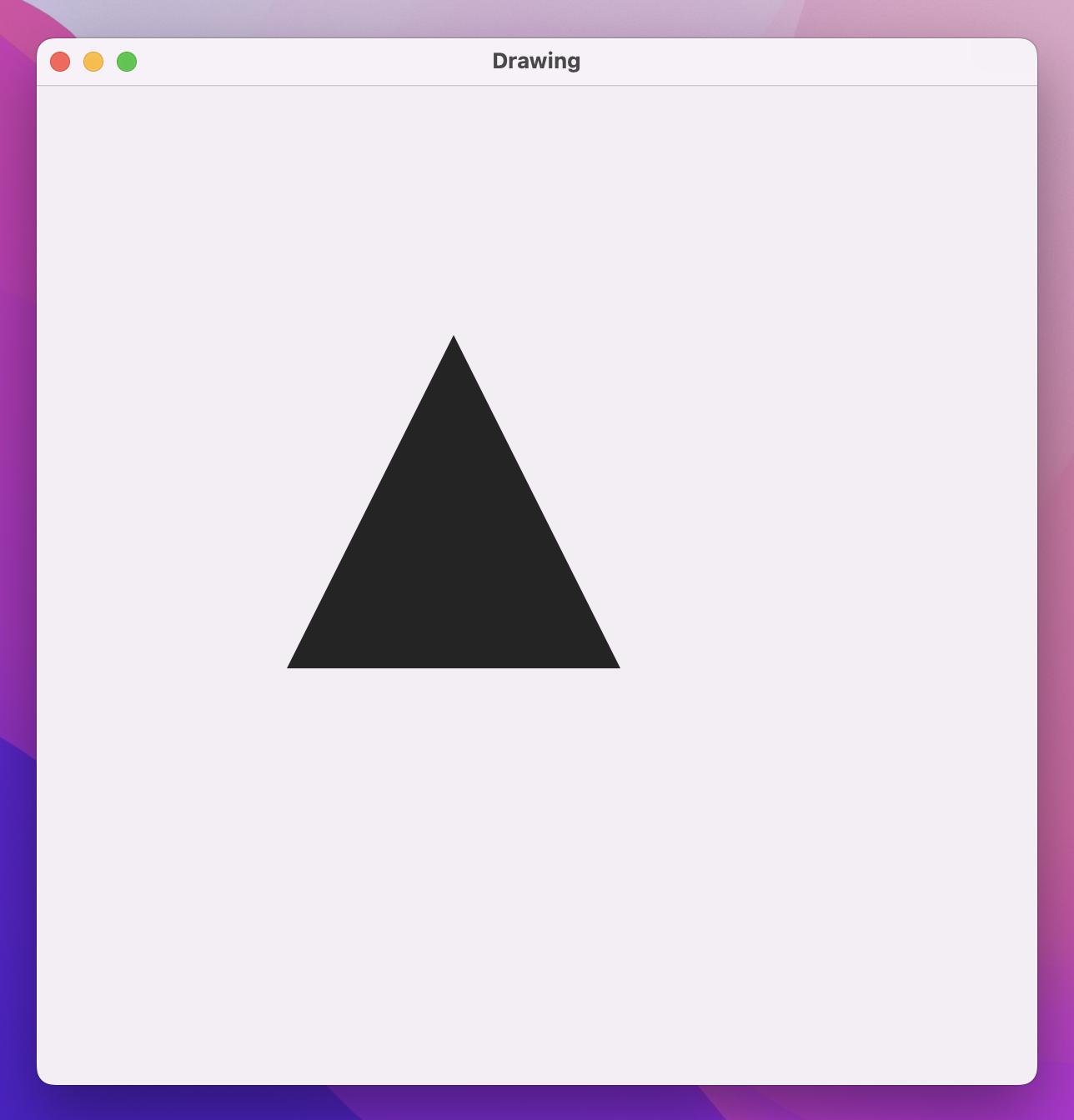
We haven’t used CGPoint before, but I did sneak in a quick reference to CGSize back in project 6. “CG” is short for Core Graphics, which provides a selection of basic types that lets us reference X/Y coordinates (CGPoint), widths and heights (CGSize), and rectangular frames (CGRect).
When our triangle code runs, you’ll see a large black triangle, positioned somewhat oddly on the screen. This is part of the problem with these raw paths: we need to use exact coordinates, so if you want to use a path by itself you either need to accept that sizing across all devices or use something like GeometryReader to scale them relative to their container.
We’ll look at a better option shortly, but first let’s look at coloring our path. One option is to use the fill() modifier, like this:
Path { path in
    path.move(to: CGPoint(x: 200, y: 100))
    path.addLine(to: CGPoint(x: 100, y: 300))
    path.addLine(to: CGPoint(x: 300, y: 300))
    path.addLine(to: CGPoint(x: 200, y: 100))
}
.fill(.blue)
.frame(width: 500, height: 500)
.padding(50)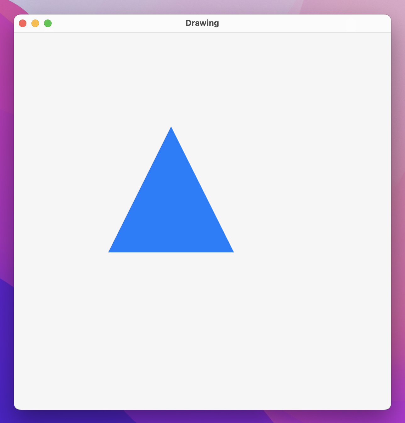
We can also use the stroke() modifier to draw around the path rather than filling it in:
.stroke(.blue, lineWidth: 10)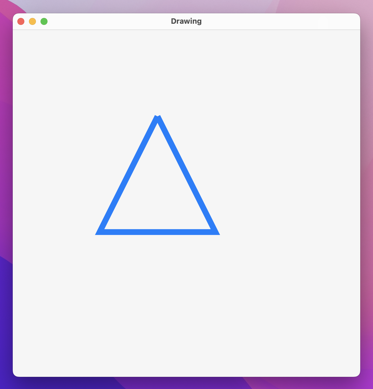
That doesn’t look quite right, though – the bottom corners of our triangle are nice and sharp, but the top corner is broken. This happens because SwiftUI makes sure lines connect up neatly with what comes before and after rather than just being a series of individual lines, but our last line has nothing after it so there’s no way to make a connection.
One way to fix this is to ask SwiftUI to close the subpath, which is the shape we’ve drawn inside our path:
Path { path in
    path.move(to: CGPoint(x: 200, y: 100))
    path.addLine(to: CGPoint(x: 100, y: 300))
    path.addLine(to: CGPoint(x: 300, y: 300))
    path.addLine(to: CGPoint(x: 200, y: 100))
    path.closeSubpath()
}
.stroke(.blue, lineWidth: 10)
.frame(width: 500, height: 500)
.padding(50)
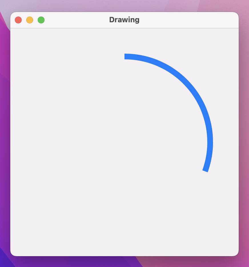
An alternative is to use SwiftUI’s dedicated StrokeStyle struct, which gives us control over how every line should be connected to the line after it (line join) and how every line should be drawn when it ends without a connection after it (line cap). This is particularly useful because one of the options for join and cap is .round, which creates gently rounded shapes:
.stroke(.blue, style: StrokeStyle(lineWidth: 10, lineCap: .round, lineJoin: .round))
With that in place you can remove the call to path.closeSubpath(), because it’s no longer needed.
Using rounded corners solves the problem of our rough edges, but it doesn’t solve the problem of fixed coordinates. For that we need to move on from paths and look at something more complex: shapes.
SwiftUI enables custom drawing with two subtly different types: paths and shapes. A path is a series of drawing instructions such as “start here, draw a line to here, then add a circle there”, all using absolute coordinates. In contrast, a shape has no idea where it will be used or how big it will be, but instead will be asked to draw itself inside a given rectangle.
Helpfully, shapes are built using paths, so once you understand paths shapes are easy. Also, just like paths, colors, and gradients, shapes are views, which means we can use them alongside text views, images, and so on.
SwiftUI implements Shape as a protocol with a single required method: given the following rectangle, what path do you want to draw? This will still create and return a path just like using a raw path directly, but because we’re handed the size the shape will be used at we know exactly how big to draw our path – we no longer need to rely on fixed coordinates.
For example, previously we created a triangle using a Path, but we could wrap that in a shape to make sure it automatically takes up all the space available like this:
struct Triangle: Shape {
    func path(in rect: CGRect) -> Path {
        var path = Path()

        path.move(to: CGPoint(x: rect.midX, y: rect.minY))
        path.addLine(to: CGPoint(x: rect.minX, y: rect.maxY))
        path.addLine(to: CGPoint(x: rect.maxX, y: rect.maxY))
        path.addLine(to: CGPoint(x: rect.midX, y: rect.minY))

        return path
    }
}
That job is made much easier by CGRect, which provides helpful properties such as minX (the smallest X value in the rectangle), maxX (the largest X value in the rectangle), and midX (the mid-point between minX and maxX).
We could then create a red triangle at a precise size like this:
Triangle()
    .fill(.red)
    .frame(width: 300, height: 300)
    .padding(50)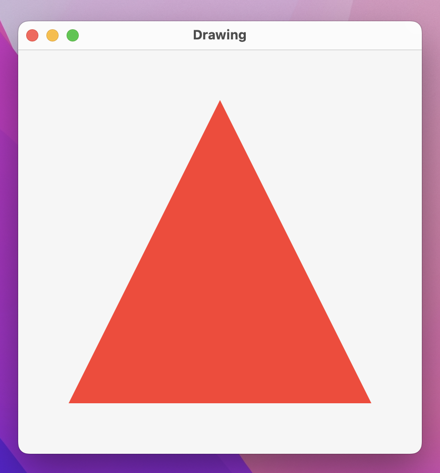
Shapes also support the same StrokeStyle parameter for creating more advanced strokes:
Triangle()
    .stroke(.red, style: StrokeStyle(lineWidth: 10, lineCap: .round, lineJoin: .round))
    .frame(width: 300, height: 300)
    .padding(50)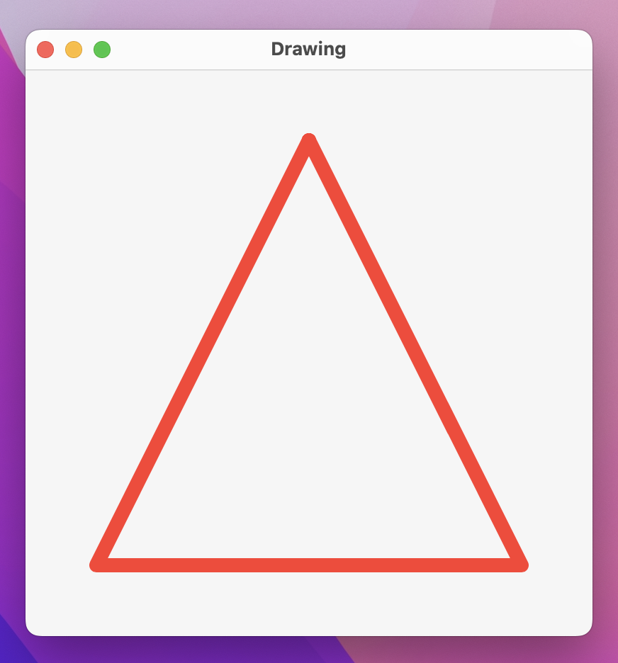
The key to understanding the difference between Path and Shape is reusability: paths are designed to do one specific thing, whereas shapes have the flexibility of drawing space and can also accept parameters to let us customize them further.
To demonstrate this, we could create an Arc shape that accepts three parameters: start angle, end angle, and whether to draw the arc clockwise or not. This might seem simple enough, particularly because Path has an addArc() method, but as you’ll see it has a couple of interesting quirks.
Let’s start with the simplest version of an arc shape:
struct Arc: Shape {
    var startAngle: Angle
    var endAngle: Angle
    var clockwise: Bool

    func path(in rect: CGRect) -> Path {
        var path = Path()
        path.addArc(center: CGPoint(x: rect.midX, y: rect.midY), radius: rect.width / 2, startAngle: startAngle, endAngle: endAngle, clockwise: clockwise)

        return path
    }
}
We can now create an arc like this:
Arc(startAngle: .degrees(0), endAngle: .degrees(110), clockwise: true)
    .stroke(.blue, lineWidth: 10)
    .frame(width: 300, height: 300)
    .padding(50)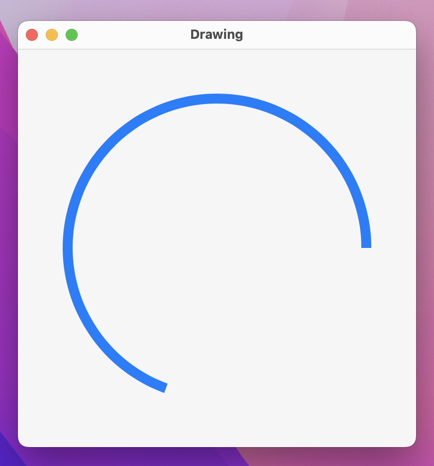
If you look at the preview of our arc, chances are it looks nothing like you expect. We asked for an arc from 0 degrees to 110 degrees with a clockwise rotation, but we appear to have been given an arc from 90 degrees to 200 degrees with a counterclockwise rotation.
What’s happening here is two-fold:
We can fix both of those problems with a new path(in:) method that subtracts 90 degrees from the start and end angles, and also flips the direction so SwiftUI behaves the way nature intended:
func path(in rect: CGRect) -> Path {
    let rotationAdjustment = Angle.degrees(90)
    let modifiedStart = startAngle - rotationAdjustment
    let modifiedEnd = endAngle - rotationAdjustment

    var path = Path()
    path.addArc(center: CGPoint(x: rect.midX, y: rect.midY), radius: rect.width / 2, startAngle: modifiedStart, endAngle: modifiedEnd, clockwise: !clockwise)

    return path
}
Run that code and see what you think – to me it produces a much more natural way of working, and neatly isolates SwiftUI’s drawing behavior.
If you create a shape without a specific size, it will automatically expand to occupy all available space. For example, this will create a circle that fills our window, giving it a 40-point blue border:
struct ContentView: View {
    var body: some View {
        Circle()
            .stroke(.blue, lineWidth: 40)
            .frame(width: 500, height: 500)
    }
}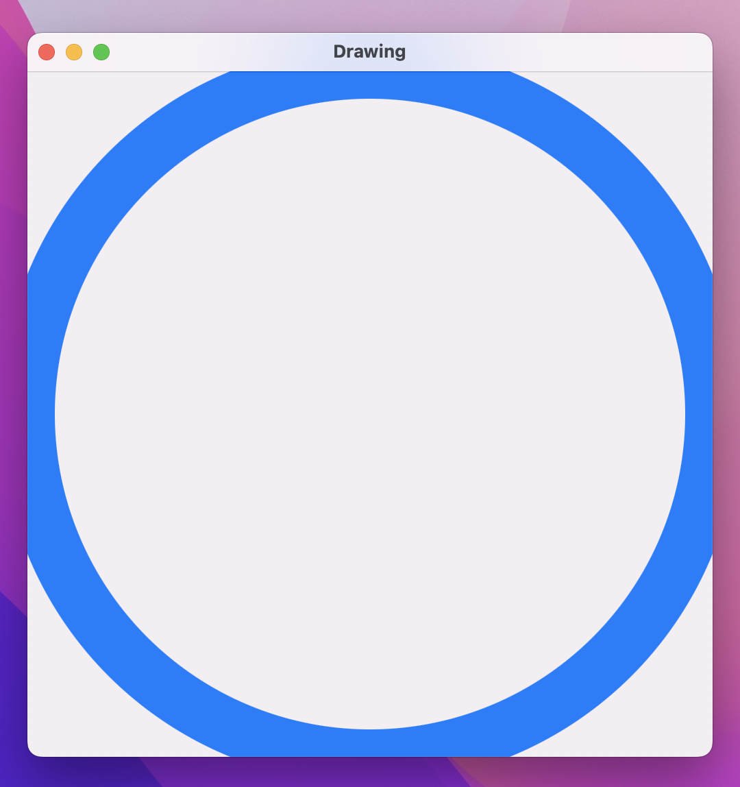
Take a close look at the edges of the border – do you notice how they are cut off?
What you’re seeing here is a side effect of the way SwiftUI draws borders around shapes. If you handed someone a pencil outline of a circle and asked them to draw over that circle with a thick pen, they would trace the exact line of the circle – about half the pen would be inside the line, and half outside. This is what SwiftUI is doing for us, but where our shapes go to the edge of the window it means the outside part of the border ends up beyond our window edges.
Now try using this circle instead:
Circle()
    .strokeBorder(.blue, lineWidth: 40)
    .frame(width: 500, height: 500)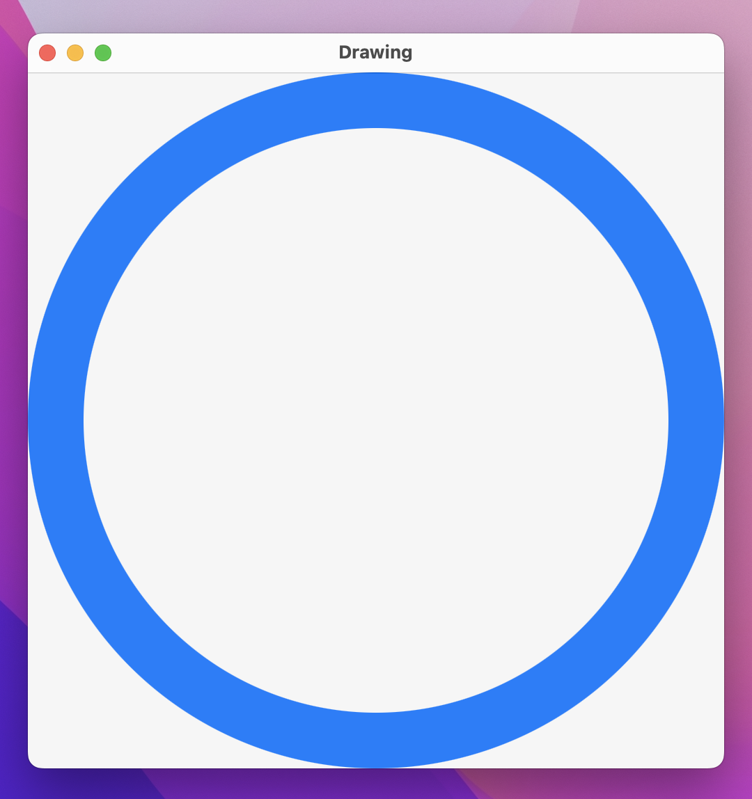
That changes stroke() to strokeBorder() and now we get a better result: all our border is visible, because Swift strokes the inside of the circle rather than centering on the line.
Previously we built an Arc shape like this:
struct Arc: Shape {
    var startAngle: Angle
    var endAngle: Angle
    var clockwise: Bool

    func path(in rect: CGRect) -> Path {
        let rotationAdjustment = Angle.degrees(90)
        let modifiedStart = startAngle - rotationAdjustment
        let modifiedEnd = endAngle - rotationAdjustment

        var path = Path()
        path.addArc(center: CGPoint(x: rect.midX, y: rect.midY), radius: rect.width / 2, startAngle: modifiedStart, endAngle: modifiedEnd, clockwise: !clockwise)

        return path
    }
}
Just like Circle, that automatically takes up all available space. However, this kind of code won’t work:
Arc(startAngle: .degrees(-90), endAngle: .degrees(90), clockwise: true)
    .strokeBorder(.blue, lineWidth: 40)
    .frame(width: 300, height: 300)
    .padding(50)
If you open Xcode’s error message you’ll see it says “Value of type 'Arc' has no member 'strokeBorder’” – that is, the strokeBorder() modifier just doesn’t exist on Arc.
There is a small but important difference between SwiftUI’s Circle and our Arc: both conform to the Shape protocol, but Circle also conforms to a second protocol called InsettableShape. This is a shape that can be inset – reduced inwards – by a certain amount to produce another shape. The inset shape it produces can be any other kind of insettable shape, but realistically it should be the same shape just in a smaller rectangle.
To make Arc conform to InsettableShape we need to add one extra method to it: inset(by:). This will be given the inset amount (half the line width of our stroke), and should return a new kind of insettable shape – in our instance that means we should create an inset arc. The problem is, we don’t know the arc’s actual size, because path(in:) hasn’t been called yet.
It turns out the solution is pretty simple: if we give our Arc shape a new insetAmount property that defaults to 0, we can just add to that whenever inset(by:) is called. Adding to the inset allows us to call inset(by:) multiple times if needed, for example if we wanted to call it once by hand then use strokeBorder().
First, add this new property to Arc:
var insetAmount = 0.0Now give it this inset(by:) method:
func inset(by amount: CGFloat) -> some InsettableShape {
    var arc = self
    arc.insetAmount += amount
    return arc
}
Important: This is one of the very few places where we need to use CGFloat, which is an archaic form of Double that, somewhat bizarrely, wormed its way into SwiftUI. It gets used in many other places too, but mostly Swift lets us use Double instead!
The amount parameter being passed in should be applied to all edges, which in the case of arcs means we should use it to reduce our draw radius. So, change the addArc() call inside path(in:) to be this:
path.addArc(center: CGPoint(x: rect.midX, y: rect.midY), radius: rect.width / 2 - insetAmount, startAngle: modifiedStart, endAngle: modifiedEnd, clockwise: !clockwise)With that change we can now make Arc conform to InsettableShape like this:
struct Arc: InsettableShape {Note: InsettableShape actually builds upon Shape, so there’s no need to add both there.
When you move beyond simple shapes and paths, two useful features of SwiftUI come together to create some beautiful effects with remarkably little work. The first is CGAffineTransform, which describes how a path or view should be rotated, scaled, or sheared; and the second is even-odd fills, which allow us to control how overlapping shapes should be rendered.
To demonstrate both of these, we’re going to create a flower shape out of several rotated ellipse petals, with each ellipse positioned around a circle. The mathematics behind this is relatively straightforward, with one catch: CGAffineTransform measures angles in radians rather than degrees. If it’s been a while since you were at school, the least you need to know is this: 3.141 radians is equal to 180 degrees, so 3.141 radians multiplied by 2 is equal to 360 degrees. And the 3.141 isn’t a coincidence: the actual value is the mathematical constant pi.
So, what we’re going to do is as follows:
This will make more sense once you see the code running, but first I want to add three more small things:
1...5 are great if you want to count through numbers one at a time, but if you want to count in 2s, or in our case count in “pi/8”s, you should use stride(from:to:by:) instead.Alright, enough talk – add this shape to your project now:
struct Flower: Shape {
    // How much to move this petal away from the center
    var petalOffset: Double = -20

    // How wide to make each petal
    var petalWidth: Double = 100

    func path(in rect: CGRect) -> Path {
        // The path that will hold all petals
        var path = Path()

        // Count from 0 up to pi * 2, moving up pi / 8 each time
        for number in stride(from: 0, to: Double.pi * 2, by: Double.pi / 8) {
            // rotate the petal by the current value of our loop
            let rotation = CGAffineTransform(rotationAngle: number)

            // move the petal to be at the center of our view
            let position = rotation.concatenating(CGAffineTransform(translationX: rect.width / 2, y: rect.height / 2))

            // create a path for this petal using our properties plus a fixed Y and height
            let originalPetal = Path(ellipseIn: CGRect(x: petalOffset, y: 0, width: petalWidth, height: rect.width / 2))

            // apply our rotation/position transformation to the petal
            let rotatedPetal = originalPetal.applying(position)

            // add it to our main path
            path.addPath(rotatedPetal)
        }

        // now send the main path back
        return path
    }
}
I realize that’s quite a lot of code, but hopefully it will become clearer when you try it out. Modify your ContentView to this:
struct ContentView: View {
    @State private var petalOffset = -20.0
    @State private var petalWidth = 100.0

    var body: some View {
        VStack {
            Flower(petalOffset: petalOffset, petalWidth: petalWidth)
                .stroke(.red, lineWidth: 1)
                .frame(width: 300)

            Text("Offset")
            Slider(value: $petalOffset, in: -40...40)
                .padding([.horizontal, .bottom])

            Text("Width")
            Slider(value: $petalWidth, in: 0...100)
                .padding(.horizontal)
        }
        .padding()
    }
}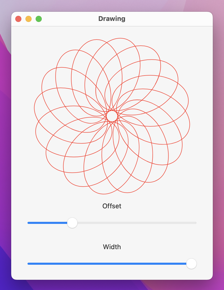
Now try that out. You should be able to see exactly how the code works once you start dragging the offset and width sliders around – it’s just a series of rotated ellipses, placed in a circular formation.
That in itself is interesting, but with one small change we can go from interesting to sublime. If you look at the way our ellipses are being drawn, they overlap frequently – sometimes one ellipse is drawn over another, and sometimes over several others.
If we fill our path using a solid color, we get a fairly unimpressive result. Try it like this:
Flower(petalOffset: petalOffset, petalWidth: petalWidth)
    .fill(.red)
    .frame(width: 300)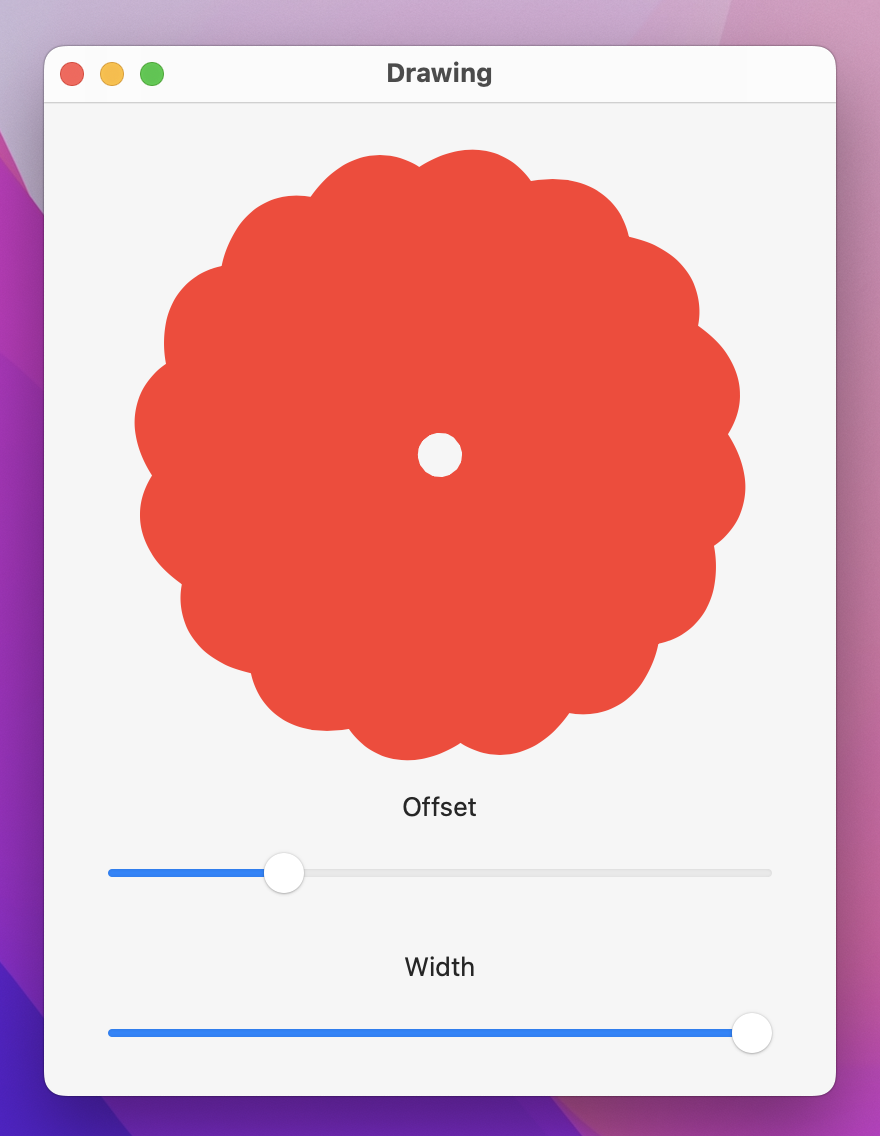
But as an alternative, we can fill the shape using the even-odd rule, which decides whether part of a path should be colored depending on the overlaps it contains. It works like this:
Only the parts that actually overlap are affected by this rule, and it creates some remarkably beautiful results. Even better, Swift UI makes it trivial to use, because whenever we call fill() on a shape we can pass a FillStyle struct that asks for the even-odd rule to be enabled.
Try it out with this:
Flower(petalOffset: petalOffset, petalWidth: petalWidth)
    .fill(.red, style: FillStyle(eoFill: true))
    .frame(width: 300)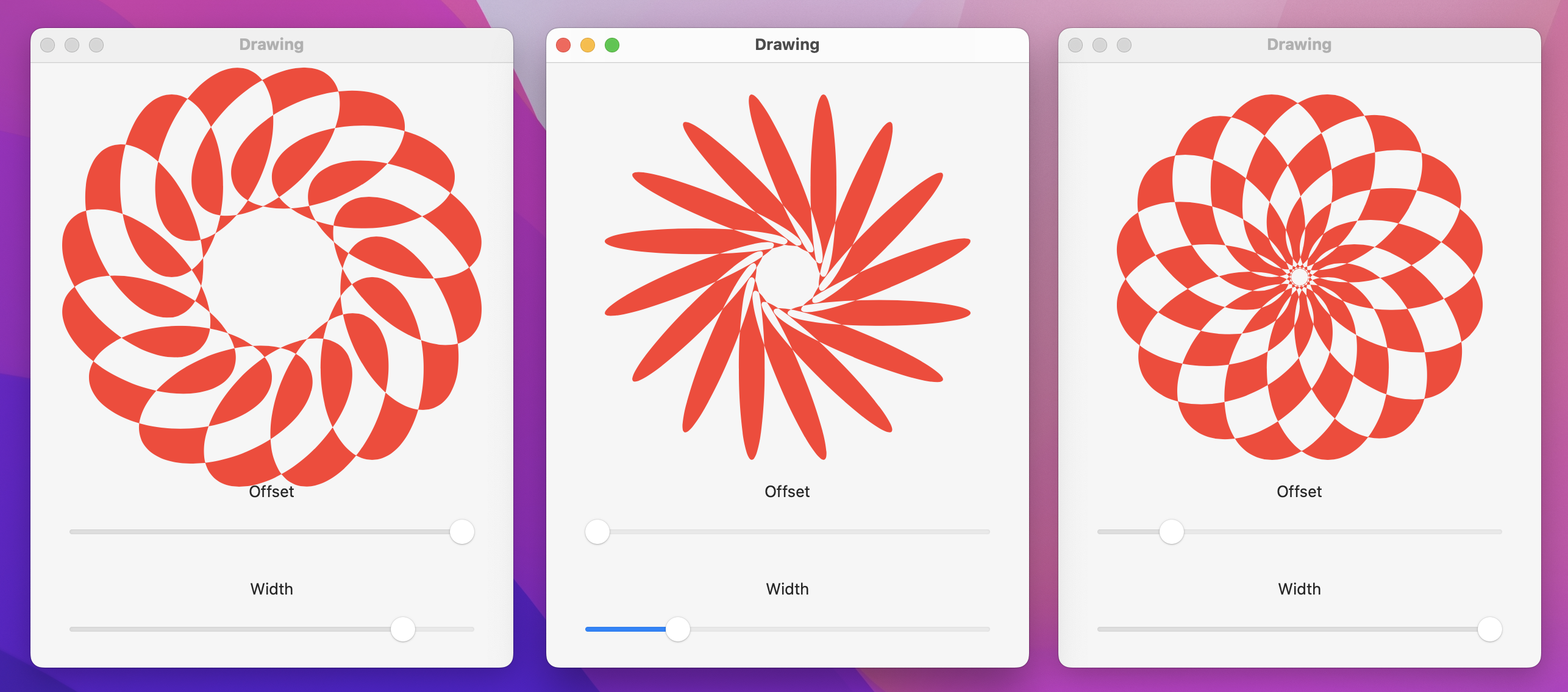
Now run the program and play – honestly, given how little work we’ve done the results are quite entrancing!
SwiftUI relies heavily on protocols, which can be a bit confusing when working with drawing. For example, we can use Color as a view, but it also conforms to ShapeStyle – a different protocol used for fills, strokes, and borders.
In practice, this means we can modify the default text view so that it has a red background:
Text("Hello World")
    .frame(width: 300, height: 300)
    .background(.red)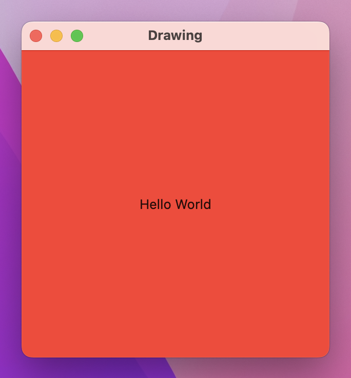
Or a red border:
Text("Hello World")
    .frame(width: 300, height: 300)
    .border(.red, width: 30)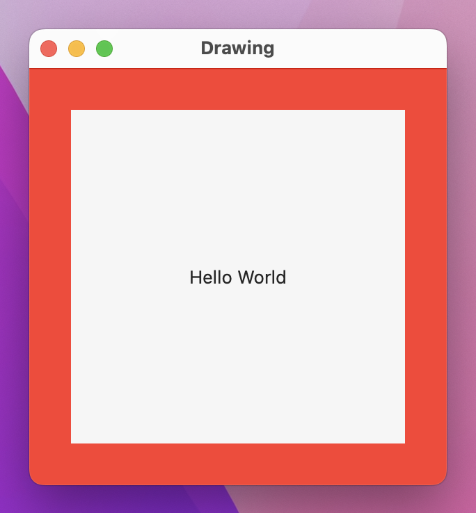
In contrast, we can use an image for the background:
Text("Hello World")
    .frame(width: 300, height: 300)
    .background(Image("Example"))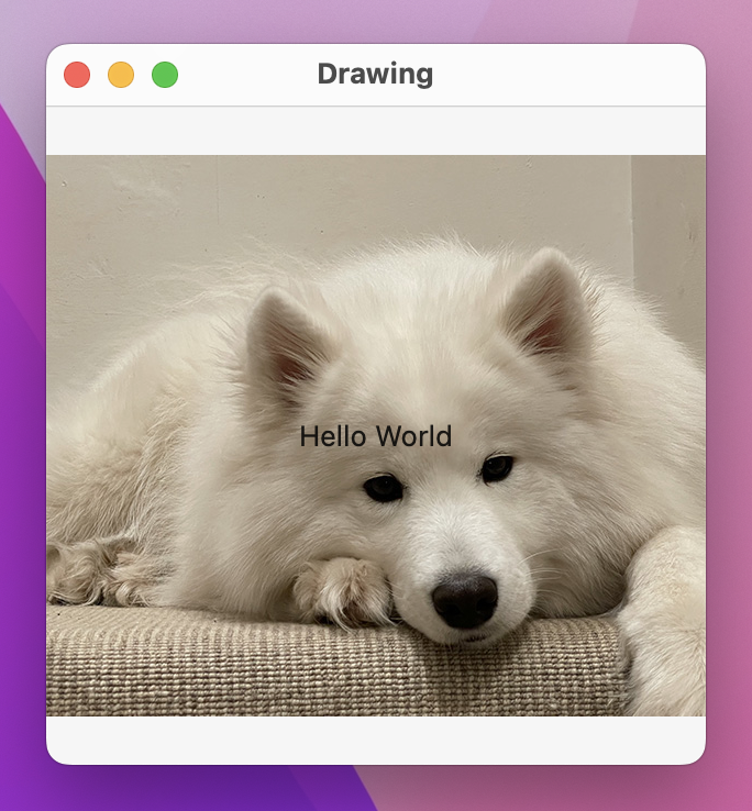
But using the same image as a border won’t work:
Text("Hello World")
    .frame(width: 300, height: 300)
    .border(Image("Example"), width: 30)
This makes sense if you think about it – unless the image is the exact right size, you have very little control over how it should look.
To resolve this, SwiftUI gives us a dedicated type that wraps images in a way that we have complete control over how they should be rendered, which in turn means we can use them for borders and fills without problem.
The type is called ImagePaint, and it’s created using one to three parameters. At the very least you need to give it an Image to work with as its first parameter, but you can also provide a rectangle within that image to use as the source of your drawing specified in the range of 0 to 1 (the second parameter), and a scale for that image (the third parameter). Those second and third parameters have sensible default values of “the whole image” and “100% scale”, so you can sometimes ignore them.
As an example, we could render an example image using a scale of 0.2, which means it’s shown at 1/5th the normal size:
Text("Hello World")
    .frame(width: 300, height: 300)
    .border(ImagePaint(image: Image("Example"), scale: 0.2), width: 30)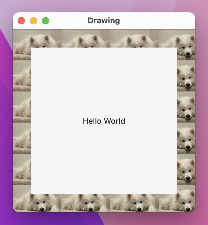
If you want to try using the sourceRect parameter, make sure you pass in a CGRect of relative sizes and positions: 0 means “start” and 1 means “end”. For example, this will show the entire width of our example image, but only the middle half:
Text("Hello World")
    .frame(width: 300, height: 300)
    .border(ImagePaint(image: Image("Example"), sourceRect: CGRect(x: 0, y: 0.25, width: 1, height: 0.5), scale: 0.1), width: 30)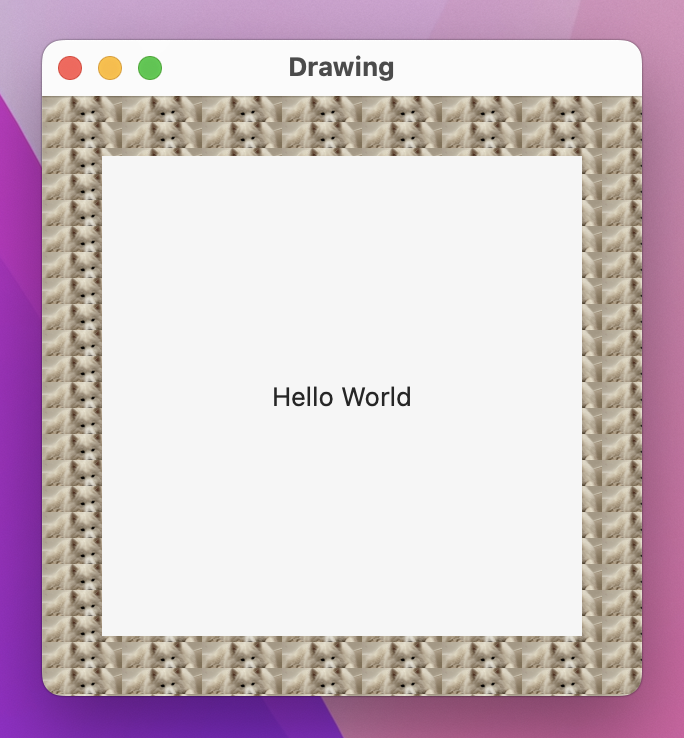
It’s worth adding that ImagePaint can be used for view backgrounds and also shape strokes. For example, we could create a capsule with our example image tiled as its stroke:
Capsule()
    .strokeBorder(ImagePaint(image: Image("Example"), scale: 0.1), lineWidth: 20)
    .frame(width: 300, height: 200)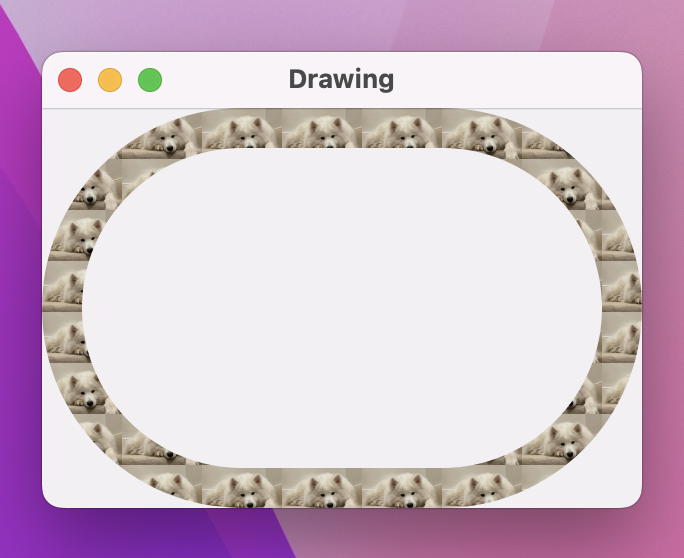
ImagePaint will automatically keep tiling its image until it has filled its area – it can work with backgrounds, strokes, borders, and fills of any size.
SwiftUI uses Core Animation for its rendering by default, which offers great performance out of the box. However, for complex rendering you might find your code starts to slow down – anything below 60 frames per second (FPS) is a problem, but really you ought to aim higher because many Macs now render at 120fps.
To demonstrate this, let’s look at some example code. We’re going to create a color-cycling view that renders concentric circles in a range of colors. The result will look like a radial gradient, but we’re going to add two properties to make it more customizable: one to control how many circles should be drawn, and one to control the color cycle – it will be able to move the gradient start and end colors around.
We can get a color cycling effect by using the Color(hue:saturation:brightness:) initializer: hue is a value from 0 to 1 controlling the kind of color we see – red is both 0 and 1, with all other hues in between. To figure out the hue for a particular circle we can take our circle number (e.g. 25), divide that by how many circles there are (e.g. 100), then add our color cycle amount (e.g. 0.5). So, if we were circle 25 of 100 with a cycle amount of 0.5, our hue would be 0.75.
One small complexity here is that hues don’t automatically wrap after we reach 1.0, which means a hue of 1.0 is equal to a hue of 0.0, but a hue of 1.2 is not equal to a hue of 0.2. As a result, we’re going to wrap the hue by hand: if it’s over 1.0 we’ll subtract 1.0, to make sure it always lies in the range of 0.0 to 1.0.
Here’s the code:
struct ColorCyclingCircle: View {
    var amount = 0.0
    var steps = 100

    var body: some View {
        ZStack {
            ForEach(0..<steps, id: \.self) { value in
                Circle()
                    .inset(by: Double(value))
                    .strokeBorder(color(for: value, brightness: 1), lineWidth: 2)
            }
        }
    }

    func color(for value: Int, brightness: Double) -> Color {
        var targetHue = Double(value) / Double(steps) + amount

        if targetHue > 1 {
            targetHue -= 1
        }

        return Color(hue: targetHue, saturation: 1, brightness: brightness)
    }
}
We can now use that in a layout, binding its color cycle to a local property controlled by a slider:
struct ContentView: View {
    @State private var colorCycle = 0.0

    var body: some View {
        VStack {
            ColorCyclingCircle(amount: colorCycle)
                .frame(width: 300, height: 300)

            Slider(value: $colorCycle)
        }
    }
}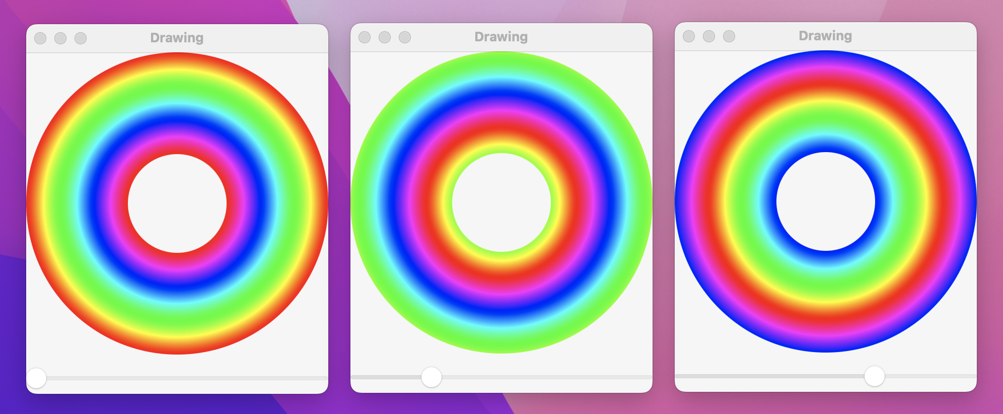
If you run the app you’ll see we have a neat color wave effect controlled entirely by dragging around the slider, and it works really smoothly.
What you’re seeing right now is powered by Core Animation, which means it will turn our 100 circles into 100 individual views being drawn onto the screen. This is computationally expensive, but as you can see it works well enough – we get smooth performance.
However, if we increase the complexity a little we’ll find things aren’t quite so rosy depending on the kind of Mac you have. Replace the existing strokeBorder() modifier with this one:
.strokeBorder(
    LinearGradient(
        gradient: Gradient(colors: [
            color(for: value, brightness: 1),
            color(for: value, brightness: 0.5)
        ]),
        startPoint: .top,
        endPoint: .bottom
    ),
    lineWidth: 2
)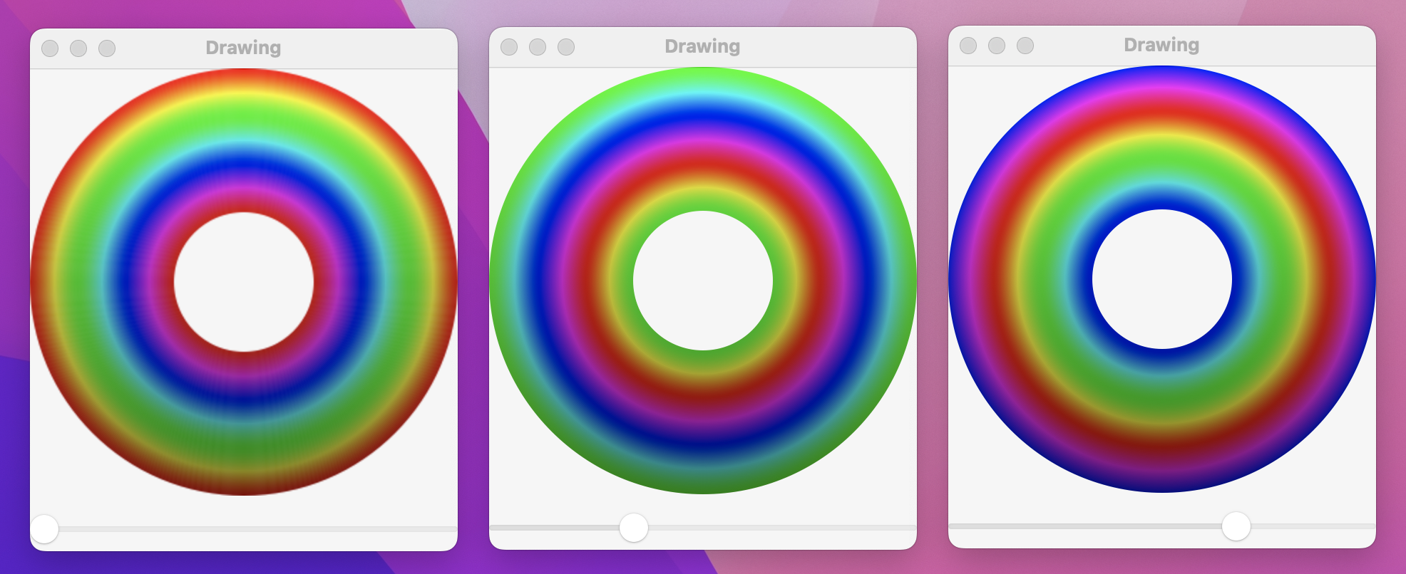
That now renders a gentle gradient, showing bright colors at the top of the circle down to darker colors at the bottom. And now when you run the app you’ll find it runs slower – SwiftUI is struggling to render 100 gradients as part of 100 separate views.
We can fix this by applying one new modifier, called drawingGroup(). This tells SwiftUI it should render the contents of the view into an off-screen image before putting it back onto the screen as a single rendered output, which is significantly faster. Behind the scenes this is powered by Metal, which is Apple’s framework for working directly with the GPU for extremely fast graphics.
So, modify the ColorCyclingCircle body to this:
var body: some View {
    ZStack {
        // existing code…
    }
    .drawingGroup()
}
Now run it again – with that one tiny addition you’ll now find we get everything rendered correctly and we’re also back at full speed even with the gradients.
Important: The drawingGroup() modifier is helpful to know about and to keep in your arsenal as a way to solve performance problems when you hit them, but you should not use it that often. Adding the off-screen render pass might slow down SwiftUI for simple drawing, so you should wait until you have an actual performance problem before trying to bring in drawingGroup().
SwiftUI gives us extraordinary control over how views are rendered, including the ability to apply real-time blurs, blend modes, saturation adjustment, and more.
Blend modes allow us to control the way one view is rendered on top of another. The default mode is .normal, which just draws the pixels from the new view onto whatever is behind, but there are lots of options for controlling color and opacity.
As an example, we could draw an image inside a ZStack, then add a red rectangle on top that is drawn with the multiply blend mode:
ZStack {
    Image("Example")
        .resizable()

    Rectangle()
        .fill(.red)
        .blendMode(.multiply)
}
.frame(width: 400, height: 300)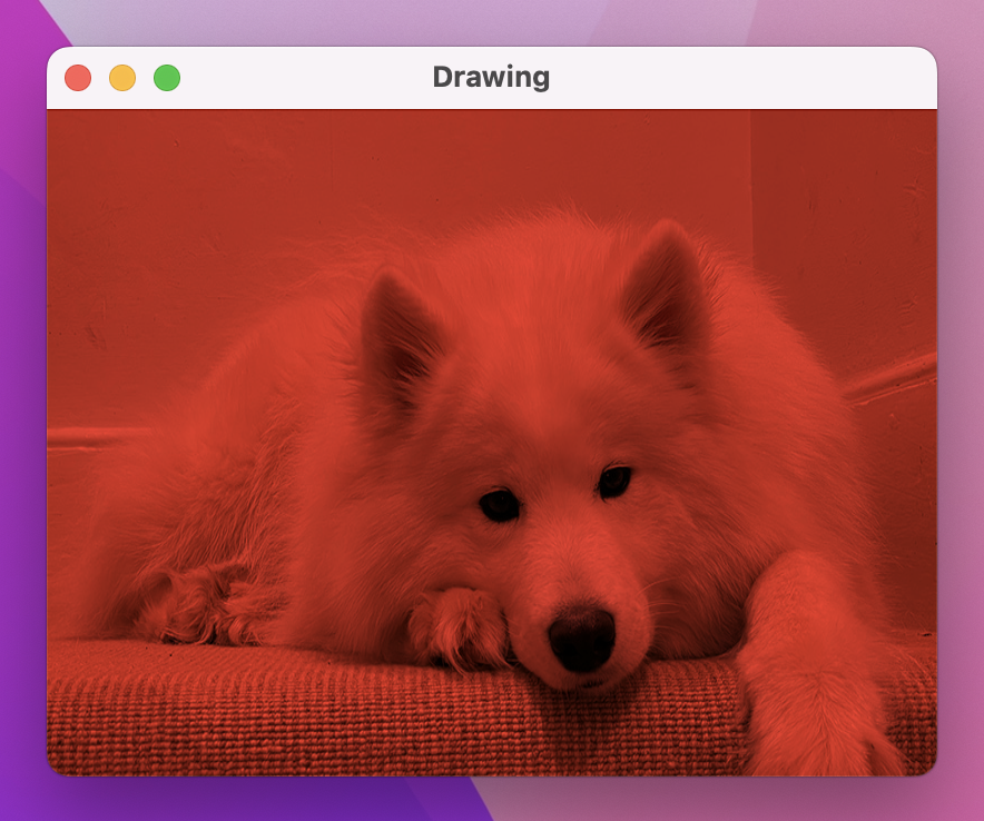
“Multiply” is so named because it multiplies each source pixel color with the destination pixel color – in our case, each pixel of the image and each pixel of the rectangle on top. Each pixel has color values for RGBA, ranging from 0 (none of that color) through to 1 (all of that color), so the highest resulting color will be 1x1, and the lowest will be 0x0.
Using multiply with a solid color applies a really common tint effect: blacks stay black (because they have the color value of 0, so regardless of what you put on top multiplying by 0 will produce 0), whereas lighter colors become various shades of the tint.
In fact, multiply is so common that there’s a shortcut modifier that means we can avoid using a ZStack:
var body: some View {
    Image("Example")
        .resizable()
        .colorMultiply(.red)
}
There are lots of other blend modes to choose from, and it’s worth spending some time experimenting to see how they work. Another popular effect is called screen, which does the opposite of multiply: it inverts the colors, performs a multiply, then inverts them again, resulting in a brighter image rather than a darker image.
As an example, we could render three circles at various positions inside a ZStack, then use a slider to control their size and overlap:
struct ContentView: View {
    @State private var amount = 0.0

    var body: some View {
        VStack {
            ZStack {
                Circle()
                    .fill(.red)
                    .frame(width: 200 * amount)
                    .offset(x: -50, y: -80)
                    .blendMode(.screen)

                Circle()
                    .fill(.green)
                    .frame(width: 200 * amount)
                    .offset(x: 50, y: -80)
                    .blendMode(.screen)

                Circle()
                    .fill(.blue)
                    .frame(width: 200 * amount)
                    .blendMode(.screen)
            }
            .frame(width: 300, height: 300)

            Slider(value: $amount)
                .padding()
        }
        .frame(maxWidth: .infinity, maxHeight: .infinity)
        .background(.black)
    }
}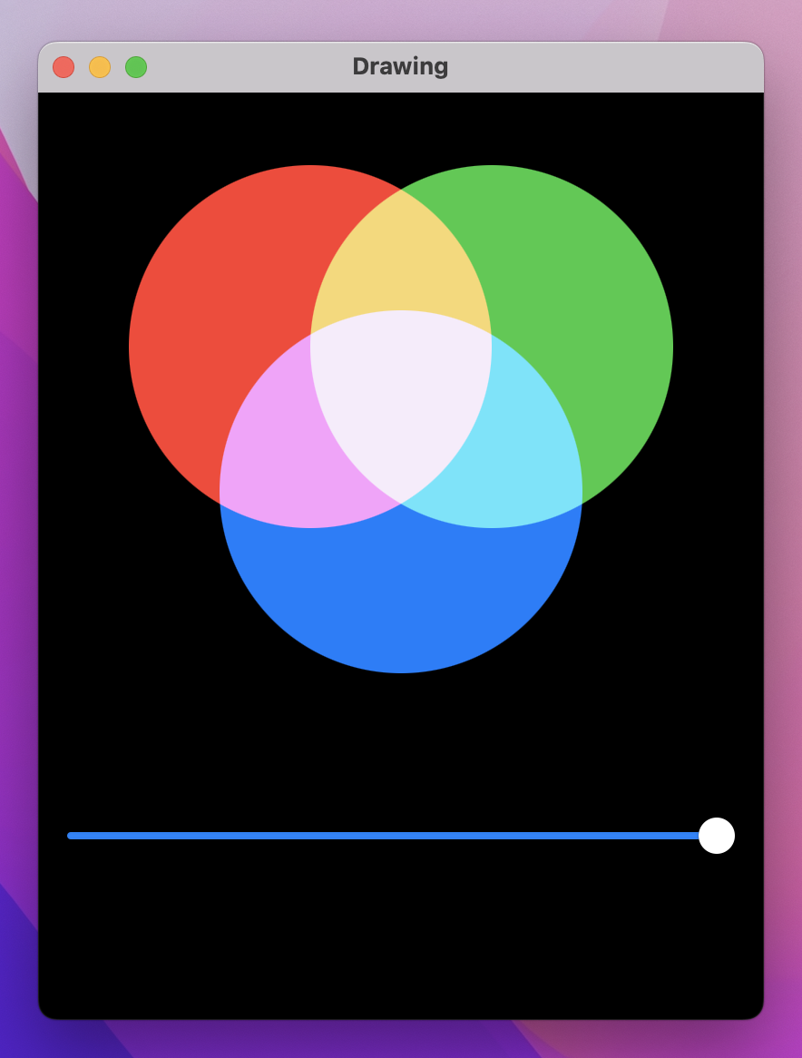
If you’re particularly observant, you might notice that the fully blended color in the center isn’t quite white – it’s a very pale lilac color. The reason for this is that Color.red, Color.green, and Color.blue aren’t fully those colors; you’re not seeing pure red when you use Color.red. Instead, you’re seeing SwiftUI’s adaptive colors that are designed to look good in both dark mode and light mode, so they are a custom blend of red, green, and blue rather than pure shades.
If you want to see the full effect of blending red, green, and blue, you should use custom colors like these three:
.fill(Color(red: 1, green: 0, blue: 0))
.fill(Color(red: 0, green: 1, blue: 0))
.fill(Color(red: 0, green: 0, blue: 1))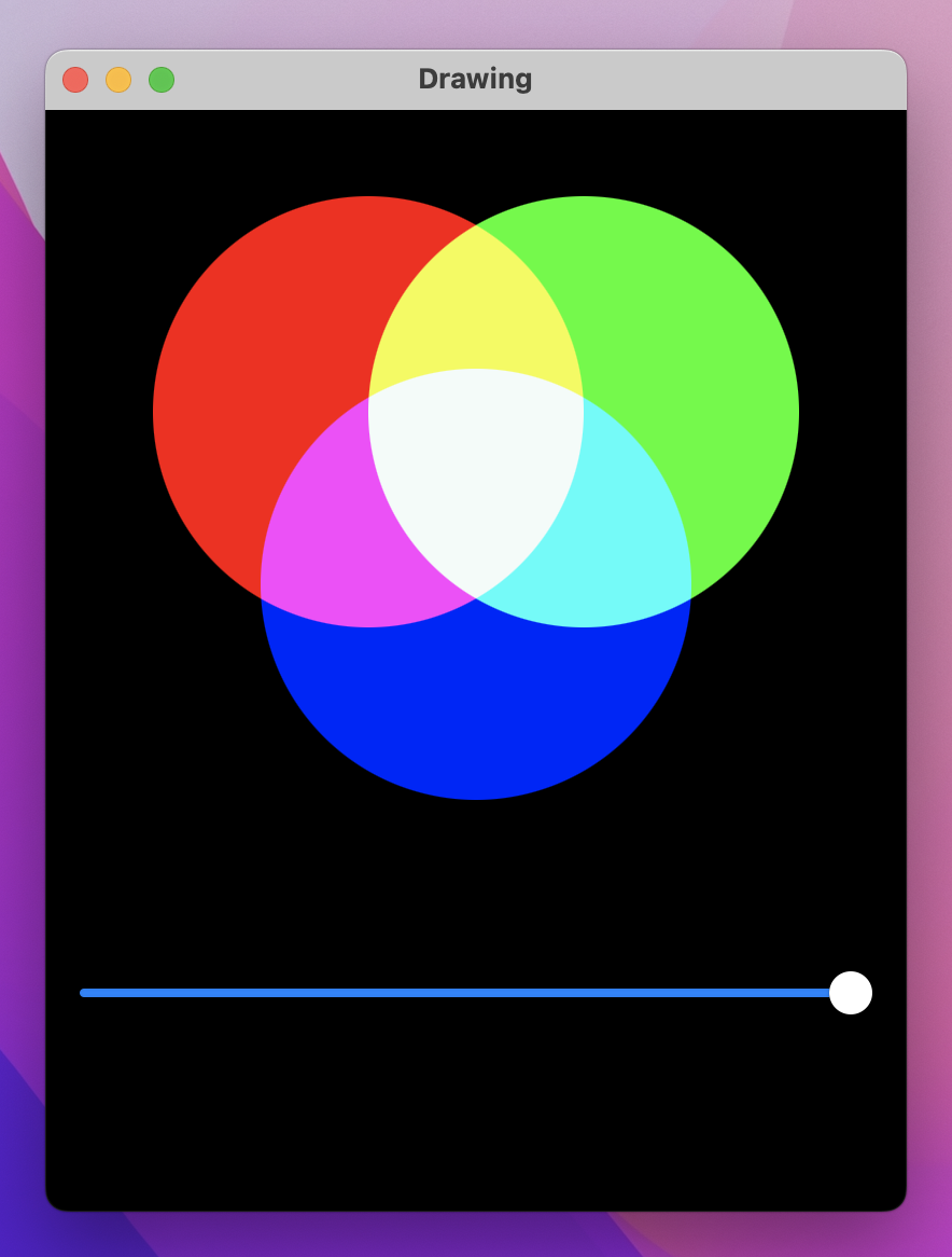
There are a host of other real-time effects we can apply, and we already looked at blur() back in project 3. So, let’s look at just one more before we move on: saturation(), which adjusts how much color is used inside a view. Give this a value between 0 (no color, just grayscale) and 1 (full color).
We could write a little code to demonstrate both blur() and saturation() in the same view, like this:
Image("Example")
    .resizable()
    .scaledToFit()
    .frame(width: 400, height: 300)
    .saturation(amount)
    .blur(radius: (1 - amount) * 20)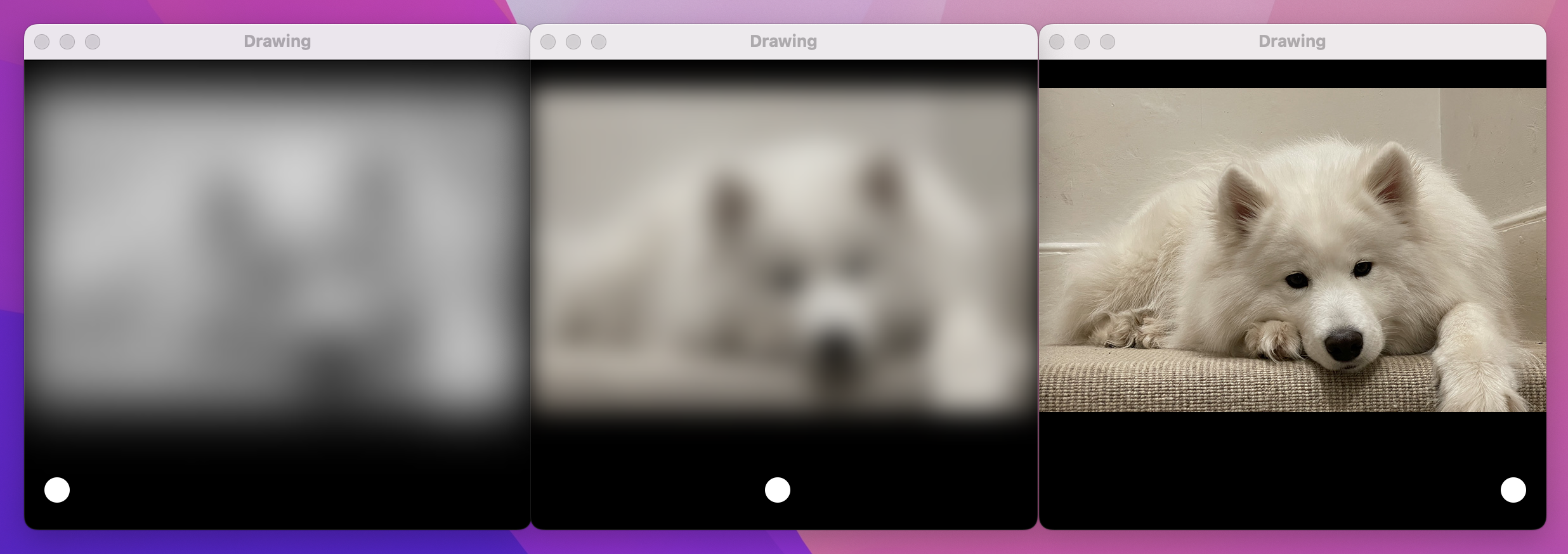
With that code, having the slider at 0 means the image is blurred and colorless, but as you move the slider to the right it gains color and becomes sharp – all rendered at lightning-fast speed.
We’ve now covered a variety of drawing-related tasks, and back in project 6 we looked at animation, so now I want to look at putting those two things together.
First, let’s build a custom shape we can use for an example – here’s the code for a trapezoid shape, which is a four-sided shape with straight sides where one pair of opposite sides are parallel:
struct Trapezoid: Shape {
    var insetAmount: Double

    func path(in rect: CGRect) -> Path {
        var path = Path()

        path.move(to: CGPoint(x: 0, y: rect.maxY))
        path.addLine(to: CGPoint(x: insetAmount, y: rect.minY))
        path.addLine(to: CGPoint(x: rect.maxX - insetAmount, y: rect.minY))
        path.addLine(to: CGPoint(x: rect.maxX, y: rect.maxY))
        path.addLine(to: CGPoint(x: 0, y: rect.maxY))

        return path
   }
}
We can now use that inside a view, passing in some local state for its inset amount so we can modify the value at runtime:
struct ContentView: View {
    @State private var insetAmount = 50.0

    var body: some View {
        Trapezoid(insetAmount: insetAmount)
            .frame(width: 200, height: 100)
            .padding(50)
            .onTapGesture {
                insetAmount = Double.random(in: 10...90)
            }
    }
}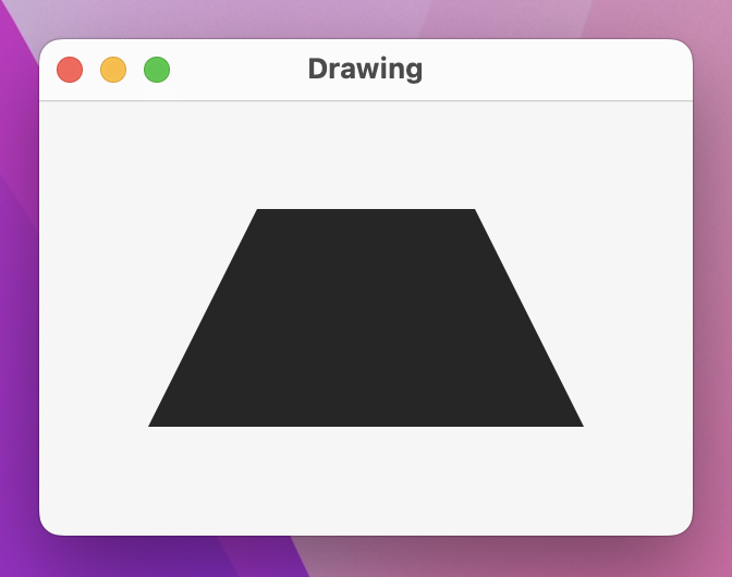
Every time you click the trapezoid, insetAmount gets set to a new value, causing the shape to be redrawn.
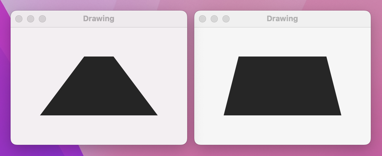
Wouldn’t it be nice if we could animate the change in inset? Sure it would – try changing the onTapGesture() closure to this:
.onTapGesture {
    withAnimation {
        insetAmount = Double.random(in: 10...90)
    }
}
Now run it again, and… nothing has changed. We’ve asked for animation, but we aren’t getting animation – what gives?
When looking at animations previously, I asked you to add a call to print() inside the body property, then said this:
“What you should see is that it prints out 2.0, 3.0, 4.0, and so on. At the same time, the button is scaling up or down smoothly – it doesn’t just jump straight to scale 2, 3, and 4. What’s actually happening here is that SwiftUI is examining the state of our view before the binding changes, examining the target state of our views after the binding changes, then applying an animation to get from point A to point B.”
So, as soon as insetAmount is set to a new random value, it will immediately jump to that value and pass it directly into Trapezoid – it won’t pass in lots of intermediate values as the animation happens. This is why our trapezoid jumps from inset to inset; it has no idea an animation is even happening.
We can fix this in only four lines of code, one of which is just a closing brace. However, even though this code is simple, the way it works might bend your brain.
First, the code – add this new computed property to the Trapezoid struct now:
var animatableData: Double {
    get { insetAmount }
    set { insetAmount = newValue }
}
You can now run the app again and see our trapezoid changing shape with a smooth animation.
What’s happening here is quite complex: when we use withAnimation(), SwiftUI immediately changes our state property to its new value, but behind the scenes it’s also keeping track of the changing value over time as part of the animation. As the animation progresses, SwiftUI will set the animatableData property of our shape to the latest value, and it’s down to us to decide what that means – in our case we assign it directly to insetAmount, because that’s the thing we want to animate.
Remember, SwiftUI evaluates our view state before an animation is applied and then again after. It can see we originally had code that evaluated to Trapezoid(insetAmount: 50), but then after a random number was chosen we ended up with (for example) Trapezoid(insetAmount: 62). So, it will interpolate between 50 and 62 over the length of our animation, each time setting the animatableData property of our shape to be that latest interpolated value – 51, 52, 53, and so on, until 62 is reached.
SwiftUI uses an animatableData property to let us animate changes to shapes, but what happens when we want two, three, four, or more properties to animate? animatableData is a property, which means it must always be one value, however we get to decide what type of value it is: it might be a single Double, or it might be two values contained in a special wrapper called AnimatablePair.
To try this out, let’s look at a new shape called Checkerboard, which must be created with some number of rows and columns:
struct Checkerboard: Shape {
    var rows: Int
    var columns: Int

    func path(in rect: CGRect) -> Path {
        var path = Path()

        // figure out how big each row/column needs to be
        let rowSize = rect.height / Double(rows)
        let columnSize = rect.width / Double(columns)

        // loop over all rows and columns, making alternating squares colored
        for row in 0..<rows {
            for column in 0..<columns {
                if (row + column).isMultiple(of: 2) {
                    // this square should be colored; add a rectangle here
                    let startX = columnSize * Double(column)
                    let startY = rowSize * Double(row)

                    let rect = CGRect(x: startX, y: startY, width: columnSize, height: rowSize)
                    path.addRect(rect)
                }
            }
        }

        return path
    }
}
We can now create a 4x4 checkerboard in a SwiftUI view, using some state properties that we can change using a tap gesture:
struct ContentView: View {
    @State private var rows = 4
    @State private var columns = 4

    var body: some View {
        Checkerboard(rows: rows, columns: columns)
            .onTapGesture {
                withAnimation(.linear(duration: 3)) {
                    rows = 8
                    columns = 16
                }
            }
    }
}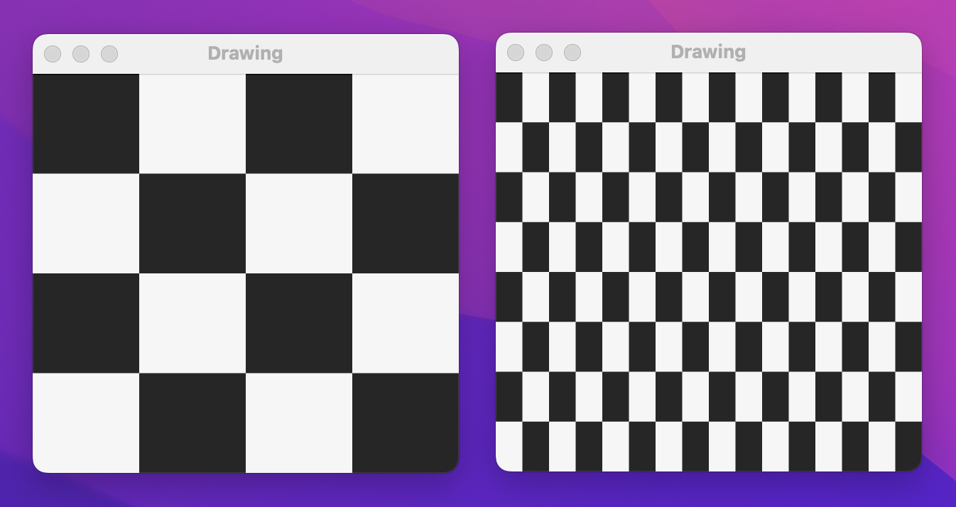
When that runs you should be able to click on the black squares to see the checkerboard jump from being 4x4 to 8x16, without animation even though the change is inside a withAnimation() block.
As with simpler shapes, the solution here is to implement an animatableData property that will be set with intermediate values as the animation progresses. Here, though, there are two catches:
row and column properties are integers, and SwiftUI can’t interpolate integers.To resolve the first problem we’re going to use a new type called AnimatablePair. As its name suggests, this contains a pair of animatable values, and because both its values can be animated the AnimatablePair can itself be animated. We can read individual values from the pair using .first and .second.
To resolve the second problem we’re just going to do some type conversion: we can convert a Double to an Int just by using Int(someDouble), and go the other way by using Double(someInt).
So, to make our checkerboard animate changes in the number of rows and columns, add this property:
var animatableData: AnimatablePair<Double, Double> {
    get {
       AnimatablePair(Double(rows), Double(columns))
    }

    set {
        rows = Int(newValue.first)
        columns = Int(newValue.second)
    }
}
Now when you run the app you should find the change happens smoothly – or as smoothly as you would expect given that we’re rounding numbers to integers.
Of course, the next question is: how do we animate three properties? Or four?
To answer that, let me show you the animatableData property for SwiftUI’s EdgeInsets type:
AnimatablePair<CGFloat, AnimatablePair<CGFloat, AnimatablePair<CGFloat, CGFloat>>>Yes, they use three separate animatable pairs, then just dig through them using code such as newValue.second.second.first.
I’m not going to claim this is the most elegant of solutions, but I hope you can understand why it exists: because SwiftUI can read and write the animatable data for a shape regardless of what that data is or what it means, it doesn’t need to re-invoke the body property of our views 60 or even 120 times a second during an animation – it just changes the parts that actually are changing.
To finish off with something that really goes to town with drawing, I’m going to walk you through creating a simple spirograph with SwiftUI. “Spirograph” is the trademarked name for a toy where you place a pencil inside a circle and spin it around the circumference of another circle, creating various geometric patterns that are known as roulettes – like the casino game.
This code involves a very specific equation. I’m going to explain it, but it’s totally OK to skip this chapter if you’re not interested – this is just for fun, and no new Swift or SwiftUI is covered here.
Our algorithm has four inputs:
So, let’s start with that:
struct Spirograph: Shape {
    let innerRadius: Int
    let outerRadius: Int
    let distance: Int
    let amount: Double
}
We then prepare three values from that data, starting with the greatest common divisor (GCD) of the inner radius and outer radius. Calculating the GCD of two numbers is usually done with Euclid's algorithm, which in a slightly simplified form looks like this:
func gcd(_ a: Int, _ b: Int) -> Int {
    var a = a
    var b = b

    while b != 0 {
        let temp = b
        b = a % b
        a = temp
    }

    return a
}
Please add that method to the Spirograph struct.
The other two values are the difference between the inner radius and outer radius, and how many steps we need to perform to draw the roulette – this is 360 degrees multiplied by the outer radius divided by the greatest common divisor, multiplied by our amount input. All our inputs work best when provided as integers, but when it comes to drawing the roulette we need to use Double, so we’re also going to create Double copies of our inputs.
Add this path(in:) method to the Spirograph struct now:
func path(in rect: CGRect) -> Path {
    let divisor = gcd(innerRadius, outerRadius)
    let outerRadius = Double(self.outerRadius)
    let innerRadius = Double(self.innerRadius)
    let distance = Double(self.distance)
    let difference = innerRadius - outerRadius
    let endPoint = ceil(2 * Double.pi * outerRadius / Double(divisor)) * amount

    // more code to come
}
Finally we can draw the roulette itself by looping from 0 to our end point, and placing points at precise X/Y coordinates. Calculating the X/Y coordinates for a given point in that loop (known as “theta”) is where the real mathematics comes in, but honestly I just converted the standard equation to Swift from Wikipedia – this is not something I would dream of memorizing!
That’s the core algorithm, but we’re going to make two small changes: we’re going to add to X and Y half the width or height of our drawing rectangle respectively so that it’s centered in our drawing space, and if theta is 0 – i.e., if this is the first point in our roulette being drawn – we’ll call move(to:) rather than addLine(to:) for our path.
Here’s the final code for the path(in:) method – replace the // more code to come comment with this:
var path = Path()

for theta in stride(from: 0, through: endPoint, by: 0.01) {
    var x = difference * cos(theta) + distance * cos(difference / outerRadius * theta)
    var y = difference * sin(theta) - distance * sin(difference / outerRadius * theta)

    x += rect.width / 2
    y += rect.height / 2

    if theta == 0 {
        path.move(to: CGPoint(x: x, y: y))
    } else {
        path.addLine(to: CGPoint(x: x, y: y))
    }
}

return path
I realize that was a lot of heavy mathematics, but the pay off is about to come: we can now use that shape in a view, adding various sliders to control the inner radius, outer radius, distance, amount, and even color:
struct ContentView: View {
    @State private var innerRadius = 125.0
    @State private var outerRadius = 75.0
    @State private var distance = 25.0
    @State private var amount = 1.0
    @State private var hue = 0.6

    var body: some View {
        VStack(spacing: 0) {
            Spacer()

            Spirograph(innerRadius: Int(innerRadius), outerRadius: Int(outerRadius), distance: Int(distance), amount: amount)
                .stroke(Color(hue: hue, saturation: 1, brightness: 1), lineWidth: 1)
                .frame(width: 300, height: 300)

            Spacer()

            Group {
                Text("Inner radius: \(Int(innerRadius))")
                Slider(value: $innerRadius, in: 10...150, step: 1)
                    .padding([.horizontal, .bottom])

                Text("Outer radius: \(Int(outerRadius))")
                Slider(value: $outerRadius, in: 10...150, step: 1)
                    .padding([.horizontal, .bottom])

                Text("Distance: \(Int(distance))")
                Slider(value: $distance, in: 1...150, step: 1)
                    .padding([.horizontal, .bottom])

                Text("Amount: \(amount, format: .number.precision(.fractionLength(2)))")
                Slider(value: $amount)
                    .padding([.horizontal, .bottom])

                Text("Color")
                Slider(value: $hue)
                    .padding(.horizontal)
            }
        }
    }
}
That was a lot of code, but I hope you take the time to run the app and appreciate just how beautiful roulettes are. What you’re seeing is actually only one form of a roulette, known as a hypotrochoid – with small adjustments to the algorithm you can generate epitrochoids and more, which are beautiful in different ways.
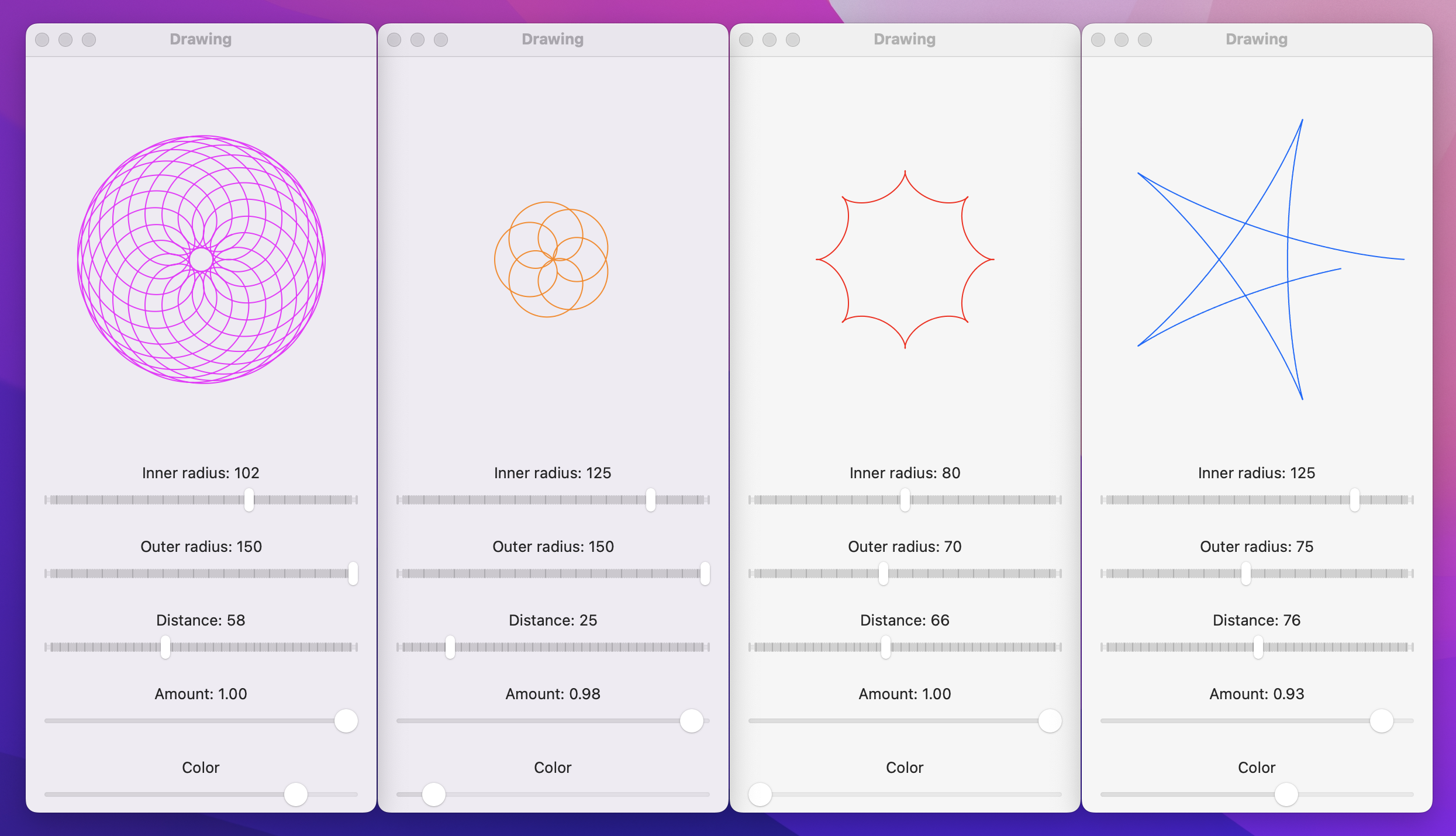
Before I finish, I’d like to remind you that the parametric equations used here are mathematical standards rather than things I just invented – I literally went to Wikipedia’s page on hypotrochoids (https://en.wikipedia.org/wiki/Hypotrochoid) and converted them to Swift.
We covered a huge amount of ground in this project, and you’ve learned about paths, shapes, strokes, transforms, drawing groups, animating values, and more. Not everyone will want to use all those features, and that’s okay – hopefully you have a clear idea of which parts interested you the most, and have some good coding experience with them.
If you combine your new-found drawing abilities with all the animation functionality we covered back in project 6, I hope you’re starting to realize just how much power and flexibility SwiftUI gives us. Yes, you can of course create whole apps using List, NavigationSplitView, and similar, but you can also build completely custom user interfaces that look fantastic and are just as fast.
One of the best ways to learn is to write your own code as often as possible, so here are three ways you should try extending this app to make sure you fully understand what’s going on.
Arrow shape – having it point straight up is fine. This could be a rectangle/triangle-style arrow, or perhaps three lines, or maybe something else depending on what kind of arrow you want to draw.Arrow shape animatable.ColorCyclingRectangle shape that is the rectangular cousin of ColorCyclingCircle, allowing us to control the position of the gradient using one or more properties.Tip: Gradient positions like .top and .bottom are actually instances of UnitPoint, and you can create your own UnitPoint instances with X/Y values ranging from 0 to 1.
Copyright © 2023 Paul Hudson, hackingwithswift.com.
You should follow me on Twitter.