We’re back to another technique project, and this time we’re going to be looking at something fast, beautiful, and really under-valued: animations.
Animations are there for a few reasons, of which one definitely is to make our user interfaces look better. However, they are also there to help users understand what’s going on with our program: when one window disappears and another slides in, it’s clear to the user where the other window has gone to, which means it’s also clear where they can look to get it back.
In this technique project we’re going to look at a range of animations and transitions with SwiftUI. Some are easy – in fact, you’ll be able to get great results almost immediately! – but some require more thinking. All will be useful, though, particularly as you work to make sure your apps are attractive and help guide the user’s eyes as best as you can.
As with the other days it’s a good idea to work in an Xcode project so you can see your code in action, so please create a new App project called AnimationSandbox.
In SwiftUI, the simplest type of animation is an implicit one: we tell our views ahead of time “if someone wants to animate you, here’s how you should respond”, and nothing more. SwiftUI will then take care of making sure any changes that do occur follow the animation you requested. In practice this makes animation trivial – it literally could not be any easier.
Of course, triggering an animation needs to be done somehow, so I want to introduce you to a new modifier called onTapGesture(). This lets us run some code when a view is clicked, which is perfect in this technique project because we can write code that changes our views somehow and try to make that change animated.
Important: For accessibility reasons, using buttons is generally preferable to using tap gestures; we're using a tap gesture here because it lets us add custom styling more easily.
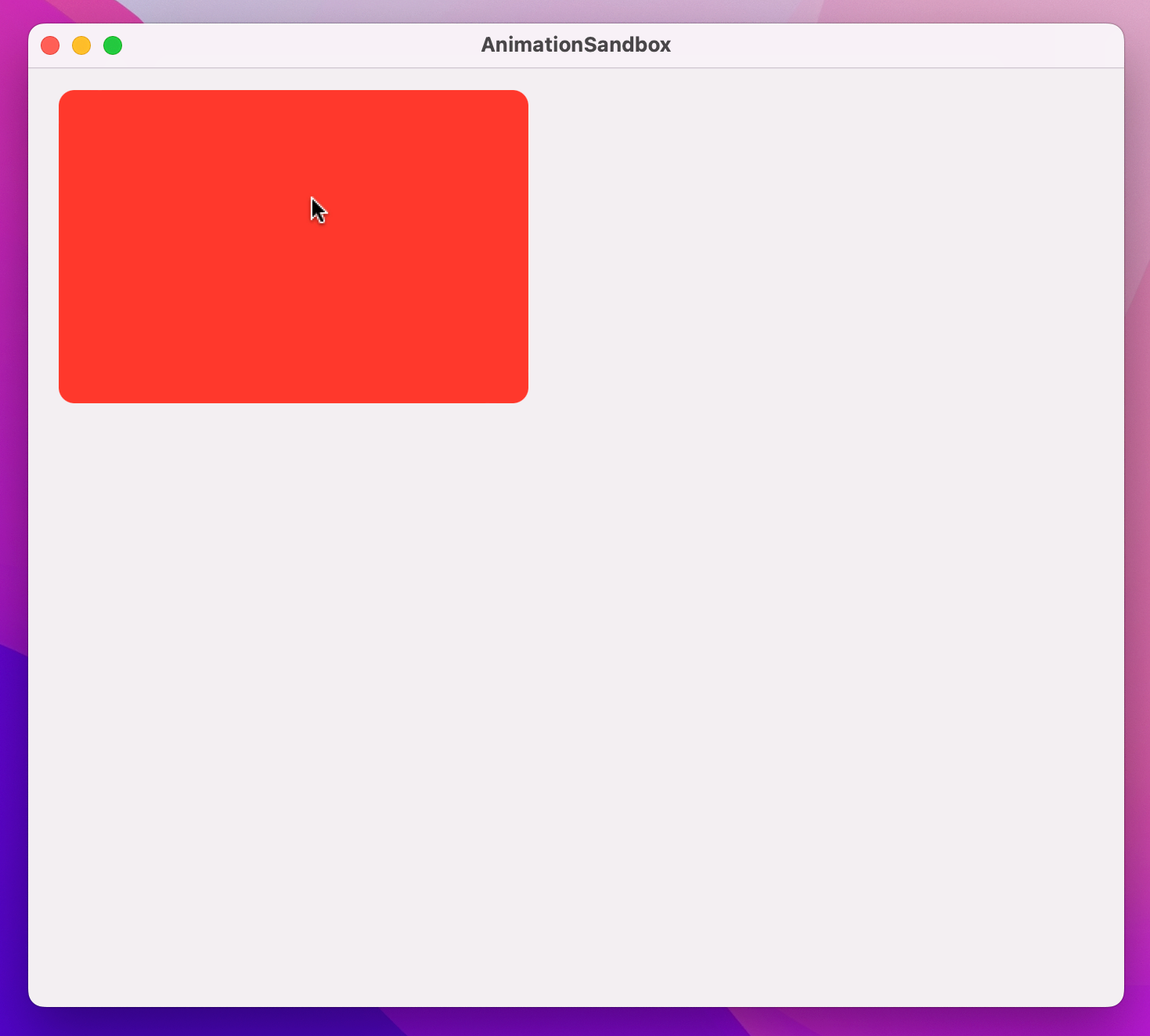
Let’s start with an example. This code shows some text with an empty tap gesture, using some points of padding and a circular clip shape:
Text("Click Me")
    .onTapGesture {
        // do nothing just yet
    }
    .padding(50)
    .background(.red)
    .foregroundStyle(.white)
    .clipShape(.circle)
    .padding(100)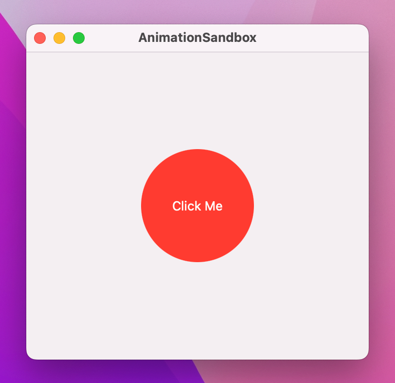
What we want is for that text to get bigger every time it’s clicked, and we can do that with a new modifier called scaleEffect(). You provide this with a value from 0 up, and it will be drawn at that size – a value of 1.0 is equivalent to 100%, i.e. the text’s normal size.
Because we want to change the scale effect value every time the text is clicked, we need to use an @State property that will store a Double. So, please add this property to your view now:
@State private var animationAmount = 1.0Now we can make the text use that for its scale effect, by adding this modifier:
.scaleEffect(animationAmount)Finally, when the text is clicked we want to increase the animation amount by 1, so use this for the tap gesture:
animationAmount += 1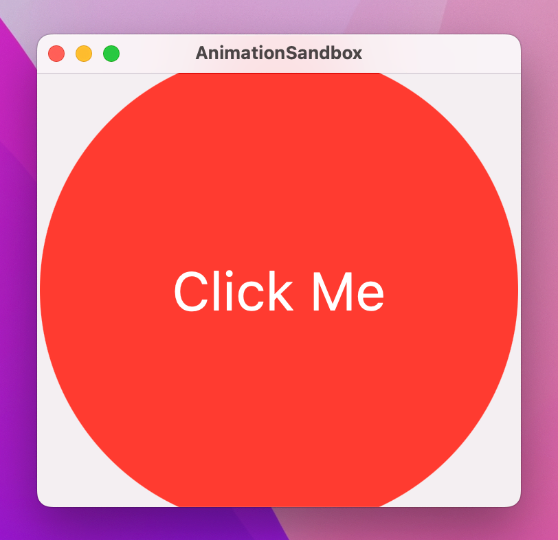
If you run that code you’ll see that you can click the text repeatedly to have it scale up and up.
Now, the human eye is highly sensitive to movement – we’re extremely good at detecting when things move or change their appearance, which is what makes animation both so important and so pleasing. So, we can ask SwiftUI to create an implicit animation for our changes so that all the scaling happens smoothly by adding an animation() modifier to the text:
.animation(.default, value: animationAmount)That asks SwiftUI to apply a default animation whenever the value of animationAmount changes, and immediately you’ll see that clicking the text now causes it to scale up with an animation.
That implicit animation takes effect on all properties of the view that change, meaning that if we attach more animating modifiers to the view then they will all change together. For example, we could add a second new modifier to the text, .blur(), which lets us add a Gaussian blur with a special radius – add this before the animation() modifier:
.blur(radius: (animationAmount - 1) * 3)A radius of (animationAmount - 1) * 3 means the blur radius will start at 0 (no blur), but then move to 3 points, 6 points, 9 points, and beyond as you click the text.
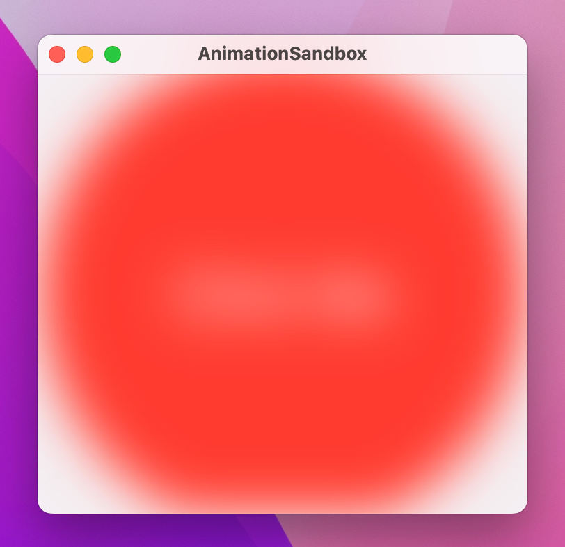
If you run the app again you’ll see that it now scales and blurs smoothly.
The point is that nowhere have we said what each frame of the animation should look like, and we haven’t even said when SwiftUI should start and finish the animation. Instead, our animation becomes a function of our state just like the views themselves.
When we attach the animation() modifier to a view, SwiftUI will automatically animate any changes that happen to that view using whatever is the default system animation, whenever the value we’re watching changes. In practice, that is an “ease in, ease out” animation, which means SwiftUI will start the animation slow, make it pick up speed, then slow down as it approaches its end.
We can control the type of animation used by passing in different values to the modifier. For example, we could use .easeOut to make the animation start fast then slow down to a smooth stop:
.animation(.easeOut, value: animationAmount)There are even spring animations, that cause the movement to overshoot then return to settle at its target. You can control the initial stiffness of the spring (which sets its initial velocity when the animation starts), and also how fast the animation should be “damped” – lower values cause the spring to bounce back and forth for longer.
For example, this makes our text scale up quickly then bounce:
.animation(.interpolatingSpring(stiffness: 50, damping: 1), value: animationAmount)For more precise control, we can customize the animation with a duration specified as a number of seconds. So, we could get an ease-in-out animation that lasts for two seconds like this:
struct ContentView: View {
    @State private var animationAmount = 1.0

    var body: some View {
        Text("Click Me")
            .onTapGesture {
                animationAmount += 1
            }
            .padding(50)
            .background(.red)
            .foregroundStyle(.white)
            .clipShape(.circle)
            .scaleEffect(animationAmount)
            .animation(.easeInOut(duration: 2), value: animationAmount)
    }
}
When we say .easeInOut(duration: 2) we’re actually creating an instance of an Animation struct that has its own set of modifiers. So, we can attach modifiers directly to the animation to add a delay like this:
.animation(
    .easeInOut(duration: 2)
        .delay(1),
    value: animationAmount
)
With that in place, clicking the text will now wait for a second before executing a two-second animation.
We can also ask the animation to repeat a certain number of times, and even make it bounce back and forward by setting autoreverses to true. This creates a one-second animation that will bounce up and down before reaching its final size:
.animation(
    .easeInOut(duration: 1)
        .repeatCount(3, autoreverses: true),
    value: animationAmount
)
If we had set repeat count to 2 then the text would scale up then down again, then jump immediately back up to its larger scale. This is because ultimately the text must match the state of our program, regardless of what animations we apply – when the animation finishes the text must have whatever value is set in animationAmount.
For continuous animations, there is a repeatForever() modifier that can be used like this:
.animation(
    .easeInOut(duration: 1)
        .repeatForever(autoreverses: true),
    value: animationAmount
)
We can use these repeatForever() animations in combination with onAppear() to make animations that start immediately and continue animating for the life of the view.
To demonstrate this, we’re going to remove the animation from the text itself and instead apply it to an overlay to make a sort of pulsating circle around the text. Overlays are created using an overlay() modifier, which lets us create new views at the same size and position as the view we’re overlaying.
So, first add this overlay() modifier to the text before the padding(100) modifier:
.overlay(
    Circle()
        .stroke(.red)
        .scaleEffect(animationAmount)
        .opacity(2 - animationAmount)
)
That makes a stroked red circle over our text, using an opacity value of 2 - animationAmount so that when animationAmount is 1 the opacity is 1 (it’s opaque) and when animationAmount is 2 the opacity is 0 (it’s transparent).
Next, remove the scaleEffect() and blur() modifiers from the text and comment out the animationAmount += 1 action part too, because we don’t want that to change any more, and move its animation modifier up to the circle inside the overlay:
.overlay(
    Circle()
        .stroke(.red)
        .scaleEffect(animationAmount)
        .opacity(2 - animationAmount)
        .animation(
            .easeOut(duration: 1)
                .repeatForever(autoreverses: false),
            value: animationAmount
        )
)
I’ve switched autoreverses to false, but otherwise it’s the same animation.
Finally, add an onAppear() modifier to the text, which will set animationAmount to 2:
.onAppear {
    animationAmount = 2
}
Because the overlay circle uses that for a “repeat forever” animation without autoreversing, you’ll see the overlay circle scale up and fade out continuously.
Your finished code should look like this:
Text("Click Me")
    .onTapGesture {
        // animationAmount += 1
    }
    .padding(50)
    .background(.red)
    .foregroundStyle(.white)
    .clipShape(.circle)
    .overlay(
        Circle()
            .stroke(.red)
            .scaleEffect(animationAmount)
            .opacity(2 - animationAmount)
            .animation(
                .easeOut(duration: 1)
                    .repeatForever(autoreverses: false),
                value: animationAmount
            )
    )
    .padding(100)
    .onAppear {
        animationAmount = 2
    }
Given how little work that involves, it creates a remarkably attractive effect!
The animation() modifier can be applied to any SwiftUI binding, which causes the value to animate between its current and new value. This even works if the data in question isn’t really something that sounds like it can be animated, such as a Boolean – you can mentally imagine animating from 1.0 to 2.0 because we could do 1.05, 1.1, 1.15, and so on, but going from “false” to “true” sounds like there’s no room for in between values.
This is best explained with some working code to look at, so I want to introduce you to a new view type called Stepper – it shows simple up and down arrows to let the user move a value inside a range of our choosing.
Here’s a view with a VStack, a Stepper, and some text:
struct ContentView: View {
    @State private var animationAmount = 1.0

    var body: some View {
        VStack {
            Stepper("Scale amount", value: $animationAmount.animation(), in: 1...10)

            Text("Click Me")
                .onTapGesture {
                    animationAmount += 1
                }
                .padding(40)
                .background(.red)
                .foregroundStyle(.white)
                .clipShape(.circle)
                .padding(100)
                .scaleEffect(animationAmount)
        }
    }
}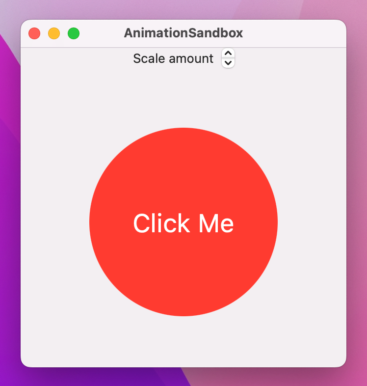
As you can see, the stepper can move animationAmount up and down, and tapping the text will add 1 to it – they are both tied to the same data, which in turn causes the size of the text to change. However, tapping the text changes animationCount immediately, so the text will just jump up to its larger size. In contrast, the stepper is bound to $animationAmount.animation(), which means SwiftUI will automatically animate its changes.
Now, as an experiment I’d like you to change the start of the body to this:
var body: some View {
    print(animationAmount)

    return VStack {
Because we have some non-view code in there, we need to add return before the VStack so Swift understands which part is the view that is being sent back. But adding print(animationAmount) is important, and to see why I’d like you to run the program again and try manipulating the stepper.
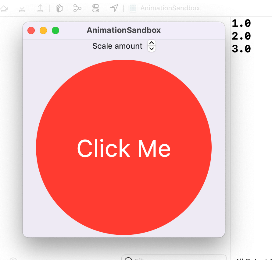
What you should see is that it prints out 2.0, 3.0, 4.0, and so on. At the same time, the text is scaling up or down smoothly – it doesn’t just jump straight to scale 2, 3, and 4. What’s actually happening here is that SwiftUI is examining the state of our view before the binding changes, examining the target state of our views after the binding changes, then applying an animation to get from point A to point B.
This is why we can animate a Boolean changing: Swift isn’t somehow inventing new values between false and true, but just animating the view changes that occur as a result of the change.
These binding animations use a similar animation() modifier that we use on views, so you can go to town with animation modifiers if you want to:
Stepper("Scale amount", value: $animationAmount.animation(
    .easeInOut(duration: 1)
        .repeatCount(3, autoreverses: true)
), in: 1...10)
Tip: With this variant of the animation() modifier, we don’t need to specify which value we’re watching for changes – it’s literally attached to the value it should watch!
These binding animations effectively turn the tables on implicit animations: rather than setting the animation on a view and implicitly animating it with a state change, we now set nothing on the view and explicitly animate it with a state change. In the former, the state change has no idea it will trigger an animation, and in the latter the view has no idea it will be animated – both work and both are important.
You’ve seen how SwiftUI lets us create implicit animations by attaching the animation() modifier to a view, and how it also lets us create animated binding changes by adding the animation() modifier to a binding, but there’s a third useful way we can create animations: explicitly asking SwiftUI to animate changes occurring as the result of a state change.
This still doesn’t mean we create each frame of the animation by hand – that remains SwiftUI’s job, and it continues to figure out the animation by looking at the state of our views before and after the state change was applied.
Now, though, we’re being explicit that we want an animation to occur when some arbitrary state change occurs: it’s not attached to a binding, and it’s not attached to a view, it’s just us explicitly asking for a particular animation to occur because of a state change.
To demonstrate this, let’s return to our simple example again:
struct ContentView: View {
    var body: some View {
        Text("Click Me")
            .onTapGesture {
                // do nothing
            }
            .padding(50)
            .background(.red)
            .foregroundStyle(.white)
            .clipShape(.circle)
            .padding(100)
    }
}
When that text is clicked, we’re going to make it spin around with a 3D effect. This requires another new modifier, rotation3DEffect(), which can be given a rotation amount in degrees as well as an axis that determines how the view rotates. Think of this axis like a skewer through your view:
Making this work requires some state we can modify, and rotation degrees are specified as a Double. So, please add this property now:
@State private var animationAmount = 0.0Next, we’re going to ask the text to rotate by animationAmount degrees along its Y axis, which means it will spin left and right. Add this modifier to the text now:
.rotation3DEffect(.degrees(animationAmount), axis: (x: 0, y: 1, z: 0))Now for the important part: we’re going to add some code to the text’s tap gesture so that it adds 360 to animationAmount every time it’s clicked.
If we just write animationAmount += 360 then the change will happen immediately, because there is no animation modifier attached to the text. This is where explicit animations come in: if we use a withAnimation() closure then SwiftUI will ensure any changes resulting from the new state will automatically be animated.
So, put this in the text’s tap gesture now:
withAnimation {
    animationAmount += 360
}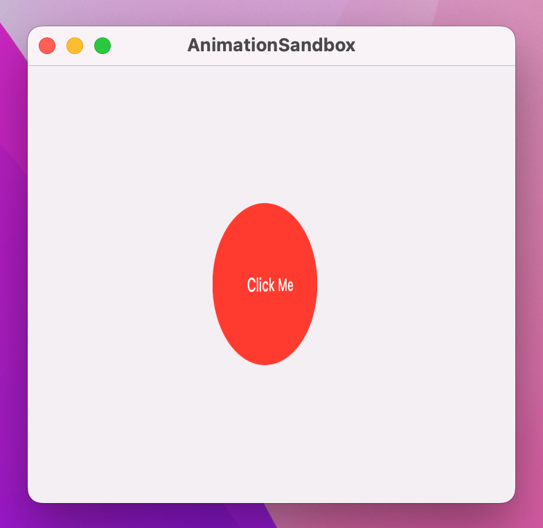
Run that code now and I think you’ll be impressed by how good it looks – every time you click the text it spins around in 3D space, and it was so easy to write. If you have time, experiment a little with the axes so you can really understand how they work. In case you were curious, you can use more than one axis at once.
withAnimation() can be given an animation parameter, using all the same animations you can use elsewhere in SwiftUI. For example, we could make our rotation effect use a spring animation using a withAnimation() call like this:
withAnimation(.interpolatingSpring(stiffness: 5, damping: 1)) {
    animationAmount += 360
}At this point, I want to put together two things that you already understand individually, but together might hurt your head a little.
Previously we looked at how the order of modifiers matters. So, if we wrote code like this:
Text("Click Me")
    .onTapGesture {
        // do nothing
    }
    .background(.blue)
    .frame(width: 200, height: 200)
    .foregroundStyle(.white)
The result would look different from code like this:
Text("Click Me")
    .onTapGesture {
        // do nothing
    }
    .frame(width: 200, height: 200)
    .background(.blue)
    .foregroundStyle(.white)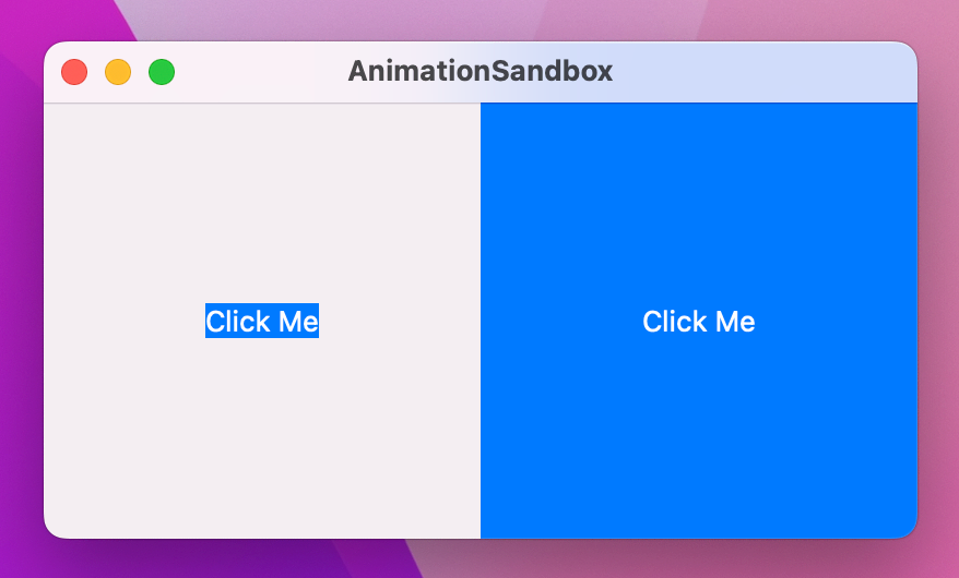
This is because if we color the background before adjusting the frame, only the original space is colored rather than the expanded space. If you recall, the underlying reason for this is the way SwiftUI wraps views with modifiers, allowing us to apply the same modifier multiple times – we repeated background() and padding() several times to create a striped border effect.
That’s concept one: modifier order matters, because SwiftUI wraps views with modifiers in the order they are applied.
Concept two is that we can apply an animation() modifier to a view in order to have it implicitly animate changes.
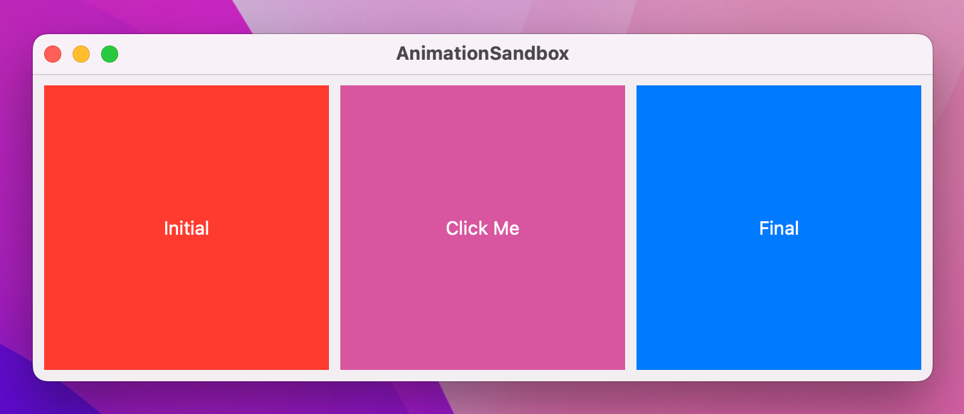
To demonstrate this, we could modify our text code so that it shows different colors depending on some state. First, we define the state:
@State private var enabled = falseWe can toggle that between true and false inside our text’s tap gesture:
enabled.toggle()Then we can use a conditional value inside the background() modifier so the text is either blue or red:
.background(enabled ? .blue : .red)Finally, we add the animation() modifier to the text to make those changes animate:
.animation(.default, value: enabled)If you run the code you’ll see that clicking the text animates its color between blue and red.
So: modifier order matters and we can attach one modifier several times to a view, and we can cause implicit animations to occur with the animation() modifier. All clear so far?
Right. Brace yourself, because this might hurt.
You can attach the animation() modifier several times, and the order in which you use it matters.
To demonstrate this, I’d like you to add this modifier to your text, after all the other modifiers:
.clipShape(.rect(cornerRadius: enabled ? 60 : 0))That will cause the text to move between a square and a rounded rectangle depending on the state of the enabled Boolean.
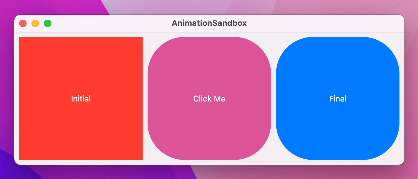
When you run the program, you’ll see that clicking the text causes it to animate between red and blue, but jump between square and rounded rectangle – that part doesn’t animate.
Hopefully you can see where we’re going next: I’d like you to move the clipShape() modifier before the animation, like this:
.frame(width: 200, height: 200)
.background(enabled ? .blue : .red)
.foregroundStyle(.white)
.clipShape(.rectangle(cornerRadius: enabled ? 60 : 0))
.animation(.default, value: enabled)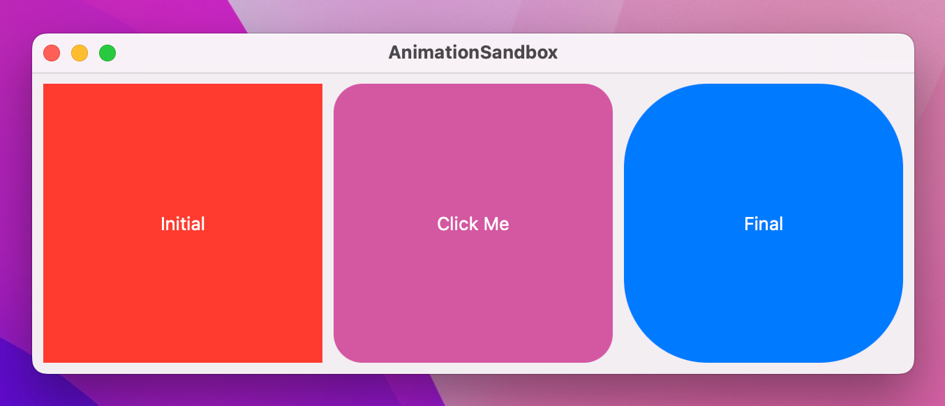
And now when you run the code both the background color and clip shape animate.
So, the order in which we apply animations matters: only changes that occur before the animation() modifier get animated.
Now for the fun part: if we apply multiple animation() modifiers, each one controls everything before it up to the next animation. This allows us to animate state changes in all sorts of different ways rather than uniformly for all properties.
For example, we could make the color change happen with the default animation, but use an interpolating spring for the clip shape:
Text("Click Me")
    .onTapGesture {
        enabled.toggle()
    }
    .frame(width: 200, height: 200)
    .background(enabled ? .blue : .red)
    .animation(.default, value: enabled)
    .foregroundStyle(.white)
    .clipShape(.rect(cornerRadius: enabled ? 60 : 0))
    .animation(.interpolatingSpring(stiffness: 10, damping: 1), value: enabled)
You can have as many animation() modifiers as you need to construct your design, which lets us split one state change into as many segments as we need.
For even more control, it’s possible to disable animations entirely by passing nil to the modifier. For example, you might want the color change to happen immediately but the clip shape to retain its animation, in which case you’d write this:
Text("Click Me")
    .onTapGesture {
        enabled.toggle()
    }
    .frame(width: 200, height: 200)
    .background(enabled ? .blue : .red)
    .animation(nil, value: enabled)
    .foregroundStyle(.white)
    .clipShape(.rect(cornerRadius: enabled ? 60 : 0))
    .animation(.interpolatingSpring(stiffness: 10, damping: 1), value: enabled)
That kind of control wouldn’t be possible without multiple animation() modifiers – if you tried to move background() after the animation you’d find that it would just undo the work of clipShape().
SwiftUI lets us attach gestures to any views, and the effects of those gestures can also be animated. We get a range of gestures to work with, such as tap gestures to let any view respond to clicks, drag gestures that respond to us dragging our mouse over a view, and more.
We’ll be looking at gestures in more detail later on, but for now let’s try something relatively simple: a red card shape that we can drag around the window, but when we let go it snaps back into its original location.
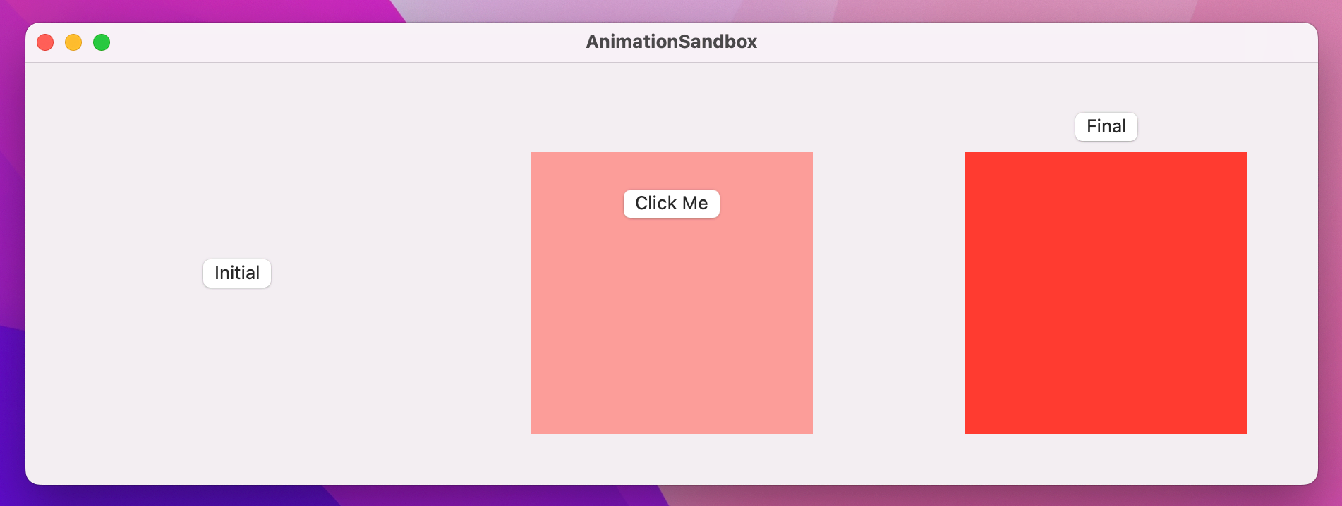
First, our initial layout:
struct ContentView: View {
    var body: some View {
        Color.red
            .frame(width: 300, height: 200)
            .clipShape(.rect(cornerRadius: 10))
            .padding(200)
    }
}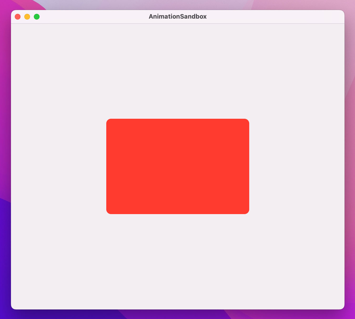
That draws a card-like view in the center of the window. We want to move that around the window based on the location of our mouse, and that requires three steps.
First, we need some state to store the amount of their drag:
@State private var dragAmount = CGSize.zeroSecond, we want to use that size to influence the card’s position on-screen. SwiftUI gives us a dedicated modifier for this called offset(), which lets us adjust the X and Y coordinate of a view without moving other views around it. You can pass in discrete X and Y coordinates if you want to, but – by no mere coincidence – offset() can also take a CGSize directly.
So, step two is to add this modifier to the card:
.offset(dragAmount)Now comes the important part: we can create a DragGesture and attach it to the card. Drag gestures have two extra modifiers that are useful to us here: onChanged() lets us run a closure whenever the user moves their mouse, and onEnded() lets us run a closure when the user lifts their finger off the mouse button, ending the drag.
Both of those closures are given a single parameter, which describes the drag operation – where it started, where it is currently, how far it moved, and so on. For our onChanged() modifier we’re going to read the translation of the drag, which tells us how far it’s moved from the start point – we can assign that directly to dragAmount so that our view moves along with the gesture. For onEnded() we’re going to ignore the input entirely, because we’ll be setting dragAmount back to zero.
So, add this modifier to the card now:
.gesture(
    DragGesture()
        .onChanged { dragAmount = $0.translation }
        .onEnded { _ in dragAmount = .zero }
)
If you run the code you’ll see you can now drag the card around, and when you release the drag it will jump back to the center. The card has its offset determined by dragAmount, which in turn is being set by the drag gesture.
Now that everything works we can bring that movement to life with some animation, and we have two options: add an implicit animation that will animate the drag and the release, or add an explicit animation to animate just the release.
To see the former in action, add this modifier to the card:
.animation(.spring(), value: dragAmount)As you drag around, the card will move to the drag location with a slight delay because of the spring animation, but it will also gently overshoot if you make sudden movements.
To see explicit animations in action, remove that animation() modifier and change your existing onEnded() drag gesture code to this:
.onEnded { _ in
    withAnimation(.spring()) {
        dragAmount = .zero
    }
}
Now the card will follow your drag immediately (because that’s not being animated), but when you release it will animate.
If we combine offset animations with drag gestures and a little delay, we can create remarkably fun animations without a lot of code.
To demonstrate this, we could write the text “Hello SwiftUI” as a series of individual letters, each one with a background color and offset that is controlled by some state. Strings are just slightly fancy arrays of characters, so we can get a real array from a string like this: Array("Hello SwiftUI").
Anyway, try this out and see what you think:
struct ContentView: View {
    let letters = Array("Hello SwiftUI")
    @State private var enabled = false
    @State private var dragAmount = CGSize.zero

    var body: some View {
        HStack(spacing: 0) {
            ForEach(0..<letters.count, id: \.self) { num in
                Text(String(letters[num]))
                    .padding(5)
                    .font(.title)
                    .background(enabled ? .blue : .red)
                    .offset(dragAmount)
                    .animation(.default.delay(Double(num) / 20), value: dragAmount)
            }
        }
        .gesture(
            DragGesture()
                .onChanged { dragAmount = $0.translation }
                .onEnded { _ in
                    dragAmount = .zero
                    enabled.toggle()
                }
        )
        .padding(200)
    }
}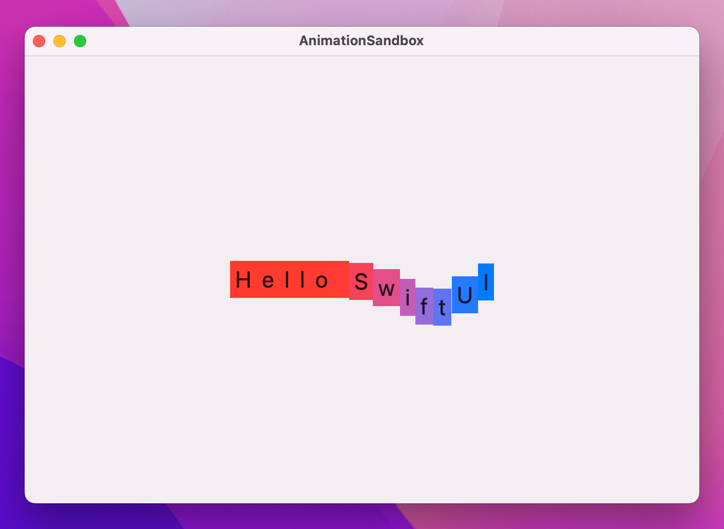
If you run that code you’ll see that any letter can be dragged around to have the whole string follow suit, with a brief delay causing a snake-like effect. SwiftUI will also add in color changing as you release the drag, animating between blue and red even as the letters move back to the center.
One of the most powerful features of SwiftUI is the ability to customize the way views are shown and hidden. Previously you’ve seen how we can use regular if conditions to include views conditionally, which means when that condition changes we can insert or remove views from our view hierarchy.
Transitions control how this insertion and removal takes place, and we can work with the built-in transitions, combine them in different ways, or even create wholly custom transitions.
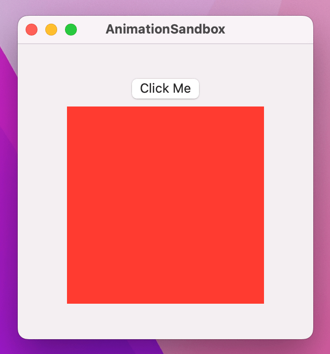
To demonstrate this, here’s a VStack with a button and a rectangle:
struct ContentView: View {
    var body: some View {
        VStack {
            Button("Click Me") {
                // do nothing
            }

            Rectangle()
                .fill(.red)
                .frame(width: 200, height: 200)
        }
        .frame(width: 300, height: 300)
    }
}
We can make the rectangle appear only when a certain condition is satisfied. First, we add some state we can manipulate:
@State private var isShowingRed = falseNext we use that state as a condition for showing our rectangle:
if isShowingRed {
    Rectangle()
        .fill(.red)
        .frame(width: 200, height: 200)
}
Finally we can toggle isShowingRed between true and false in the button’s action:
isShowingRed.toggle()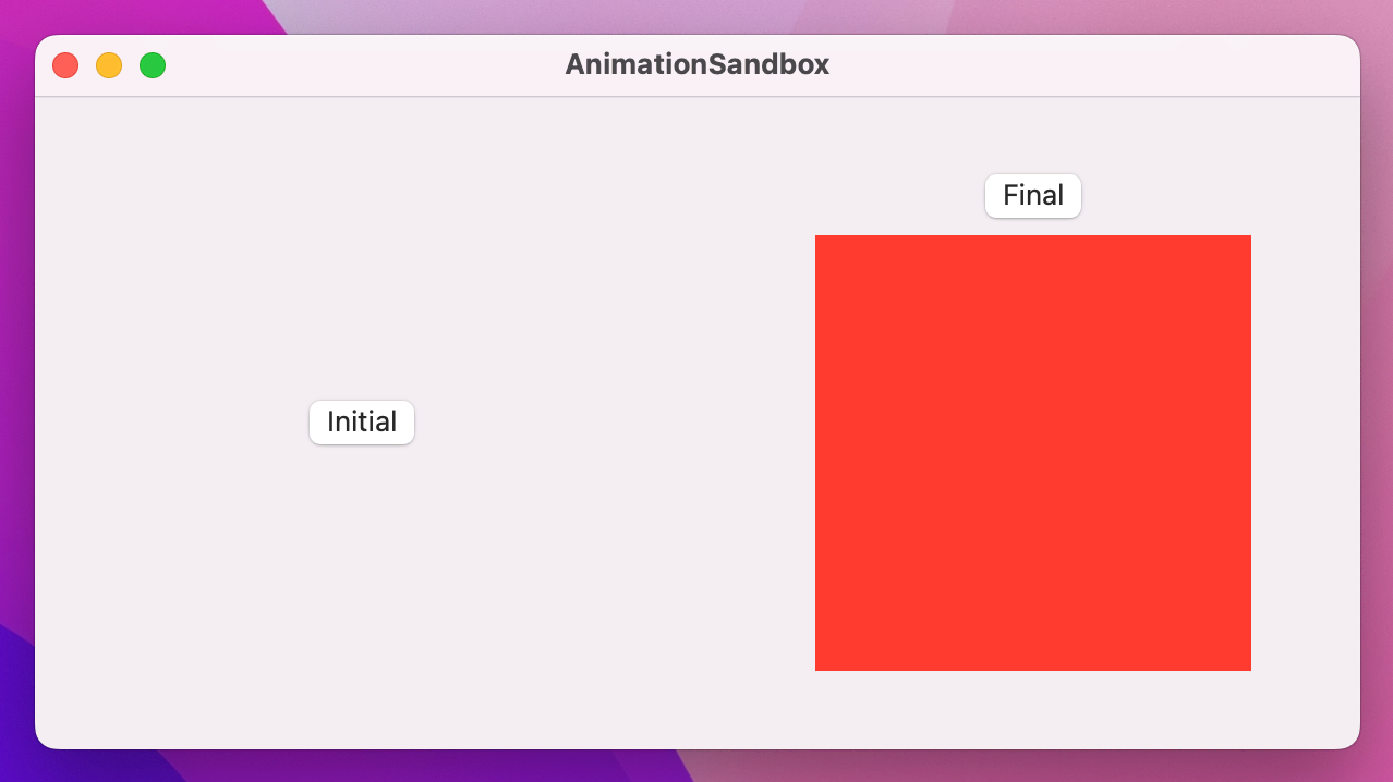
If you run the program, you’ll see that pressing the button shows and hides the red square. There’s no animation; it just appears and disappears abruptly.
We can get SwiftUI’s default view transition by wrapping the state change using withAnimation(), like this:
withAnimation {
    isShowingRed.toggle()
}
With that small change, the app now fades the red rectangle in and out, while also moving the button up to make space. It looks OK, but we can do better with the transition() modifier.
For example, we could have the rectangle scale up and down as it is shown just by adding the transition() modifier to it:
Rectangle()
    .fill(.red)
    .frame(width: 200, height: 200)
    .transition(.scale)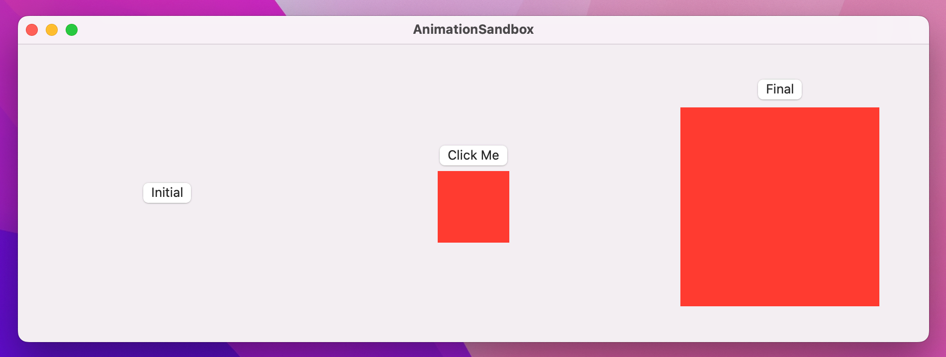
Now clicking the button looks much better: the rectangle scales up as the button makes space, then scales down when clicking again.
There are a handful of other transitions you can try if you want to experiment. A useful one is .asymmetric, which lets us use one transition when the view is being shown and another when it’s disappearing. To try it out, replace the rectangle’s existing transition with this:
.transition(.asymmetric(insertion: .scale, removal: .opacity))It’s possible – and actually surprisingly easy – to create wholly new transitions for SwiftUI, allowing us to add and remove views using entirely custom animations.
This functionality is made possible by the .modifier transition, which accepts any view modifier we want. The catch is that we need to be able to instantiate the modifier, which means it needs to be one we create ourselves.
To try this out, we could write a view modifier that lets us mimic the Pivot animation in Keynote – it causes a new slide to rotate in from its top-left corner.
In SwiftUI-speak, that means creating a view modifier that causes our view to rotate in from one corner, without escaping the bounds it’s supposed to be in. SwiftUI actually gives us modifiers to do just that: rotationEffect() lets us rotate a view in 2D space, and clipped() stops the view from being drawn outside of its rectangular space.
rotationEffect() is similar to rotation3DEffect(), except it always rotates around the Z axis. However, it also gives us the ability to control the anchor point of the rotation – which part of the view should be fixed in place as the center of the rotation. SwiftUI gives us a UnitPoint type for controlling the anchor, which lets us specify an exact X/Y point for the rotation or use one of the many built-in options – .topLeading, .bottomTrailing, .center, and so on.
Let’s put all this into code by creating a CornerRotateModifier struct that has an anchor point to control where the rotation should take place, and an amount to control how much rotation should be applied:
struct CornerRotateModifier: ViewModifier {
    let amount: Double
    let anchor: UnitPoint

    func body(content: Content) -> some View {
        content
            .rotationEffect(.degrees(amount), anchor: anchor)
            .clipped()
    }
}
The addition of clipped() there means that when the view rotates the parts that are lying outside its natural rectangle don’t get drawn.
We can try that straight away using the .modifier transition, but it’s a little unwieldy. A better idea is to wrap that in an extension to AnyTransition, making it rotate from -90 to 0 on its top leading corner:
extension AnyTransition {
    static var pivot: AnyTransition {
        .modifier(
            active: CornerRotateModifier(amount: -90, anchor: .topLeading),
            identity: CornerRotateModifier(amount: 0, anchor: .topLeading)
        )
    }
}
With that in place we now attach the pivot animation to any view using this:
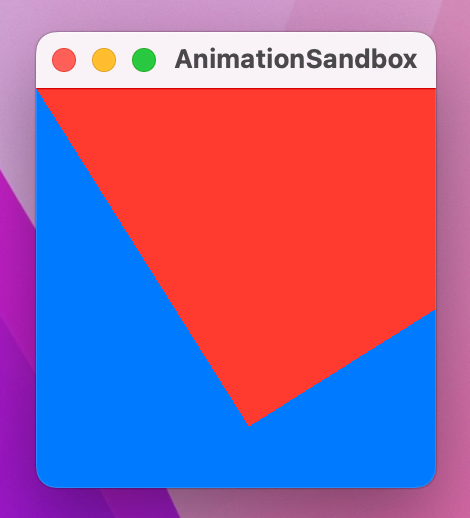
.transition(.pivot)You’ve already seen HStack and VStack for laying views out horizontally and vertically, but there’s a third stack called ZStack that lets us layer views on top of each other. We can try ZStack out here, use an onTapGesture() modifier to make a red rectangle pivot onto the screen:
struct ContentView: View {
    @State private var isShowingRed = false

    var body: some View {
        ZStack {
            Rectangle()
                .fill(.blue)
                .frame(width: 200, height: 200)

            if isShowingRed {
                Rectangle()
                    .fill(.red)
                    .frame(width: 200, height: 200)
                    .transition(.pivot)
            }
        }
        .onTapGesture {
            withAnimation {
                isShowingRed.toggle()
            }
        }
    }
}
This technique project started off easier, took a few twists and turns, and progressed into more advanced animations, but I hope it’s given you an idea of just how powerful – and how flexible! – SwiftUI’s animation system is.
As I’ve said previously, animation is about both making your app look great and also adding extra meaning. So, rather than making a view disappear abruptly, can you add a transition to help the user understand something is changing?
Also, don’t forget what it looks like to be playful in your user interface. My all-time #1 favorite iOS animation is one that Apple ditched when they moved to iOS 7, and it was the animation for deleting passes in the Wallet app – a metal shredder appeared and cut your pass into a dozen strips that then dropped away. It only took a fraction of a second more than the current animation, but it was beautiful and fun too!
Copyright © 2023 Paul Hudson, hackingwithswift.com.
You should follow me on Twitter.