This third SwiftUI project is actually our first technique project – a change in pace as we explore certain SwiftUI features in depth, looking at how they work in detail along with why they work that way.
In this technique project we’re going to take a close look at views and view modifiers, and hopefully answer some of the most common questions folks have at this point – why does SwiftUI use structs for its views? Why does it use some View so much? How do modifiers really work? My hope is that by the end of this project you’ll have a thorough understanding of what makes SwiftUI tick.
As with the other days it’s a good idea to work in an Xcode project so you can see your code in action, so please create a new App project called ViewsAndModifiers now.
If you ever programmed for UIKit or AppKit (Apple’s original user interface frameworks for iOS and macOS) you’ll know that they use classes for views rather than structs. SwiftUI does not: we prefer to use structs for views across the board, and there are a couple of reasons why.
First, there is an element of performance: structs are simpler and faster than classes. I say an element of performance because lots of people think this is the primary reason SwiftUI uses structs, when really it’s just one part of the bigger picture.
In AppKit, every view descended from a class called NSView that had many properties and methods, and every NSView and NSView subclass had to have them because that’s how inheritance works.
In SwiftUI, all our views are trivial structs and are almost free to create. Think about it: if you make a struct that holds a single integer, the entire size of your struct is… that one integer. Nothing else. No surprise extra values inherited from parent classes, or grandparent classes, or great-grandparent classes, etc – they contain exactly what you can see and nothing more.
Thanks to the power of modern Macs, I wouldn’t think twice about creating 1000 integers or even 100,000 integers – it would happen in the blink of an eye. The same is true of 1000 SwiftUI views or even 100,000 SwiftUI views; they are so fast it stops being worth thinking about.
However, even though performance is important there’s something much more important about views as structs: it forces us to think about isolating state in a clean way. You see, classes are able to change their values freely, which can lead to messier code – how would SwiftUI be able to know when a value changed in order to update the UI?
By producing views that don’t mutate over time, SwiftUI encourages us to move to a more functional design approach: our views become simple, inert things that convert data into UI, rather than intelligent things that can grow out of control.
You’ll see this in action as you learn more about the kinds of things that can be a view: colors are views, as are gradients, rectangles, circles, and more – trivial types that hold very little data. In fact, you can’t get a great deal simpler than using the color red as a view: it holds no information other than “fill my space with red”.
Tip: If you use a class for your view you might find your code either doesn’t compile or crashes at runtime. Trust me on this: use a struct.
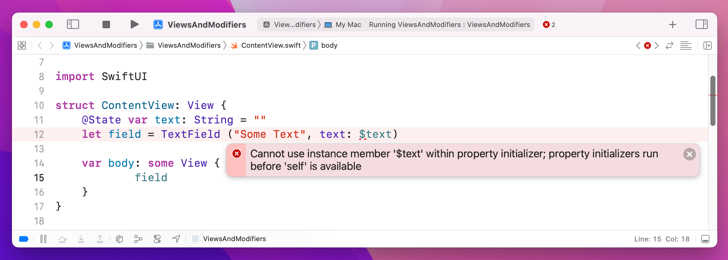
Whenever we apply a modifier to a SwiftUI view, we actually create a new view with that change applied – we don’t just modify the existing view in place. If you think about it, this behavior makes sense: our views only hold the exact properties we give them, so if we set the background color or font size there is no place to store that data.
We’re going to look at why this happens shortly, but first I want to look at the practical implications of this behavior. Take a look at this code:
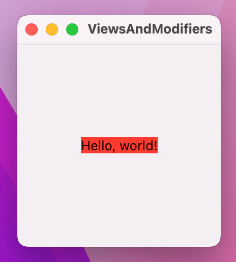
Text("Hello, world!")
    .background(.red)
    .frame(width: 200, height: 200)
That uses a new modifier called background(), which lets us set any other view as the background for the text view. In this case we’re using .red, which refers to Color.red, so if I asked you what that will look like when it runs chances are you would guess it shows a 200x200 red text area.
Well, if you guessed that you’d be wrong. Instead, you’ll see a 200x200 empty square, with "Hello, world!" in the middle and with a red rectangle directly around "Hello, world!".
You can understand what’s happening here if you think about the way modifiers work: each one creates a new struct with that modifier applied, rather than just setting a property on the view.
You can peek into the underbelly of SwiftUI by asking for the type of our view’s body. Modify the text to this:
Text("Hello, world!")
    .background(.red)
    .frame(width: 200, height: 200)
    .onAppear {
        print(type(of: self.body))
    }
Swift’s type(of:) method prints the exact type of a particular value, and in this instance it will print the following: ModifiedContent<ModifiedContent<ModifiedContent<Text, _BackgroundStyleModifier<Color>>, _FrameLayout>, _AppearanceActionModifier>
You can see two things here:
ModifiedContent<OurThing, OurModifier>.ModifiedContent<ModifiedContent<…To read what the type is, start from the innermost type and work your way out:
ModifiedContent<Text, _BackgroundStyleModifier<Color>: our text view has a background color applied.ModifiedContent<…, _FrameLayout>, which takes our first view (text + background color) and gives it a larger frame.ModifiedContent<…, _AppearanceActionModifier>, which is what triggers the onAppear() code when the view is shown.As you can see, we end with ModifiedContent types stacking up – each one takes a view to transform plus the actual change to make, rather than modifying the view directly.
What this means is that the order of your modifiers matter. If we rewrite our code to apply the background color after the frame, then you might get the result you expected:
Text("Hello, world!")
    .frame(width: 200, height: 200)
    .background(.red)
    .onAppear {
        print(type(of: self.body))
    }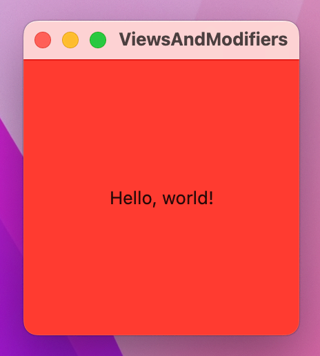
The best way to think about it for now is to imagine that SwiftUI renders your view after every single modifier. So, as soon as you say .background(.red) it colors the background in red, regardless of what frame you give it. If you then later expand the frame, it won’t magically redraw the background – that was already applied.
Of course, this isn’t actually how SwiftUI works, because if it did it would be a performance nightmare, but it’s a neat mental shortcut to use while you’re learning.
An important side effect of using modifiers is that we can apply the same effect multiple times: each one simply adds to whatever was there before.
For example, SwiftUI gives us the padding() modifier, which adds a little space around a view so that it doesn’t push up against other views or the edge of the window. If we apply padding then a background color, then more padding and a different background color, we can give a view multiple borders, like this:
Text("Hello, world!")
    .padding()
    .background(.red)
    .padding()
    .background(.blue)
    .padding()
    .background(.green)
    .padding()
    .background(.yellow)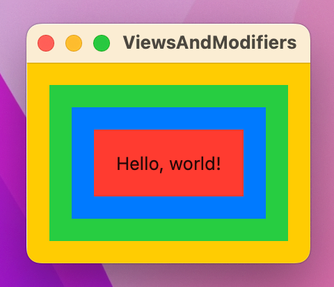
SwiftUI relies very heavily on a Swift power feature called “opaque return types”, which you can see in action every time you write some View. This means “one object that conforms to the View protocol, but we don’t want to say what.”
Returning some View means even though we don’t know what view type is going back, the compiler does. That might sound small, but it has important implications.
First, using some View is important for performance: SwiftUI needs to be able to look at the views we are showing and understand how they change, so it can correctly update the user interface. If SwiftUI didn’t have this extra information, it would be really slow for SwiftUI to figure out exactly what changed – it would pretty much need to ditch everything and start again after every small change.
The second difference is important because of the way SwiftUI builds up its data using ModifiedContent. Previously I showed you this code:
Text("Hello, world!")
    .frame(width: 200, height: 200)
    .background(.red)
    .onAppear {
        print(type(of: self.body))
    }
That creates a simple text view then makes it print its exact Swift type, and gives some long output with a couple of instances of ModifiedContent.
The View protocol has an associated type attached to it, which is Swift’s way of saying that View by itself doesn’t mean anything – we need to say exactly what kind of view it is. It effectively has a hole in it, in a similar way to how Swift doesn’t let us say “this variable is an array” and instead requires that we say what’s in the array: “this variable is a string array.”
So, while it’s not allowed to write a view like this:
struct ContentView: View {
    var body: View {
        Text("Hello World")
    }
}
It is perfectly legal to write a view like this:
struct ContentView: View {
    var body: Text {
        Text("Hello World")
    }
}
Returning View makes no sense, because Swift wants to know what’s inside the view – it has a big hole that must be filled. On the other hand, returning Text is fine, because we’ve filled the hole; Swift knows what the view is.
Now let’s return to our code from earlier:
Text("Hello, world!")
    .frame(width: 200, height: 200)
    .background(.red)
    .onAppear {
        print(type(of: self.body))
    }
If we want to return one of those from our body property, what should we write? While you could try to figure out the exact combination of ModifiedContent structs to use, it’s hideously painful and the simple truth is that we don’t care because it’s all internal SwiftUI stuff.
What some View lets us do is say “this will be a view, such as Button or Text, but I don’t want to say what.” So, the hole that View has will be filled by a real view object, but we aren’t required to write out the exact long type.
There are two places where it gets a bit more complicated:
VStack work – it conforms to the View protocol, but how does it fill the “what kind of content does it have?” hole if it can contain lots of different things inside it?body property, without wrapping them in a stack?To answer the first question first, if you create a VStack with two text views inside, SwiftUI silently creates a TupleView to contain those two views – a special type of view that holds exactly two views inside it. So, the VStack fills the “what kind of view is this?” with the answer “it’s a TupleView containing two text views.”
And what if you have three text views inside the VStack? Then it’s a TupleView containing three views. Or four views. Or eight views, or even ten views – there is literally a version of TupleView that tracks ten different kinds of content:
TupleView<(C0, C1, C2, C3, C4, C5, C6, C7, C8, C9)>And that’s why SwiftUI doesn’t allow more than 10 views inside a parent: they wrote versions of TupleView that handle 2 views through 10, but no more.
As for the second question, Swift silently applies a special attribute to the body property called @ViewBuilder. This has the effect of silently wrapping multiple views in one of those TupleView containers, so that even though it looks like we’re sending back multiple views they get combined into one TupleView.
This behavior isn’t magic: if you right-click on the View protocol and choose “Jump to Definition”, you’ll see the requirement for the body property and also see that it’s marked with the @ViewBuilder attribute:
@ViewBuilder var body: Self.Body { get }Of course, how SwiftUI interprets multiple views going back without a stack around them isn’t specifically defined anywhere, but as you’ll learn later on that’s actually helpful.
It’s common to want modifiers that apply only when a certain condition is met, and in SwiftUI the easiest way to do that is with the ternary conditional operator.
As a reminder, to use the ternary operator you write your condition first, then a question mark and what should be used if the condition is true, then a colon followed by what should be used if the condition is false. If you forget this order a lot, remember Scott Michaud’s helpful mnemonic: What do you want to check, True, False, or “WTF” for short.
For example, if you had a property that could be either true or false, you could use that to control the background color of your window like this:
struct ContentView: View {
    @State private var redBackground = false

    var body: some View {
        Button("Hello World") {
            // flip the Boolean between true and false
            redBackground.toggle()
        }
        .frame(maxWidth: .infinity, maxHeight: .infinity)
        .background(redBackground ? .red : .blue)
    }
}
So, when redBackground is true the modifier effectively reads .background(.red), and when it’s false the modifier becomes .background(.blue). Because SwiftUI watches for changes in our @State properties and re-invokes our body property, whenever that property changes the color will immediately update.
You can often use regular if conditions to return different views based on some state, but this actually creates more work for SwiftUI – rather than seeing one Button being used with different colors, it now sees two different Button views, and when we flip the Boolean condition it will destroy one to create the other rather than just recolor what it has.
So, this kind of code might look the same, but it’s actually less efficient:
if redBackground {
    Button("Hello World") {
        redBackground.toggle()
    }
    .frame(maxWidth: .infinity, maxHeight: .infinity)
    .background(.red)
} else {
    Button("Hello World") {
        redBackground.toggle()
    }
    .frame(maxWidth: .infinity, maxHeight: .infinity)
    .background(.blue)
}
Sometimes using if statements are unavoidable, but where possible prefer to use the ternary operator instead.
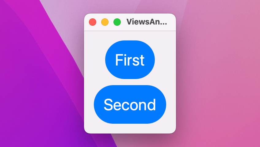
Many modifiers can be applied to containers, which allows us to apply the same modifier to many views at the same time.
For example, SwiftUI gives us the font() modifier to control the font used to draw text. It has a number of built-in sizes we can draw on to benefit from system-standard designs, but you can also create custom fonts and sizes if you want.
If we have four text views in a VStack and want to give them all the same font modifier, we could apply the modifier to the VStack directly and have that change apply to all four text views:
VStack {
    Text("Gryffindor")
    Text("Hufflepuff")
    Text("Ravenclaw")
    Text("Slytherin")
}
.font(.title)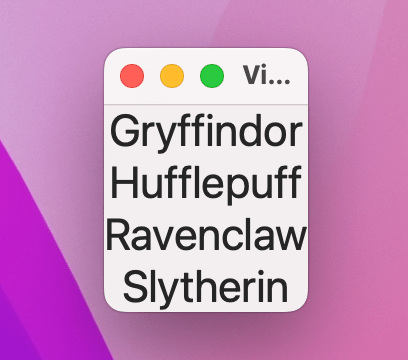
This is called an environment modifier, and is different from a regular modifier that is applied to a view.
From a coding perspective these modifiers are used exactly the same way as regular modifiers. However, they behave subtly differently because if any of those child views override the same modifier, the child’s version takes priority.
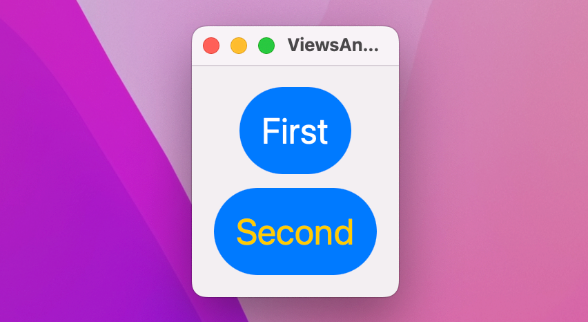
As an example, this shows our four text views with the title font, but one has a large title:
VStack {
    Text("Gryffindor")
        .font(.largeTitle)
    Text("Hufflepuff")
    Text("Ravenclaw")
    Text("Slytherin")
}
.font(.title)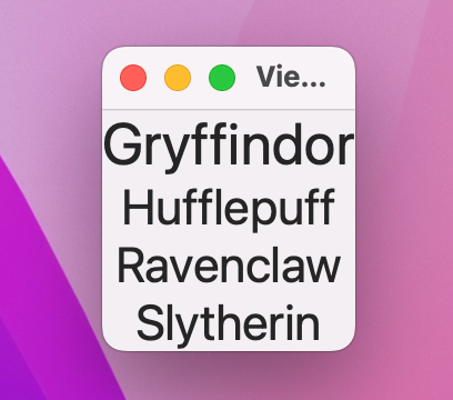
There, font() is an environment modifier, which means the Gryffindor text view can override it with a custom font.
However, this applies a blur effect to the VStack then attempts to disable blurring on one of the text views:
VStack {
    Text("Gryffindor")
        .blur(radius: 0)
    Text("Hufflepuff")
    Text("Ravenclaw")
    Text("Slytherin")
}
.blur(radius: 5)
That won’t work the same way: blur() is a regular modifier, so any blurs applied to child views are added to the VStack blur rather than replacing it.
To the best of my knowledge there is no way of knowing ahead of time which modifiers are environment modifiers and which are regular modifiers other than reading the individual documentation for each modifier and hoping it’s mentioned. Still, I’d rather have them than not: being able to apply one modifier everywhere is much better than copying and pasting the same thing into multiple places.
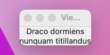
There are lots of ways to make it easier to use complex view hierarchies in SwiftUI, and one option is to use properties – to create a view as a property of your own view, then use that property inside your layouts.
For example, we could create two text views like this as properties, then use them inside a VStack:
struct ContentView: View {
    let motto1 = Text("Draco dormiens")
    let motto2 = Text("nunquam titillandus")

    var body: some View {
        VStack {
            motto1
            motto2
        }
    }
}
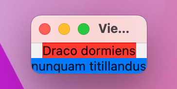
You can even apply modifiers directly to those properties as they are being used, like this:
VStack {
    motto1
        .background(.red)
    motto2
        .background(.blue)
}
Creating views as properties can be helpful to keep your body code clearer – not only does it help avoid repetition, but it can also get more complex code out of the body property.
Swift doesn’t let us create one stored property that refers to other stored properties, because it would cause problems when the object is created. This means trying to create a TextField bound to a local property will cause problems.
However, you can create computed properties if you want, like this:
var motto1: some View {
    Text("Draco dormiens")
}
This is often a great way to carve up your complex views into smaller chunks, but be careful: unlike the body property, Swift won’t automatically apply the @ViewBuilder attribute here, so if you want to send multiple views back you have three options.
First, you can place them in a stack, like this:
var spells: some View {
    VStack {
        Text("Lumos")
        Text("Obliviate")
    }
}
If you don’t specifically want to organize them in a stack, you can also send back a Group. When this happens, the arrangement of your views is determined by how you use them elsewhere in your code:
var spells: some View {
    Group {
        Text("Lumos")
        Text("Obliviate")
    }
}
The third option is to add the @ViewBuilder attribute yourself, like this:
@ViewBuilder var spells: some View {
    Text("Lumos")
    Text("Obliviate")
}
Of them all, I prefer to use @ViewBuilder because it mimics the way body works, however I’m also wary when I see folks cram lots of functionality into their properties – it’s usually a sign that their views are getting a bit too complex, and need to be broken up. Speaking of which, let’s tackle that next…
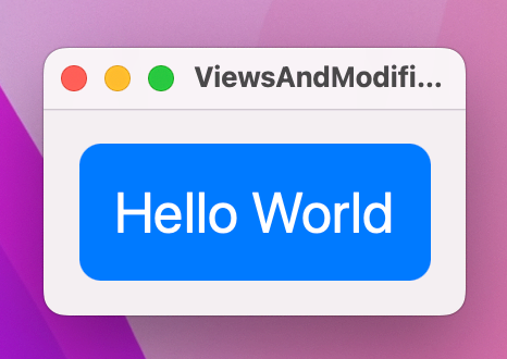
SwiftUI lets us break complex views down into smaller views without incurring much if any performance impact. This means that we can split up one large view into multiple smaller views, and SwiftUI takes care of reassembling them for us.
To demonstrate this, I want to introduce you to a new modifier so we can build something a little more complex: clipShape() lets us change the shape of a view, which is helpful when used after a background color. There are several built-in shapes such as .circle, .capsule, and .rect(cornerRadius) to create rounded rectangles, but later on you’ll learn how to create your own custom shapes.
So, we could create a view with a particular way of styling text views – they have a large font, some padding, foreground and background colors, plus a capsule shape:
struct ContentView: View {
    var body: some View {
        VStack(spacing: 10) {
            Text("First")
                .font(.largeTitle)
                .padding()
                .foregroundStyle(.white)
                .background(.blue)
                .clipShape(.capsule)

            Text("Second")
                .font(.largeTitle)
                .padding()
                .foregroundStyle(.white)
                .background(.blue)
                .clipShape(.capsule)
        }
    }
}
Because those two text views are identical apart from their text, we can wrap them up in a new custom view, like this:
struct CapsuleText: View {
    var text: String

    var body: some View {
        Text(text)
            .font(.largeTitle)
            .padding()
            .foregroundStyle(.white)
            .background(.blue)
            .clipShape(.capsule)
    }
}
We can then use that CapsuleText view inside our original view, like this:
struct ContentView: View {
    var body: some View {
        VStack(spacing: 10) {
            CapsuleText(text: "First")
            CapsuleText(text: "Second")
        }
    }
}
Of course, we can also store some modifiers in the view and customize others when we use them. For example, if we removed foregroundStyle() from CapsuleText, we could then apply custom colors when creating instances of that view like this:
VStack(spacing: 10) {
    CapsuleText(text: "First")
        .foregroundStyle(.white)
    CapsuleText(text: "Second")
        .foregroundStyle(.yellow)
}
Don’t worry about performance issues here – it’s extremely efficient to break up SwiftUI views in this way.
SwiftUI gives us a range of built-in modifiers, such as font(), background(), and clipShape(). However, it’s also possible to create custom modifiers that do something specific.
To create a custom modifier, create a new struct that conforms to the ViewModifier protocol. This has only one requirement, which is a method called body that accepts whatever content it’s being given to work with, and must return some View.
For example, we might say that all titles in our app should have a particular style, so first we need to create a custom ViewModifier struct that does what we want:
struct Title: ViewModifier {
    func body(content: Content) -> some View {
        content
            .font(.largeTitle)
            .foregroundStyle(.white)
            .padding()
            .background(.blue)
            .clipShape(.rect(cornerRadius: 10))
    }
}
We can now use that with the modifier() modifier – yes, it’s a modifier called “modifier”, but it lets us apply any sort of modifier to a view, like this:
Text("Hello World")
    .modifier(Title())
When working with custom modifiers, it’s usually a smart idea to create extensions on View that make them easier to use. For example, we might wrap the Title modifier in an extension such as this:
extension View {
    func titleStyle() -> some View {
        modifier(Title())
    }
}
We can now use the modifier like this:
Text("Hello World")
    .titleStyle()
Custom modifiers can do much more than just apply other existing modifiers – they can also create new view structure, as needed. Remember, modifiers return new objects rather than modifying existing ones, so we could create one that embeds the view in a stack and adds another view:
struct Watermark: ViewModifier {
    var text: String

    func body(content: Content) -> some View {
        VStack(spacing: 0) {
            content

            Text(text)
                .font(.caption)
                .foregroundStyle(.white)
                .padding(5)
                .background(.black)
        }
    }
}

extension View {
    func watermarked(with text: String) -> some View {
        modifier(Watermark(text: text))
    }
}
With that in place, we can now add a watermark to any view like this:
Color.blue
    .frame(width: 300, height: 200)
    .watermarked(with: "Hacking with Swift")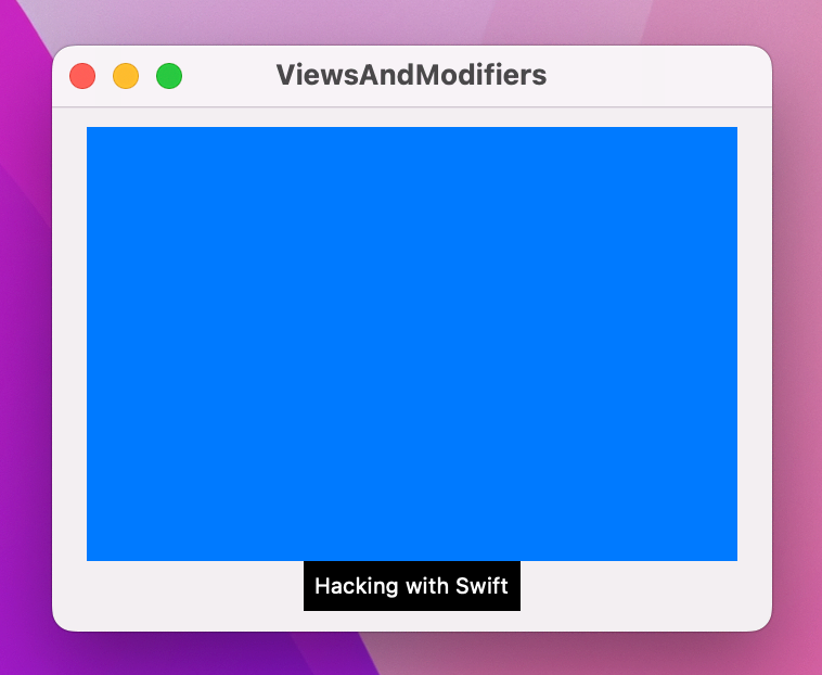
Tip: Often folks wonder when it’s better to add a custom view modifier versus just adding a new method to View, and really it comes down to one main reason: custom view modifiers can have their own stored properties, whereas extensions to View cannot.
Although it’s not something you’re likely to do often, I want to at least show you that it’s perfectly possible to create custom containers in your SwiftUI apps. This takes more advanced Swift knowledge because it leverages some of Swift’s power features, so it’s OK to skip this if you find it too much.
To try it out, we’re going to make a new type of stack called a GridStack, which will let us create any number of views inside a fixed grid. What we want to say is that there is a new struct called GridStack that conforms to the View protocol and has a set number of rows and columns, and that inside the grid will be lots of content cells that themselves must conform to the View protocol.
In Swift we’d write this:
struct GridStack<Content: View>: View {
    let rows: Int
    let columns: Int
    let content: (Int, Int) -> Content

    var body: some View {
        // more to come
    }
}
The first line – struct GridStack<Content: View>: View – uses a more advanced feature of Swift called generics, which in this case means “you can provide any kind of content you like, but whatever it is it must conform to the View protocol.” After the colon we repeat View again to say that GridStack itself also conforms to the View protocol.
Take particular note of the let content line – that defines a closure that must be able to accept two integers and return some sort of content we can show.
We need to complete the body property with something that combines multiple vertical and horizontal stacks to create as many cells as was requested. We don’t need to say what’s in each cell, because we can get that by calling our content closure with the appropriate row and column.
So, we might fill it in like this:
var body: some View {
    VStack {
        ForEach(0..<rows, id: \.self) { row in
            HStack {
                ForEach(0..<columns, id: \.self) { column in
                    content(row, column)
                }
            }
        }
    }
}
Tip: When looping over ranges, SwiftUI can use the range directly only if we know for sure the values in the range won’t change over time. Here we’re using ForEach with 0..<rows and 0..<columns, both of which are values that can change over time – we might add more rows, for example. In this situation, we need to add a second parameter to ForEach, id: \.self, to tell SwiftUI how it can identify each view in the loop.
Now that we have a custom container, we can write a view using it like this:
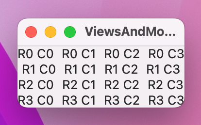
struct ContentView: View {
    var body: some View {
        GridStack(rows: 4, columns: 4) { row, col in
            Text("R\(row) C\(col)")
        }
    }
}
Our GridStack is capable of accepting any kind of cell content, as long as it conforms to the View protocol. So, we could give cells a stack of their own if we wanted:
GridStack(rows: 4, columns: 4) { row, col in
    HStack {
        Text("R\(row)")
        Text("C\(col)")
    }
}
For more flexibility we could leverage the same @ViewBuilder attribute used by SwiftUI for the body property of its views. Modify the content property of GridStack to this:
@ViewBuilder let content: (Int, Int) -> ContentWith that in place SwiftUI will now automatically create an implicit horizontal stack inside our cell closure:
GridStack(rows: 4, columns: 4) { row, col in
    Text("R\(row)")
    Text("C\(col)")
}
Both options work, so do whichever you prefer.
These technique projects are designed to dive deep into specific SwiftUI topics, and I hope you’ve learned a lot about views and modifiers here – why SwiftUI uses structs for views, why some View is so useful, how modifier order matters, and much more.
Views and modifiers are the fundamental building blocks of any SwiftUI app, which is why I wanted to focus on them so early in this course. View composition is particularly key, as it allows us to build small, reusable views that can be assembled like bricks into larger user interfaces.
Create a custom ViewModifier (and accompanying View extension) that makes a view have a large, blue font suitable for prominent titles in a view.
For a bigger challenge, go back to project 2 and make the result text show in different colors depending on how close the user is: red for 0 cows 0 bulls, yellow for anything between 1 and 3 cows, and green for 4 cows.
Copyright © 2023 Paul Hudson, hackingwithswift.com.
You should follow me on Twitter.