Making your app accessible means taking steps to ensure that everyone can use it fully regardless of their individual needs. For example, if they are blind then your app should work well with the system’s VoiceOver system to ensure your UI can be read smoothly.
SwiftUI gives us a huge amount of functionality for free, because its layout system of VStack and HStack naturally forms a flow of views. However, it isn’t perfect, and any time you can add some extra information to help out the macOS accessibility system it’s likely to help.
Usually the best way to test out your app is to enable VoiceOver support and run the app – if your app works great with VoiceOver, there’s a good chance you’re already far ahead of the average for macOS apps.
Anyway, in this technique project we’re going to look at a handful of accessibility techniques so you’re able to clearly see what effect they have on your code.
Please start by creating a new macOS app using the App template, naming it AccessibilitySandbox. You should run this project on your Mac with VoiceOver enabled, so you can see and hear exactly what’s happening.
In the files for this project I have placed four pictures downloaded from Unsplash. Unsplash filenames are made up of a picture ID and the photographer’s name, so if you drag them into your asset catalog you’ll see they have names such as "ales-krivec-15949" and so on. That in itself isn’t a problem, and in fact I think it can be a helpful way of remembering where assets came from. However, it does present a problem for screen readers.
To get started with VoiceOver, we’re going to create a simple view that cycles randomly through the four pictures in our asset catalog. Modify the ContentView struct to this:
struct ContentView: View {
    let pictures = [
        "ales-krivec-15949",
        "galina-n-189483",
        "kevin-horstmann-141705",
        "nicolas-tissot-335096"
    ]

    @State private var selectedPicture = Int.random(in: 0...3)

    var body: some View {
        Image(pictures[selectedPicture])
            .resizable()
            .scaledToFit()
            .onTapGesture {
                selectedPicture = Int.random(in: 0...3)
            }
    }
}
There’s nothing complicated there, but it already helps to illustrate two serious problems.
If you haven’t already enabled VoiceOver in the Settings app on your Mac, please do so now: System Preferences > Accessibility > VoiceOver, then check the box. Alternatively, you can activate Siri at any time and ask to enable or disable VoiceOver.
Important: Immediately below the VoiceOver toggle is a button “Open VoiceOver Training”, which is a great way to familiarize yourself with how VoiceOver works.
Now launch our app, and try clicking on the picture to activate it. If you listen carefully to VoiceOver you should hear two problems:
onTapGesture() modifier.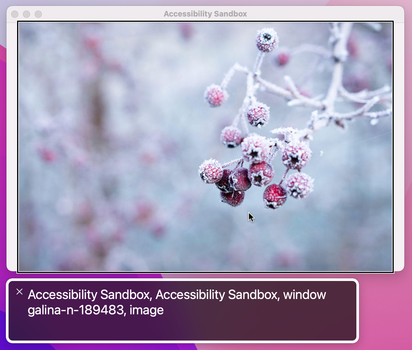
The first of those problems is a side effect of SwiftUI trying to give us sensible behavior out of the box: when given an image, it automatically uses the image’s filename as the text to read out.
We can control what VoiceOver reads for a given view by attaching two modifiers: .accessibilityLabel() and .accessibilityHint(). They both take text containing anything we want, but they serve different purposes:
The label is exactly what we need to solve the first of our problems, because it means we can leave the image name as it is while still having VoiceOver read out something that helps users.
First, add this second array of image descriptions as a property for ContentView:
let labels = [
    "Tulips",
    "Frozen tree buds",
    "Sunflowers",
    "Fireworks",
]
And now attach this modifier to the image:
.accessibilityLabel(labels[selectedPicture])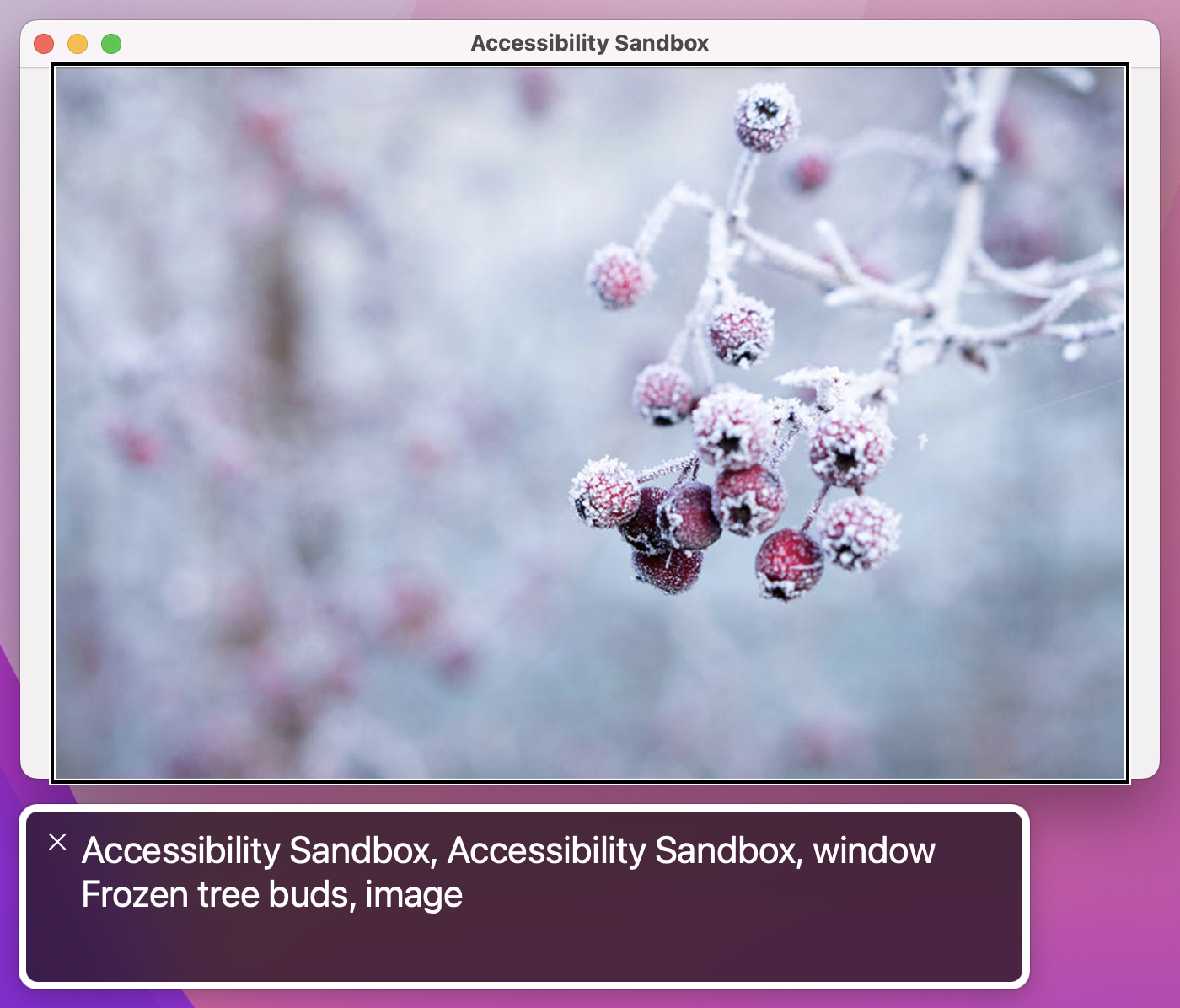
This allows VoiceOver to read the correct label no matter what image is present. Of course, if your image wasn’t randomly changing you could just type your label directly into the modifier.
The second problem is that the image is identified as an image. This is self-evidently true, but it’s also not helpful because we’ve attached a tap gesture to it so it’s effectively a button.
We can fix this second problem using another modifier, .accessibilityAddTraits(). This lets us provide some extra behind the scenes information to VoiceOver that describes how the view works, and in our case we can tell it that our image is also a button by adding this modifier:
.accessibilityAddTraits(.isButton)If you wanted, you could remove the image trait as well, because it isn’t really adding much:
.accessibilityRemoveTraits(.isImage)With these changes in place our UI works much better: VoiceOver now reads a useful description of the image’s contents, and also makes users aware the image is also a button.


However, this is a good time to stop and reflect: do you really need a tap gesture here at all, or would a regular button work better? Although there are some places where tap gestures are required – getting the location of a tap, for example – broadly speaking using a real button is always preferable to using a tap gesture.
If you spend even a few minutes with an active VoiceOver user, you’ll learn two things very quickly: they are remarkably adept at navigating around user interfaces, and they also often set reading speed extremely fast – way faster than you or I would use.
It’s important to take both of those things into account when we’re designing our UI: these users aren’t just trying VoiceOver out of curiosity, but are instead VoiceOver power users who rely on it to access your app. As a result, it’s important we ensure our UI removes as much clutter as possible so that users can navigate through it quickly and not have to listen to VoiceOver reading unhelpful descriptions.
Beyond setting labels and hints, there are several ways we can control what VoiceOver reads out. There are three in particular I want to focus on:
All of these are simple changes to make, but they result in a big improvement.
For example, we can tell SwiftUI that a particular image is just there to make the UI look better by using Image(decorative:). Whether it’s a simple bullet point or an animation of your app’s mascot character running around, it doesn’t actually convey any information and so Image(decorative:) tells SwiftUI it should be ignored by VoiceOver.
Use it like this:
Image(decorative: "character")This leaves the image as being accessible to VoiceOver if it has some important traits, such as .isButton – it will say “button” when it’s highlighted, and if we attach a tap gesture that works – but it doesn’t read out the image’s filename as the automatic VoiceOver label. If you then add a label or a hint that will be read.
If you want to go a step further, you can use the .accessibilityHidden() modifier, which makes any view completely invisible to the accessibility system:
Image(decorative: "character")
    .accessibilityHidden(true)
With that modifier the image becomes invisible to VoiceOver regardless of what traits it has. Obviously you should only use this if the view in question really does add nothing – if you had placed a view offscreen so that it wasn’t currently visible to users, you should mark it inaccessible to VoiceOver too.
The last way to hide content from VoiceOver is through grouping, which lets us control how the system reads several views that are related. As an example, consider this layout:
VStack {
    Text("Your score is")
    Text("1000")
        .font(.title)
}
VoiceOver sees that as two unrelated text views, and so it will either read “Your score is” or “1000” depending on what the user has selected. Both of those are unhelpful, which is where the .accessibilityElement(children:) modifier comes in: we can apply it to a parent view, and ask it to combine children into a single accessibility element.
For example, this will cause both text views to be read together:
VStack {
    Text("Your score is")
    Text("1000")
        .font(.title)
}
.accessibilityElement(children: .combine)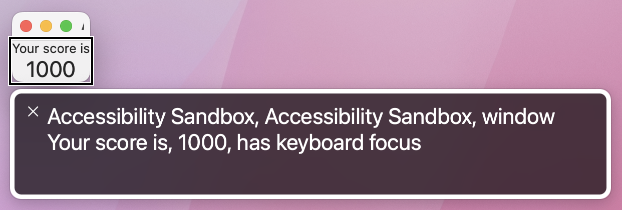
That works really well when the child views contain separate information, but in our case the children really should be read as a single entity. So, the better solution here is to use .accessibilityElement(children: .ignore) so the child views are invisible to VoiceOver, then provide a custom label to the parent, like this:
VStack {
    Text("Your score is")
    Text("1000")
        .font(.title)
}
.accessibilityElement(children: .ignore)
.accessibilityLabel("Your score is 1000")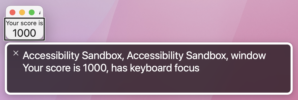
It’s worth trying both of these to see how they differ in practice. Using .combine adds a pause between the two pieces of text, because they aren’t necessarily designed to be read together. Using .ignore and a custom label means the text is read all at once, and is much more natural.
Tip: .ignore is the default parameter for children, so you can get the same results as .accessibilityElement(children: .ignore) just by saying .accessibilityElement().
By default SwiftUI provides VoiceOver readouts for its user interface controls, and although these are often good sometimes they just don’t fit with what you need. In these situations we can use the accessibilityValue() modifier to separate a control’s value from its label, but we can also specify custom actions using accessibilityAdjustableAction() that get triggered using switch control or other accessible input devices.
For example, you might build a view that shows some kind of input controlled by various buttons, like a custom stepper:
struct ContentView: View {
    @State private var value = 10

    var body: some View {
        VStack {
            Text("Value: \(value)")

            Button("Increment") {
                value += 1
            }

            Button("Decrement") {
                value -= 1
            }
        }
        .padding()
    }
}
That might work just the way you want with mouse interactions, but it’s not a great experience with VoiceOver because all users will hear is a click every time they click one of the buttons.
To fix this we can give SwiftUI specific instructions for how to handle adjustment, by grouping our VStack together using accessibilityElement() and accessibilityLabel(), then by adding the accessibilityValue() and accessibilityAdjustableAction() modifiers to respond to input with custom code.
Adjustable actions hand us the direction the user moved, and we can respond however we want. There is one proviso: yes, we can choose between increment and decrement movements, but we also need a special default case to handle unknown future values – Apple has reserved the right to add other kinds of adjustments in the future.
Here’s how it looks in code:
VStack {
    Text("Value: \(value)")

    Button("Increment") {
        value += 1
    }

    Button("Decrement") {
        value -= 1
    }
}
.padding()
.accessibilityElement()
.accessibilityLabel("Value")
.accessibilityValue(String(value))
.accessibilityAdjustableAction { direction in
    switch direction {
    case .increment:
        value += 1
    case .decrement:
        value -= 1
    default:
        print("Not handled.")
    }
}
That lets users select the whole VStack to have “Value: 10” read out, but then they can move up or down to manipulate the value and have just the numbers read out – it’s a much more natural way of working.
Accessibility isn’t something that’s “nice to have” – it should be regarded as a fundamental part of your application design, and considered from the very beginning onwards. SwiftUI didn’t get its excellent accessibility support because Apple thought about it at the last minute, but instead because it got baked in from the start – every part of SwiftUI was crafted with accessibility in mind, and we’d be doing a great disservice to our users if we didn’t match that same standard.
What’s more, I hope you can agree that adding extra accessibility is surprisingly easy – some special values here, a little grouping there, and some bonus traits are all simple things that take only minutes to add, but are the difference between “opaque” and “easy to use” for millions of people around the world.
Here are three ways you should try extending this app to make sure you fully understand what’s going on.
Copyright © 2023 Paul Hudson, hackingwithswift.com.
You should follow me on Twitter.