I’ll say it up front: this is the biggest project in the book. This is partly because we’re using some of the most advanced features available in macOS, but partly because the end result is a great app that you could easily extend and ship for real if you wanted.
The app we’ll create is called Screenable, and it’s designed to create App Store screenshots for iPhone apps. Users will be able to select a screenshot of their app to have it imported into a iPhone shell, then write text to go next to it. To make things more interesting, we’ll let them change the font, add colors, select a background image, and even add shadows before exporting the final image – all with just a few clicks.
Along the way you’ll learn about FileDocument, SwiftUI’s protocol for creating versioned documents that integrate seamlessly with iCloud. We’re also going to cover a fair amount of powerful Swift and SwiftUI features, including custom drawing using Canvas, adding shadows, handling drag and drop, letting the user enter multi-line text and choose colors, adding toolbar buttons, parsing Markdown, loading files bundled into our project, and more – this is a really awesome project, and I hope you enjoy following along as much as I enjoyed writing it!
Create a new App project using Xcode named Screenable – don’t use the Document App template, because I’d rather you created the code from scratch so you understand what it all does. There are lots of assets you’ll need to follow along with this project, so please download them now: https://github.com/twostraws/macos. Look in the SwiftUI directory for project13-files:
Okay, let’s get started…
Documents lie at the heart of so much of macOS. When you edit a file in Pages, create a new composition in GarageBand, or even just create a file in TextEdit, you’re working with a document – one collective piece of data that describes all the work you have done in a specific file.
That by itself might sound simple, but it’s already very unusual because on most other platforms the operating system has no concept of documents at all; everything is just a file. In comparison, documents on macOS are handled by the operating system rather than us trying to read and write them directly, which means we need to prepare our data and hand it over to the OS to store, and also write some code to receive a file from the OS and turn it back into our live data.
You might well wonder why this is useful, and the answer is quite brilliant: when we use documents rather than just reading and writing files directly, we automatically get support for version control, Time Machine, file sharing, undo and redo, and so much more – it’s literally no work to let users browse back to older versions of our document, because Apple takes care of it all for us.
Our first step will be to design the simplest form of our document. Eventually this document will store a lot of settings for the user’s screenshot, but for now we’re just going to store the caption string – text they want to appear above the iPhone.
Start by creating a new Swift file called ScreenableDocument.swift, replacing its Foundation import with these two:
import SwiftUI
import UniformTypeIdentifiers
You know that first import already, but the second provides a series of types and declarations that describe identifying names for files – things like “public.json” for JSON, “com.apple.m4a-audio” for an M4A audio file, or “com.adobe.photoshop-image” for a PSD. The UniformTypeIdentifiers framework imports a huge collection of built-in identifiers, but also allows us to create our own for our custom document.
Now we’re going to create the skeleton of our document type. This will conform to two different protocols: Codable, which is the combination of Decodable and Encodable so we can read and write this data from JSON, and FileDocument, which is the protocol SwiftUI uses to work with documents.
Initially this only takes two lines of code:
Of the two, only the first is interesting because this is where the UniformTypeIdentifiers framework comes in – we need to create an identifier for our document type that is unique to us, so that we don’t try to open files created by other programs. This is done by creating a UTType struct with our identifier string, which as you saw with M4A and PSD files should be in reverse DNS format: your website’s domain name, with each segment reversed. For me that will be “com.hackingwithswift.screenable”, but you should use your website there instead.
Add this code to ScreenableDocument.swift now:
struct ScreenableDocument: FileDocument, Codable {
    static var readableContentTypes = [UTType(exportedAs: "com.hackingwithswift.screenable")]

    var caption = ""
}
Now, when you press Cmd+B Xcode will complain loudly at you that you aren’t fulfilling the FileDocument protocol. This is because we need to implement two pieces of code in order for this to be able to work properly: an initializer to create ScreenableDocument instances from saved files, and some code to write documents whenever needed.
Both of these will use Codable to convert our data type to and from JSON, but this time there’s a twist: we don’t actually read and write files from disk, because that part is done for us by macOS, but instead we deal with a new type called FileWrapper. This is designed to handle a variety of different file types with one uniform API, so whether you’re dealing with a single file, a directory of files, or even a link to a file somewhere else, it’s all one piece of code.
In our case our JSON really is a single file, so we’re going to use the regular file contents of our wrapper – it means “this is literally just one file on the filesystem, so give me its contents.”
Let’s add the new code now – add this initializer to load the file contents and decode it into a ScreenableDocument instance:
init(configuration: ReadConfiguration) throws {
    if let data = configuration.file.regularFileContents {
        self = try JSONDecoder().decode(ScreenableDocument.self, from: data)
    }
}
Then we need a method to go the other way – to write our data to disk. This needs to have an exact name, so use code completion to help you out:
func fileWrapper(configuration: WriteConfiguration) throws -> FileWrapper {
    let data = try JSONEncoder().encode(self)
    return FileWrapper(regularFileWithContents: data)
}
Before we move on, there’s one last thing I want to do here. When we created that custom initializer, we told Swift that was the way we wanted to create documents – by loading them from a file. That’s true, but it’s also not the only way we want to create documents, because a lot of the time we also want to create new, empty documents.
So, alongside being able to create documents from a file wrapper, we also want an empty initializer that accepts no parameters and does nothing – it just uses whatever defaults our properties were given. Add this to the struct now:
init() {

}
Now that we have a basic document in place, the next step is to configure our app to use it. This takes four changes, each of which are new, so let’s walk through them step by step.
First, our ContentView will be the editing window for our document; it will contain a whole bunch of user interface controls for adjusting the document and previewing the result. However, it doesn’t own the document – it won’t create the document, and it won’t destroy the document, because that’s all handled for us by macOS.
So, we have a problem: we need to be able to refer to a document, and be able to change its values, but we don’t actually want ContentView to create it locally. This is the same problem that TextField has internally, because it wants to be able to edit some text that is stored elsewhere – we might create an @State value for the text in our view, and when the user enters some text into a TextField it should update that property rather than something stored locally in the text field.
The solution here is a new property wrapper called @Binding. This is responsible for referring to some program state that was created elsewhere, and it gives us all the benefits of @State without actually creating the object locally.
In the case of ContentView, we need a binding to a ScreenableDocument, so add this property now:
@Binding var document: ScreenableDocumentNotice that we’re not creating the document here, we’re just saying that one must be provided. This allows ContentView to work with all parts of the document, but ultimately macOS retains control of how it’s created and stored.
The second new thing to learn comes in our preview struct, because that creates a ContentView and now needs to be given a binding to a ScreenableDocument instance. We don’t want a real, dynamic binding here because it’s not going to change over time, so instead we’re going to create a constant binding of an empty document. Replace your current preview code with this:
ContentView(document: .constant(ScreenableDocument()))Now, technically this isn’t actually new because we used a constant binding back in project 2 when we made our very first text field, but I didn’t actually explain what it was – I just said it’s a constant value. Now you can see what’s happening a bit more: when we use $ with an @State property we access its two-way binding, which is what TextField needs so it can read and write some external data. Our ContentView also wants a binding so that it can work with external data, but for previewing purposes a constant binding is enough.
The third change we need to make is in ScreenableApp.swift, because that also creates a ContentView. The default code here is this:
WindowGroup {
    ContentView()
}
That tells SwiftUI there will be zero or more independent windows, each one containing its own ContentView instance. We don’t want that here, because in a document-based app each window represents one document – everything about the window relates to that document, including its title.
So, rather than using WindowGroup we’re going to use a new type here called DocumentGroup. This needs to be given two parameters:
ContentView, with the document passed in as a binding.The file that we’re passed in contains a couple of other useful pieces of information, including the full URL to the file and also whether it’s currently editable or not, but what we care about most is the document binding inside – that’s what we need to feed in to ContentView.
So, replace the current WindowGroup code with this:
DocumentGroup(newDocument: ScreenableDocument()) { file in
    ContentView(document: file.$document)
}
Notice the $ sign on the document, because we’re accessing its binding rather than just the simple value – we want to make sure changes in ContentView automatically sync back to the document, and therefore get handed over to macOS.
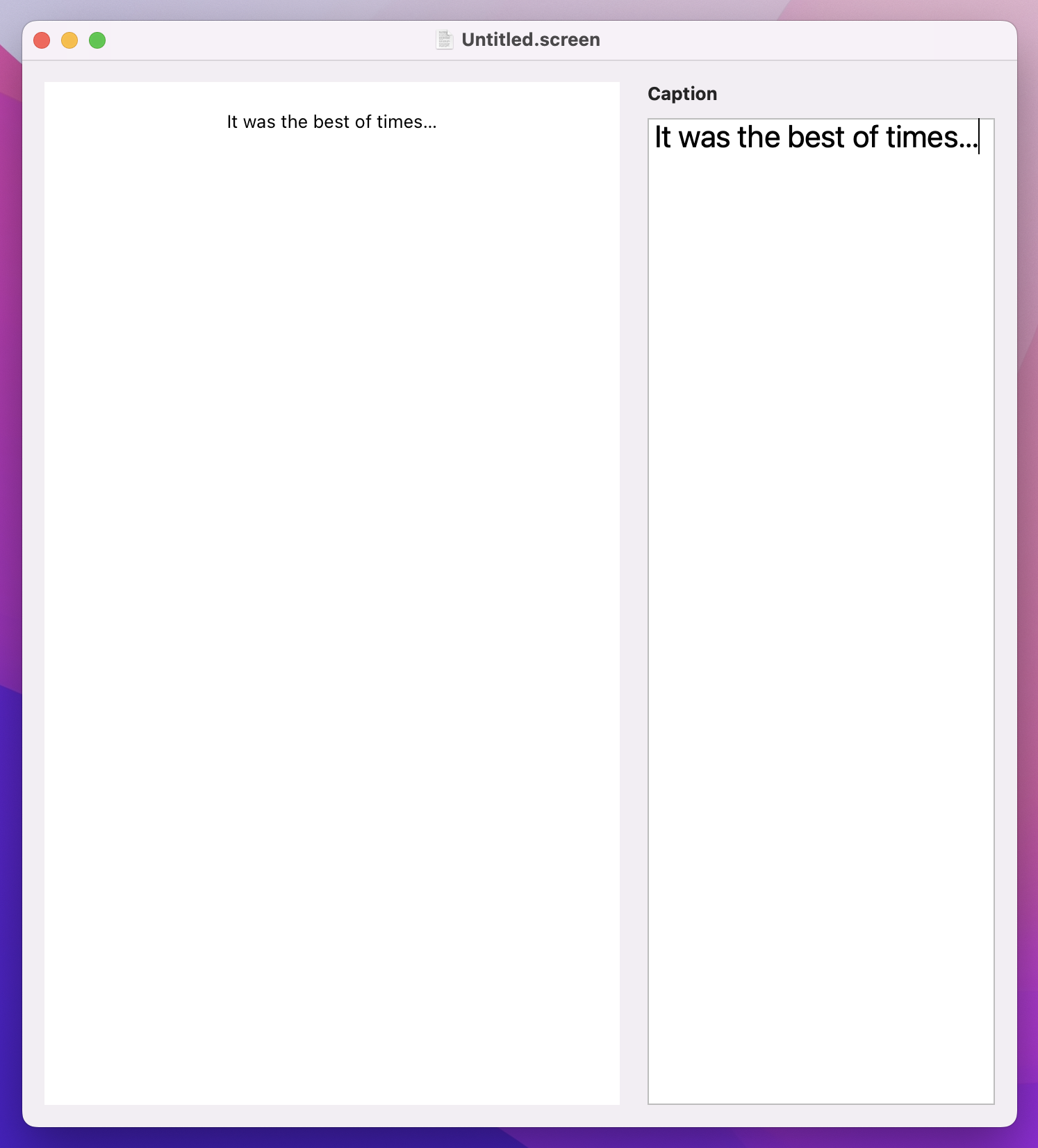
The last step in getting our document up and running is to actually use it somehow. Previously we’ve used TextField for editing single lines of text, but now I want to introduce you to TextEditor: a multi-line text view that is easier to use for longer strings.
TextEditor is even easier to use than TextField, because it takes a two-way binding to a string as its only parameter. For us, that’s the caption property in our document binding, so replace the default “Hello, world!” code with this:
TextEditor(text: $document.caption)So far this probably all seems great – every step we’ve taken seems logical and important, and the amount of code is fairly small. But (isn’t there always a but?) if you try running our project you’ll see a large warning appears in Xcode’s debug console, saying that we need to register “com.hackingwithswift.screenable” in the Info.plist file of our project.
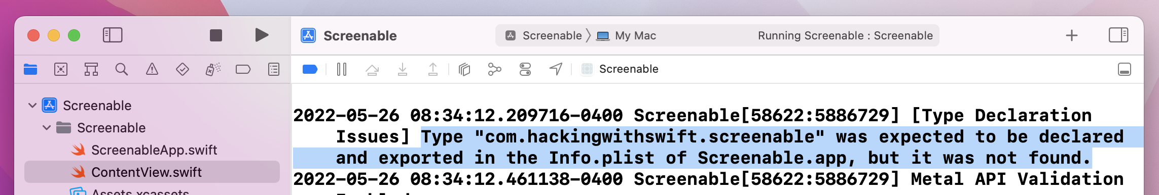
What’s happening here is important. You see, macOS needs to know ahead of time what kind of files we support: the data we can write, and the data we can read. This allows the system to automatically open our project when double-clicking a file, for example, and because it needs to be available as soon as the app is installed it is not done in code. Instead, it’s done in a rather arcane file called Info.plist, which contains all the configuration options for our project.
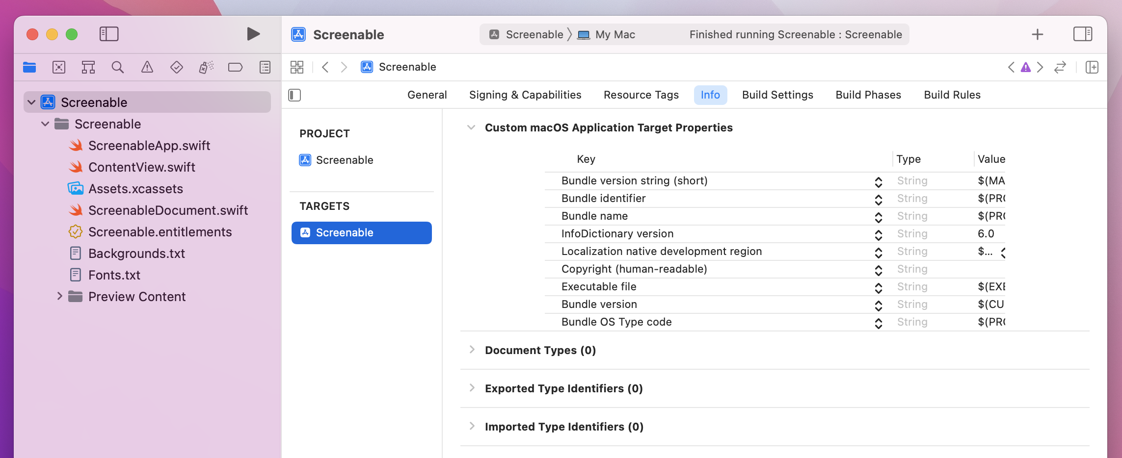
It used to be the case that every project had an Info.plist file you could just edit, but in Xcode 13 and later one is generated only when it’s actually needed. In this case, we don’t actually need to touch the file at all, because Xcode has special user interface in place for configuring the data macOS needs to know.
Start by selecting Screenable from the top of the project navigator, then going to the Screenable target, then selecting its Info tab. We were in here previously when making project 10 have no window, but this time we’re going to ignore all the rows at the top and focus on the options below: Document Types, Exported Type Identifiers, and Imported Type Identifiers. These describe the types of documents we’re able to open, write, and read, and we need to put more or less the same information in each of them.
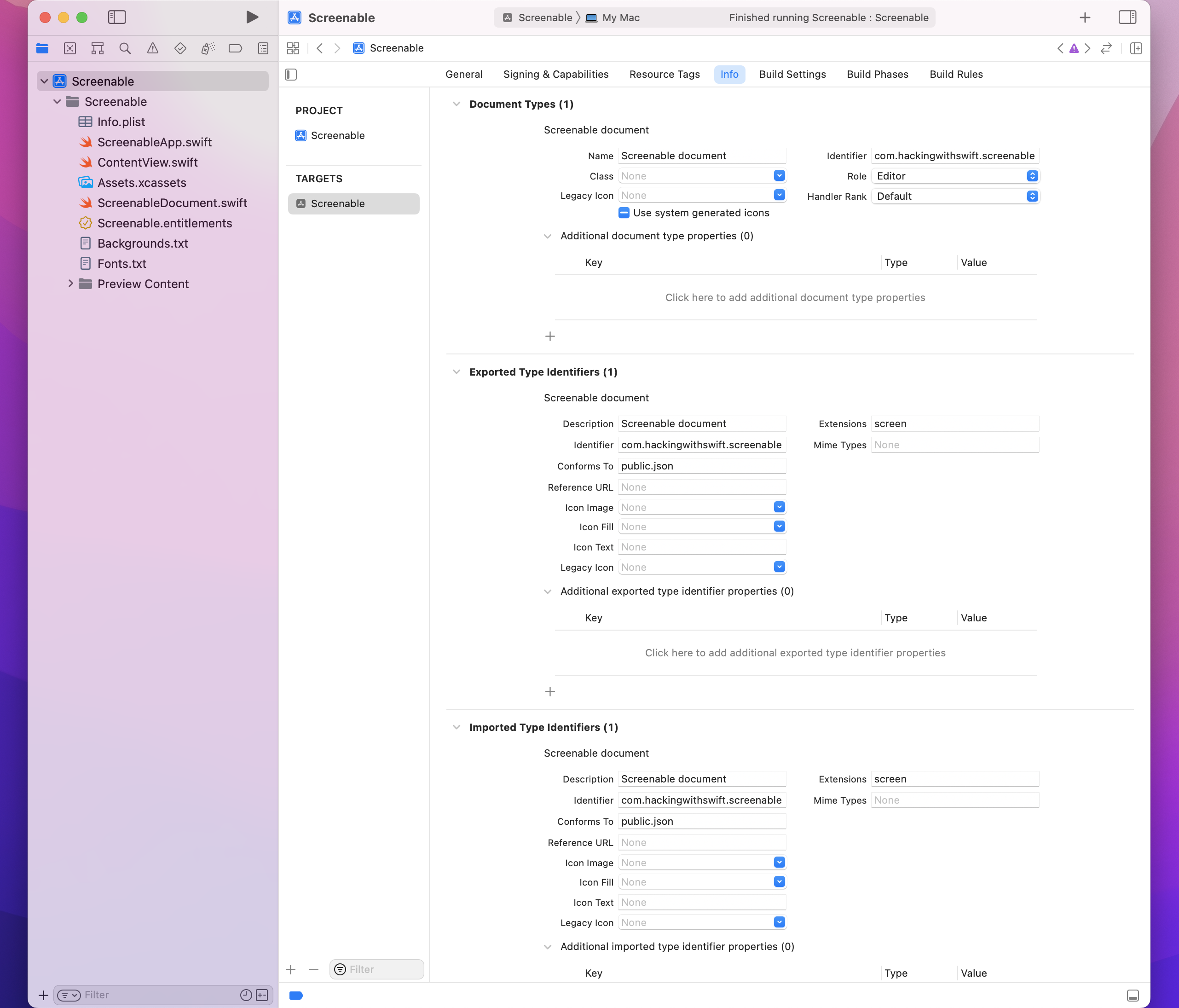
Let’s start with Document Types first – click + there, then fill in the following values:
Now add + under Exported Type Identifiers, then fill in the following values:
Finally, click + under Imported Type Identifiers, and fill out the same four values with the same text.
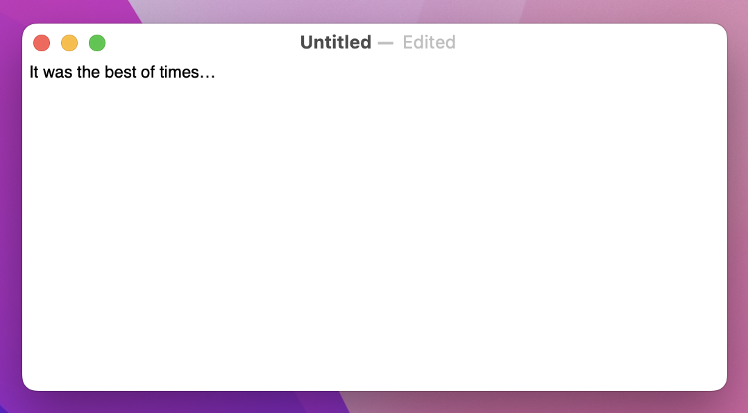
With that done, our configuration to handle documents is almost complete! If you run the app again, you should be able to press Cmd+N to make a new document, and see an editable text area appear. In the title bar you’ll see “Untitled” for your filename, and as you type you’ll see “Edited” appear next to it automatically.
It’s not perfect, because we still need to make one more change. To see the problem, try pressing Cmd+W to close the window once you’ve made unsaved changes – your app will likely crash immediately, because we haven’t told macOS that we want to be able to read and write files.
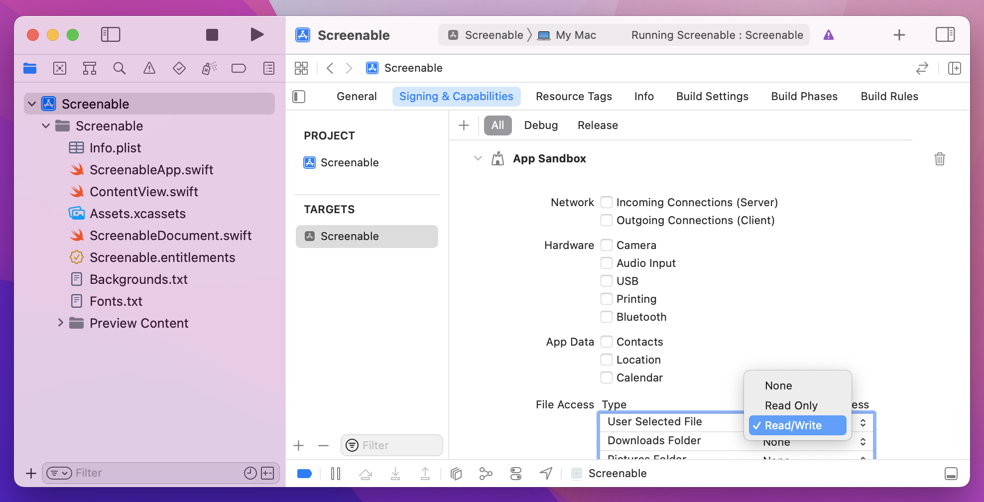
The fix here is trivial: go back to your target’s settings, but this time to go the Signing & Capabilities tab where we added support for outgoing network connections back in project 7. This time I’d like you to look under the File Access settings and change User Selected File from Read Only to Read/Write.
Now when you run the app and close your window, you’ll see the standard macOS save dialog appear automatically.
Even better:
That’s a huge amount of functionality we’re getting just by supporting documents. So, I think it’s fair to say that the end result of using documents is worth it, and this is an extremely valuable skill for macOS developers – even if it does involve some set up work beforehand!
At the heart of this project is going to be a rendered screenshot that the user has created. This will combine a number of things when we’re done, including:
We could try and create that all entirely using plain SwiftUI views, but customization is a little limited – we want to place text and images at exact locations, rather than have SwiftUI place them automatically.
So, rather than use a combination of VStack, HStack, and more for our rendering, we’re going to use a dedicated drawing view called Canvas that lets us render text, images, gradients, and more, all with exact positioning and more.
This canvas needs to be used in several places in our program, rather than repeating ourselves we’re going to pull it out into its own SwiftUI view. This splits our project into three important parts:
Canvas.To get things moving, we’re going to get our drawing canvas up and running, fill it in with a solid color, then add the user’s caption on top.
First, create a new SwiftUI view called RenderView, and give it a single property to store the document it’s drawing:
let document: ScreenableDocumentThat doesn’t need to use @Binding because we’re only reading the value, not trying to write changes back.
When it comes to the preview struct, you can either send in an empty ScreenableDocument if you don’t use previews much, or create and configure something with example data as you progress. Something like this ought to work:
static var previews: some View {
    var document = ScreenableDocument()
    document.caption = "Hello, world"

    return RenderView(document: document)
}
In terms of what this new view will do, it’s going to be entirely a Canvas: a SwiftUI view that is designed for high-performance drawing, using practically anything you want. We can use this to render simple shapes and paths, text, images, and more, but for real control we can pass it any kind of SwiftUI view and have it be composited into the final product.
We’re going to build this up step by step, so to avoid problems I’m going to put down some comment markers that we can fill in over the rest of this project. Replace the default body property of RenderView with this:
Canvas { context, size in
    // set up

    // draw the background image

    // add a gradient

    // draw the caption

    // draw the phone
} symbols: {
    // add custom SwiftUI views
}
.frame(width: 414, height: 736)
We’re going to be putting a lot of functionality into there, but first I want to clarify three things:
Canvas is our drawing code, where everything we draw is immediately rendered to the screen. You can see it accepts two parameters: one for the drawing context, which we use for all our drawing instructions, and one for the size we have to draw in.symbols closure is where we can pass in any custom SwiftUI views – we pass them in there using regular SwiftUI code, then look them up and use them inside the canvas rendering code.We’re not going to fill in all those Canvas comments at once, because it’s a lot of work. However, we can fill in two based on what we already have: the setup code can create a handful of fixed values up front, such as the size of our phone image, and the user’s caption can be drawn.
First, the set up – add this below the // set up comment:
let fullSizeRect = CGRect(origin: .zero, size: size)
let fullSizePath = Path(fullSizeRect)
let phoneSize = CGSize(width: 300, height: 607)
let imageInsets = CGSize(width: 16, height: 14)
Tip: Often I’ve said to replace comments with code, but here I think keeping the comments in place is a good idea so you can see at a glance what all the code does.
That creates four values:
With that done we can draw a simple background. Later on we’ll make this optionally draw an image, but for now a simple color is good enough. Put this below the // draw the background comment:
context.fill(fullSizePath, with: .color(.white))That white background won’t be visible if the user adds a background image later on, but it’s still useful for now and for times when they don’t add a background.
Drawing the text is trickier, for two reasons:
Canvas has native text-drawing functionality built in, it doesn’t give us control over exact positioning and text alignment, so we’re going to create a SwiftUI view in the symbols section of our canvas and render that.Let’s tackle it piece by piece, starting with the view we want to place. Like I said, we can do text rendering inside Canvas, but if we inject a custom SwiftUI view then we’ll have access to the full range of modifiers you’ve learned so far. In fact, I’d like to throw in another one while we’re here: multilineTextAlignment() lets us control how text should be aligned when it wraps across more than one line. It’s useful here because I think the resulting text looks better aligned to the center.
Go ahead and add this view below the // add custom SwiftUI views comment:
Text(document.caption)
    .foregroundStyle(.black)
    .multilineTextAlignment(.center)
    .tag("Text")
Tip: The tag() modifier is used to find this view in the rendering closure.
Now for the tricky part: under the // draw the caption comment we need to render the caption centered horizontally, and also keep track of how much vertical space it occupied so we can adjust later drawing appropriately.
This starts off easily enough, because we’re going to create a verticalOffset value to hold a default value of 0.0:
var verticalOffset = 0.0That value will ultimately contain how much we need to push down our phone image and screenshot, based on what the user wrote for their caption. Of course, if the caption is empty then our vertical offset is straightforward: we can subtract our phone height from the available height, then divide by 2 so we draw in the center.
Add this below the previous code:
if document.caption.isEmpty {
    verticalOffset = (size.height - phoneSize.height) / 2
} else {
    // more code to come
}
The next part is that // more code to come comment, which needs to find the “Text” symbol we created a few minutes ago, measure its size, draw it to the canvas, then adjust verticalOffset appropriately.
Finding symbols is done by calling resolveSymbol(), passing in the tag of the view you want to find. We named ours “Text”, but because you might be asking for a view that doesn’t exist this method returns an optional.
A resolved symbol is one that is ready to draw in the current graphics context, which means SwiftUI knows exactly how big it will be. For us that means we can calculate how to center it using the same technique we used with verticalOffset, but we’re going to place it 20 points down from the top so it doesn’t go quite to the edge, then add the text’s height plus 40 points to verticalOffset to account for 20 points of padding at the top and bottom of the text.
Add this in place of // more code to come:
if let resolvedCaption = context.resolveSymbol(id: "Text") {
    // center the text
    let textPosition = (size.width - resolvedCaption.size.width) / 2

    // draw it 20 points from the top
    context.draw(resolvedCaption, in: CGRect(origin: CGPoint(x: textPosition, y: 20), size: resolvedCaption.size))

    // use the text height + 20 before the text + 20 after the text for verticalOffset
    verticalOffset = resolvedCaption.size.height + 40
}
That’s all the rendering we’re going to do in this step, so all that remains is to go back to ContentView and add a RenderView instance so we can see it draw our output. Given the shape of the canvas we’re using, I think a HStack with a little spacing looks good, so replace your current body code with this:
HStack(spacing: 20) {
    RenderView(document: document)
    TextEditor(text: $document.caption)
}
If you run the app now, you’ll find that our preview updates instantly as we type into the text editor – hopefully you can see how this is starting to come together!
We can make the whole thing look a little neater with some judicious use of VStack and modifiers.
First, add some padding around the HStack, like this:
HStack(spacing: 20) {
    RenderView(document: document)
    TextEditor(text: $document.caption)
}
.padding()
Now wrap the TextEditor inside a VStack with leading alignment, so we can place a title above it in bold:
HStack(spacing: 20) {
    RenderView(document: document)

    VStack(alignment: .leading) {
        Text("Caption")
            .bold()

        TextEditor(text: $document.caption)
    }
}
.padding()
That VStack will represent one section of our user interface, which is the part to do with the caption. But later on we’ll be adding more sections to control things like backgrounds and shadows, so we’re going to wrap that first VStack in a second VStack – a stack of stacks – so we can space out each section neatly.
This outer VStack doesn’t need an alignment because everything will sit correctly by default, but I do want to fix it a fixed width so it looks good on-screen. Adjust your VStack to this:
VStack(spacing: 20) {
    VStack(alignment: .leading) {
        Text("Caption")
            .bold()

        TextEditor(text: $document.caption)
    }
}
.frame(width: 250)
Last but not least, I want to add a little styling to the TextEditor: a bigger font, and a gentle border around the edge to separate it from the background. Add these two modifiers to the TextEditor now:
.font(.title)
.border(.tertiary, width: 1)
Your final view body should look like this:
struct ContentView: View {
    @Binding var document: ScreenableDocument

    var body: some View {
        HStack(spacing: 20) {
            RenderView(document: document)

            VStack(spacing: 20) {
                VStack(alignment: .leading) {
                    Text("Caption")
                        .bold()

                    TextEditor(text: $document.caption)
                        .font(.title)
                        .border(.tertiary, width: 1)
                }
            }
            .frame(width: 250)
        }
        .padding()
    }
}
That looks much better, but we’re only getting started…
Tip: I think our layout works best by adding .windowResizability(.contentSize) to the DocumentGroup in ScreenableApp.swift, but you’re welcome to leave that out if you prefer.
When setting up this project, I asked you to copy in a lot of images from my GitHub repository, along with two text files that represent the background images and fonts we have available for us to use. Both of these are simple text files with one string per line, and we’re going to load the first of them now so the user can select a custom font for their caption.
When Xcode builds our project, it produces what’s called an app bundle. This contains our program itself, any code signatures that identify us to the App Store, any asset catalog data, plus also any extra files we’ve included. For this project, those “extra files” include the two text files I asked you to copy over, and we’re going to write a little code to make it easier to load those files from the app bundle.
First, create a new file called Bundle-StringArray.swift. Bundle is Apple’s class for working with app bundles, and although complex apps can have several app bundles most of the time you’ll only have one main app bundle.
Start by adding this method stub to your new file, which expects to be given a filename and will return a string array:
extension Bundle {
    func loadStringArray(from file: String) -> [String] {
        // more code to come
    }
}
The first thing this method will do is look for the file in our app bundle. This isn’t straightforward, because of sandboxing – Apple copies our app and all its data into a unique, unguessable URL on the user’s filesystem, so we need to ask the bundle to find the file for us.
Of course, we might ask for a file that doesn’t exist, so what should we do then? Well, it the file can’t be found, in this case it means we’ve made a rather serious error: this file is supposed to be in our app bundle so that it can be used by the app, so if we somehow forgot it there’s no point making our app stagger on in a broken state.
Instead, we should crash. Yes, you read that right: if there is something that absolutely must be in your app bundle and it isn’t in there, I think the best thing to do is crash the app. After all, if that file is missing, what else is missing or corrupt? We can trigger a crash by calling the fatalError() function, passing in an explanatory string describing the problem.
Let’s start filling in the new method now, starting with this code that asks for the URL where a bundled file exists, or triggers a crash if it can’t be found:
guard let url = self.url(forResource: file, withExtension: nil) else {
    fatalError("Failed to locate \(file) in bundle.")
}
If that succeeds, url will be set to the full location of the file on disk, so the next step is to load that into a string. This is actually just one line of code at its core, because strings have a contentsOf initializer that accepts a URL and loads it in. In practice it takes a little more than one line because this initializer will throw an error if the string can’t be found, so we’ll use try? to convert that into an optional then use fatalError() again if the string load failed.
Add this below the previous code:
guard let string = try? String(contentsOf: url) else {
    fatalError("Failed to load \(file) from bundle.")
}
Tip: Again, causing a crash here is perfectly fine – if it crashes here it means you’re unable to access files in the app bundle, which means something is fundamentally wrong.
At this point in the method, we’ve found the requested file in our app bundle and we’ve loaded it into a string, so all that remains is to split the string up into an array based on line breaks. To avoid any accidental spacing resulting in blank elements in our array, we’re going to trim any whitespace first. Add this final line to the method now:
return string.trimmingCharacters(in: .whitespacesAndNewlines).components(separatedBy: .newlines)That completes the Bundle extension, so we can put it into action immediately back in ContentView. Like I said, most of the time you’ll be using the main app bundle, so we can add a property to ContentView that calls loadStringArray() on that main bundle, asking it to load Fonts.txt:
let fonts = Bundle.main.loadStringArray(from: "Fonts.txt")That handles all the font names, but what about font sizes? We could use names for these two, such as “Small” or “Extra Large”, but it’s actually easier and more flexible to just give users access to point sizes like they use everywhere else.
So, we’re going to add two new properties to our document: one to store the font name, and one to store the font size. Both of these need sensible default values, so new documents work well out of the box – I’ll go with Helvetica Neue at 16pt, but you’re welcome to experiment.
Add these two properties to ScreenableDocument now, below the caption:
var font = "Helvetica Neue"
var fontSize = 16
Important: Every time you add new properties to your document, existing documents won’t load any more. You’ll be seeing a lot of warnings in Xcode about this, but it’s okay – we’re obviously modifying our data constantly as we build the project, but just make a new document and you’ll be fine.
We can put the first of those to use in ContentView immediately, because its a plain old Picker looping over the fonts array – add this directly after the TextEditor:
Picker("Select a caption font", selection: $document.font) {
    ForEach(fonts, id: \.self, content: Text.init)
}
The font size is a little trickier: we could list every point size from 12 through 72, but that would make for a huge menu when really I think it’s safe to say most folks aren’t going to worry about the difference between 54 and 55 points.
So, instead, we’re going to count from 12 through 72 in 4s: 12, 16, 20, 24, and so on. This can be done using a new function called stride(from:through:by:), which does exactly what we need with one small wrinkle: it doesn’t return an array, so ForEach won’t like it. That’s easily fixed, though, because we can create an array from the result, which does the trick.
Add this second picker below the previous one:
Picker("Size of caption font", selection: $document.fontSize) {
    ForEach(Array(stride(from: 12, through: 72, by: 4)), id: \.self) { size in
        Text("\(size)pt")
    }
}
Our document stores the extra data, and our SwiftUI layout provides controls for editing it, so now we just need to make it take effect in RenderView.
This actually just takes one modifier, font(). Previously we’ve used this with Dynamic Type sizes such as .largeTitle and .headline, but here we’re going to provide a custom name and size to get exactly what the user asked for.
Add this modifier to the Text(document.caption) view in our canvas symbols:
.font(.custom(document.font, size: Double(document.fontSize)))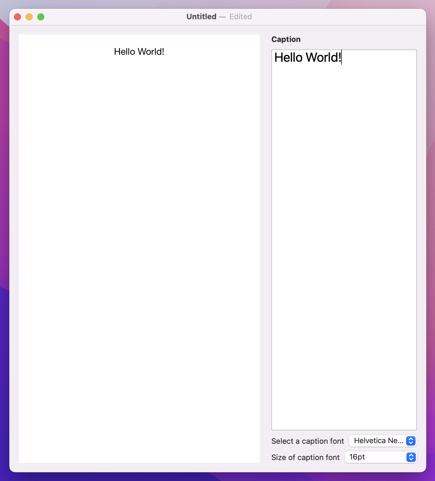
That’s looking better, but before we move on I want to make one further change: the caption font and size both come under the Caption section, so it should be pretty obvious what they do even without a label next to them.
While we could just use an empty string for those pickers, that causes problems with accessibility because there’s no description to VoiceOver for what each one does. A better idea is to use a new modifier called labelsHidden(), which hides all the control labels wherever it’s used.
We actually don’t want visible labels anywhere in this part of our user interface, so we’re going to add labelsHidden() to the whole VStack – attach this modifier to the inner VStack that holds our font settings:
.labelsHidden()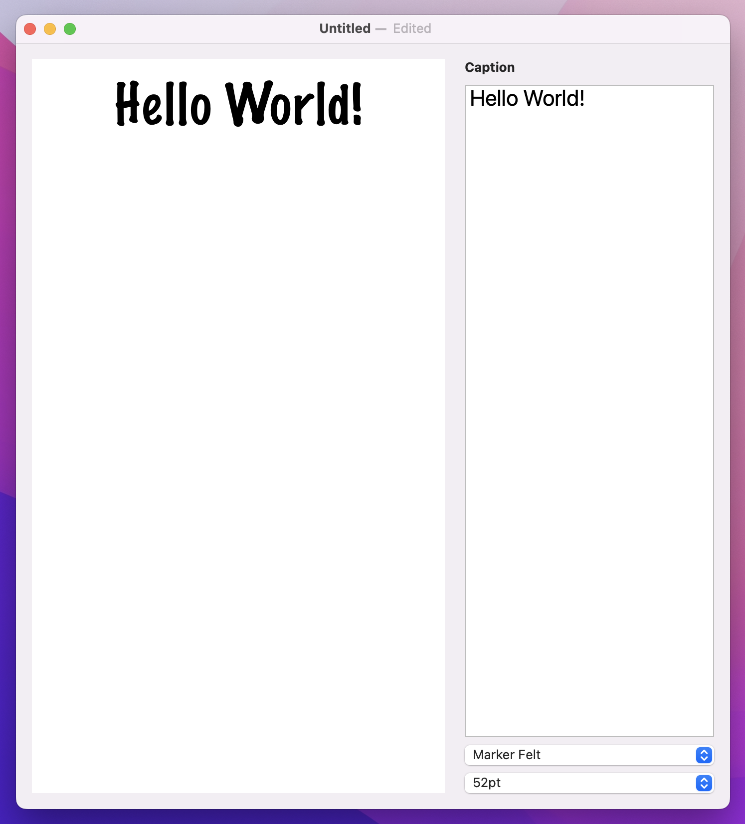
Much better!
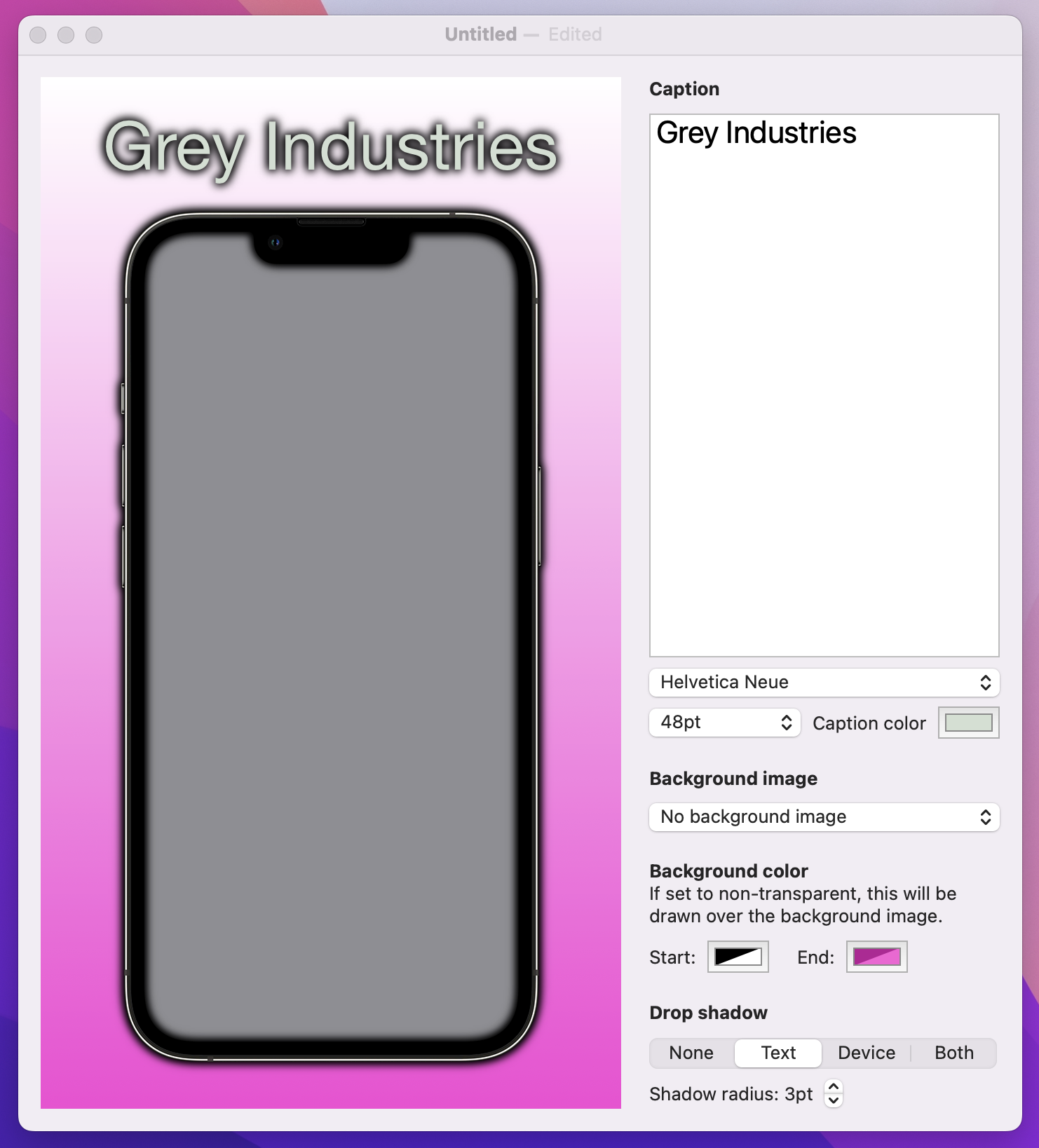
Bringing our screenshot to life means showing some actual imagery in there – a placeholder iPhone, yes, but also a screenshot from the user and a background picture, so it’s really customizable.
Making this work means repeating the previous three steps: modifying our document type, adding some extra SwiftUI components to control the new data, then rendering it somehow.
Start by adding these new properties to ScreenableDocument:
var backgroundImage = ""
var userImage: Data?
Tip: We don’t need a property to store the iPhone graphic, because it doesn’t change.
The first one is a simple string, which you’ve seen a hundred times already. But the second is one new: Data is designed to store any kind of binary data at all, such as JPEG images, MP3 audio, or even just strings that you downloaded from the internet.
In fact, I’ve been a bit sneaky: you’ve met Data previously, but I didn’t call it out as a new type. Every time you use JSONDecoder or JSONEncoder, you’re working with a Data instance because that is what they read and write, and every time you use URLSession.shared.data(from:) to fetch a URL’s contents, you’re also using Data – it’s even right there in the name!
Over in ContentView, before we add some UI to control the background image we must first load the full list of background pictures from Backgrounds.txt. This is another text file with one string per line, so we can use the same loadStringArray() method we made earlier to add another property in ContentView:
let backgrounds = Bundle.main.loadStringArray(from: "Backgrounds.txt")The second step is to add a new Picker to the body of our view. This will be a new section in our layout, so add this after the caption VStack:
VStack(alignment: .leading) {
    Text("Background image")
        .bold()

    Picker("Background image", selection: $document.backgroundImage) {
        ForEach(backgrounds, id: \.self, content: Text.init)
    }
}
.labelsHidden()
Tip: I’ve added another labelsHidden() modifier here because again the label doesn’t add much.
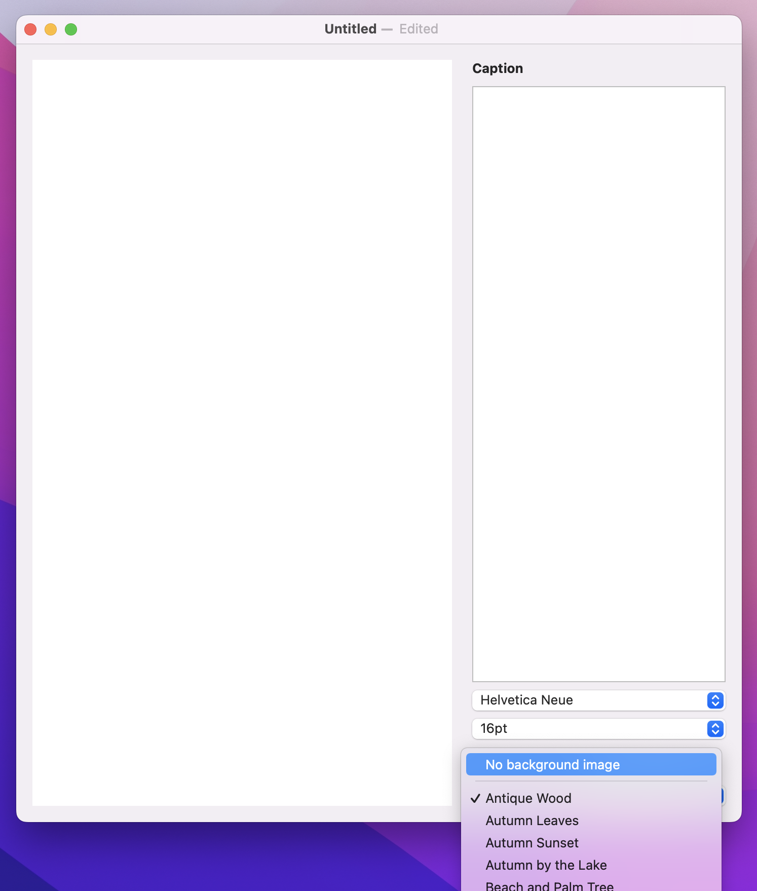
That’s a good start, but it’s not quite enough because it doesn’t include an option for no background image. We can add that by placing a single static Text view inside the Picker but outside the ForEach – we’re combining static and dynamic data, just like you can do with lists. Even better, we can add an extra view after the text called Divider, which will add a separator line between the static row and all the other options.
So, modify your new background image picker to this:
Picker("Background image", selection: $document.backgroundImage) {
    Text("No background image").tag("")
    Divider()

    ForEach(backgrounds, id: \.self, content: Text.init)
}
Rendering that background is surprisingly easy: if the backgroundImage property of our document isn’t empty, we can call the draw() method of our graphics context and pass in an image to draw and a rectangle to draw it in – SwiftUI will take care of making sure the image is resized to fit into the space we provide.
Add this in the Canvas drawing code, after the call to fill() that colors the background white:
if document.backgroundImage.isEmpty == false {
    context.draw(Image(document.backgroundImage), in: fullSizeRect)
}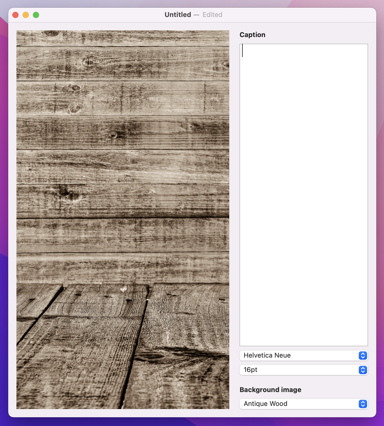
That’s all it takes to add our background image, so give it a try!
Drawing an iPhone is a little trickier, because it requires careful positioning. We already added a verticalOffset value that controls how far the user’s caption should push the phone image, but now I want to add a second offset to track the horizontal position of the phone. This is easier to calculate, because it will always be canvas width minus the phone width, then halved.
Add this constant next to verticalOffset:
let horizontalOffset = (size.width - phoneSize.width) / 2And now we can draw the phone using the combination of horizontal and vertical offset – put this below the // draw the phone comment:
context.draw(Image("iPhone"), in: CGRect(origin: CGPoint(x: horizontalOffset, y: verticalOffset), size: phoneSize))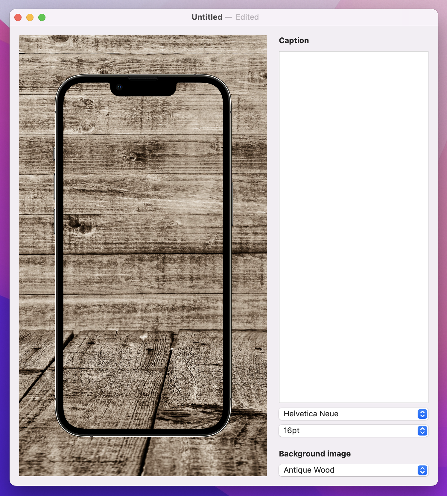
If you run the app, you’ll see the iPhone frame now sits on top of the user’s background image, which is good. But what we really want is to draw something on the screen, which means rendering the user’s screenshot first then drawing the phone on top.
We’re storing the user’s picture in an optional Data property in our document, but you can’t actually load a Data instance into a SwiftUI Image. Instead, we first need to load the data into an NSImage – an AppKit image – then load that into the SwiftUI image. This can then be fed into the canvas drawing using the same resolveSymbol(id:) method we used with the caption.
To make this happen we need to add another symbol to our canvas, next to the Text(document.caption) view. If we have user image data set, and if we’re able to load an NSImage from that data, then we’ll send back a SwiftUI Image view with the tag “Image”. If we don’t have any data, or if somehow it’s corrupt, we’ll send back the color gray with the same tag, so it will be used instead.
Add this to your canvas symbols now:
if let userImage = document.userImage, let nsImage = NSImage(data: userImage) {
    Image(nsImage: nsImage)
        .tag("Image")
} else {
    Color.gray
        .tag("Image")
}
Now for the tricky part: we can read the “Image” view in our canvas rendering code without any problem, but where should it be placed? This takes a little mathematics, so we’ll write it step by step. Start by adding this condition directly before the code that draws the iPhone image, so that our screenshot is layered under the iPhone bezel:
if let screenshot = context.resolveSymbol(id: "Image") {
    // more code to come
}
First, we need to decide where we want to draw the screenshot. This needs to use two values:
Replace the // more code to come comment with this:
let drawPosition = CGPoint(x: horizontalOffset + imageInsets.width, y: verticalOffset + imageInsets.height)Second, for the draw size this needs to be our phone width and height minus double the image insets. Think about it: if we are inset 16 points horizontally, then our overall width must be 32 points less because we subtract 16 for the left edge and 16 for the right.
Add this below the previous line:
let drawSize = CGSize(width: phoneSize.width - imageInsets.width * 2, height: phoneSize.height - imageInsets.height * 2)Now that we have a position and size, we can draw the screenshot:
context.draw(screenshot, in: CGRect(origin: drawPosition, size: drawSize))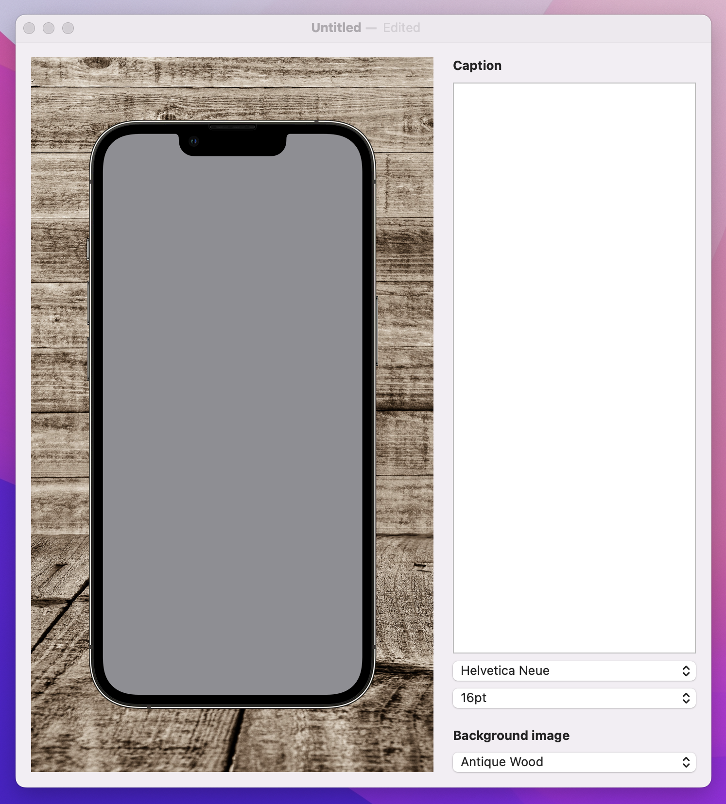
We haven’t actually put anything in the userImage property yet, but if you run the app now you should at least see the gray placeholder behind the screen. If you see it in front of the screen it means you need to rearrange your code so the screenshot is drawn before the phone.
To finish off this step – and to really propel this project towards completion – we’re going to add the ability for the user to drag in an image to use inside their render.
This is quite straightforward in SwiftUI:
Data instance, using the Data(contentsOf:) initializer. This works the same as the String(contentsOf:) we used previously, including the need to use try? or similar.userImage property of our document.Let’s put this into code – add this method to ContentView now:
func handleDrop(of urls: [URL]) -> Bool {
    guard let url = urls.first else { return false }
    let loadedImage = try? Data(contentsOf: url)
    document.userImage = loadedImage
    return true
}
That method tells our app how to respond to a drag operation, but we still need to tell SwiftUI when to call that method – what view can have images dropped on it.
In our case, that view is RenderView, so we’re going to add a new modifier to it called dropDestination(). We’ll be providing it with two parameters here: the type of data to accept (URL.self, because we care about files being dragged in), and also a trailing closure with code to call the new handleDrop(of:) method:
So, modify your RenderView code in ContentView to this:
RenderView(document: document)
    .dropDestination(for: URL.self) { items, location in
        handleDrop(of: items)
    }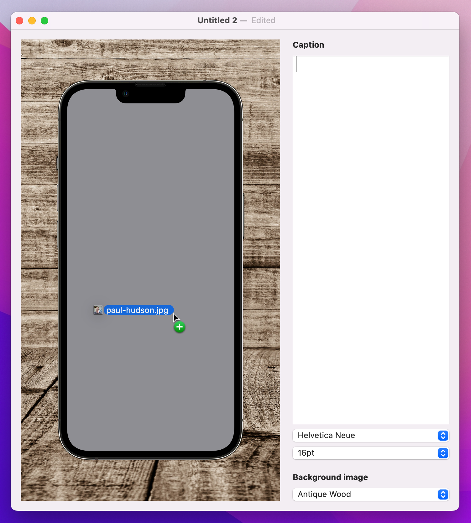
If you run the project now, it should work – you should be able to drag an image into the render view to see it appear on the phone.
Now we’re going to tackle the hardest part of this project, and it’s frustrating because honestly the problem here is SwiftUI and Apple could make this entire piece of work disappear if they wanted.
What we’re going to do is allow the user to customize three colors: one of the text, and two to make a gradient that goes over the background image to help increase text contrast.
This starts out easy, because we can just add three properties to our ScreenableDocument struct to store each of the colors:
var captionColor = Color.black
var backgroundColorTop = Color.clear
var backgroundColorBottom = Color.clear
But then Xcode throws up a big warning that now ScreenableDocument no longer conforms to the Codable protocol – which is pretty serious, given that we’re using Codable for loading and saving our documents.
To cut a long story short, SwiftUI’s Color doesn’t conform to Codable, so we have two options:
Color.Resolved type, which does conform to Codable, but requires a second copy of all our storage.The first of those is easier, but only but a little. You see, we can’t read the red, green, blue, and opacity values from Color, but instead need to convert the color into an NSColor. To make matters even worse, reading colors from NSColor uses a really ugly API, so this whole thing is a bit of a mess. Sadly, it’s a mess we can’t avoid if we’re to add color support to this app, and it's still easier than trying to bounce through Color.Resolved!
To mitigate the problems a little, we’ll be wrapping this entire horror show up inside an extension on Color so that the whole rest of our code doesn’t need to see it. This extension then becomes reusable code you can put into any project, whenever you need to read and write colors.
To get started, create a new Swift file called Color-Codable.swift, replace its Foundation import with SwiftUI, then give it this code:
extension Color: Codable {
}
That tells Swift that the Color view conforms to the Codable protocol, which of course it doesn’t. However, by adding this conformance we get the chance to add conformance by hand, which takes four pieces of code:
Codable about the pieces of data we want to store.Color.Color.Codable system.None of these steps are complex, but it all does feel rather clunky.
The first step is to tell the Codable protocol the data we want to store, which in this case is four values covering the four RGBA components of a color: red, green, blue, and alpha – the name that NSColor uses for opacity.
This is done by placing an enum for each value into our extension, with one case for each piece of data. So, add this to the Color extension now:
enum CodingKeys: CodingKey {
    case red, green, blue, alpha
}
Tip: That enum is called CodingKeys, and conforms to a protocol called CodingKey – it’s an important distinction.
The second step is to create an initializer that can create a SwiftUI Color instance from those four pieces of data. This is part of the Codable system: it will hand us an object called a Decoder, and we can then ask it to load all the data matching our CodingKeys enum. Once that’s done, we can read individual Double values from the decoder, then finally call init() with them.
Add this to the Color extension next:
public init(from decoder: Decoder) throws {
    let container = try decoder.container(keyedBy: CodingKeys.self)
    let r = try container.decode(Double.self, forKey: .red)
    let g = try container.decode(Double.self, forKey: .green)
    let b = try container.decode(Double.self, forKey: .blue)
    let a = try container.decode(Double.self, forKey: .alpha)

    self.init(red: r, green: g, blue: b, opacity: a)
}
I want to point out a few things in there:
try, because we might find the data is missing a piece of the data. We don’t catch that error here and don’t need to, because it will be caught when decoding the overall Color.Double. If somehow Swift finds something else such as a string, that will throw an error.CodingKeys enum – Swift literally won’t let us use an invalid key by accident. This is a great deal safer than the strings of UserDefaults and @AppStorage.The third piece of code needed in this extension will convert a SwiftUI Color instance into its RGBA components. This is the worst part of the whole process, because Apple’s API here is ancient and quite unlike anything else in this book.
There are three problems here:
CGFloat – this is another place where Swift can’t quietly let us bridge to Double.The actual code to do this isn’t hard, but I did want to make it clear it might look a bit odd at first for historical reasons!
Add this method to your Color extension now:
func getComponents() -> (red: Double, green: Double, blue: Double, alpha: Double) {
    var r: CGFloat = 0
    var g: CGFloat = 0
    var b: CGFloat = 0
    var a: CGFloat = 0

    let color = NSColor(self).usingColorSpace(.sRGB)
    color?.getRed(&r, green: &g, blue: &b, alpha: &a)

    return (r, g, b, a)
}
As you can see, that creates four CGFloat numbers, converts the current color into an NSColor, then calls a method to read out the color values. That’s where we turn the color values into pointers – all those & markers mean “send in the memory address of this object so it can be overwritten.” When the method call completes, r, g, b, and a will contain their respective color data, and we can send it back as a tuple.
The fourth and final piece of code in this extension is to write SwiftUI Color data to the Codable system. This is pretty much the reverse of the initializer we wrote a few minutes ago: we start by calling the new getComponents() method so we have the RGBA data, we then create a container keyed by the CodingKeys enum, and then write out each value for its appropriate enum case.
Add this final piece of code to the Color extension now:
public func encode(to encoder: Encoder) throws {
    let components = getComponents()
    var container = encoder.container(keyedBy: CodingKeys.self)

    try container.encode(components.red, forKey: .red)
    try container.encode(components.green, forKey: .green)
    try container.encode(components.blue, forKey: .blue)
    try container.encode(components.alpha, forKey: .alpha)
}
That completes the extension, which means we have taught Swift how to load and save Color data using Codable. This means our ScreenableDocument struct is now back to correctly conforming to Codable once more, so the whole project compiles. Once again, I really hope Apple sees the light and lets us avoid this epic detour in the future!
If you remember, adding new features to this app is done in three steps: modifying the data model, adding some SwiftUI views to edit the data, then updating the rendering code. Well, we just finished the first step after all that work, and we can now proceed to the much easier two parts that remain!
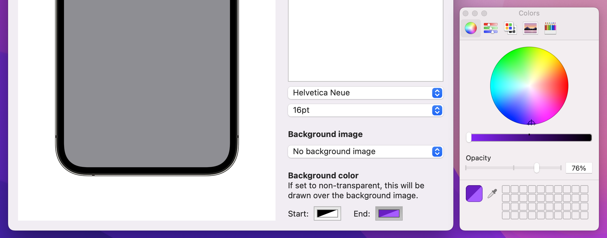
Selecting colors through SwiftUI is done through a dedicated view called ColorPicker – provide it with a title plus a Color binding, and it will do literally everything else for you.
To put this into action, add another section to your SwiftUI view, below the background image section:
VStack(alignment: .leading) {
    Text("Background color")
        .bold()

    Text("If set to non-transparent, this will be drawn over the background image.")
        .frame(maxWidth: .infinity, alignment: .leading)

    HStack(spacing: 20) {
        ColorPicker("Start:", selection: $document.backgroundColorTop)
        ColorPicker("End:", selection: $document.backgroundColorBottom)
    }
}
Important: There is no labelsHidden() modifier here because we need the label to differentiate between the two color pickers.
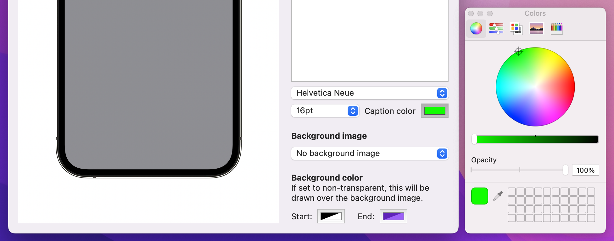
We need a third color picker to handle the text color, and because our font size picker can be quite small I’m going to squeeze this one to the side of it in a HStack. So, modify your font size picker code to this:
HStack {
    Picker("Size of caption font", selection: $document.fontSize) {
        ForEach(Array(stride(from: 12, through: 72, by: 4)), id: \.self) { size in
            Text("\(size)pt")
        }
    }

    ColorPicker("Caption color", selection: $document.captionColor)
}
That’s our SwiftUI views updated to reflect the new properties, so the final step is to make our drawing work.
Making the caption text change color is trivial, because that’s just changing the hard-coded .black color to document.captionColor in the symbols for RenderView:
Text(document.caption)
    .font(.custom(document.font, size: Double(document.fontSize)))
    .foregroundStyle(document.captionColor)
    .multilineTextAlignment(.center)
    .tag("Text")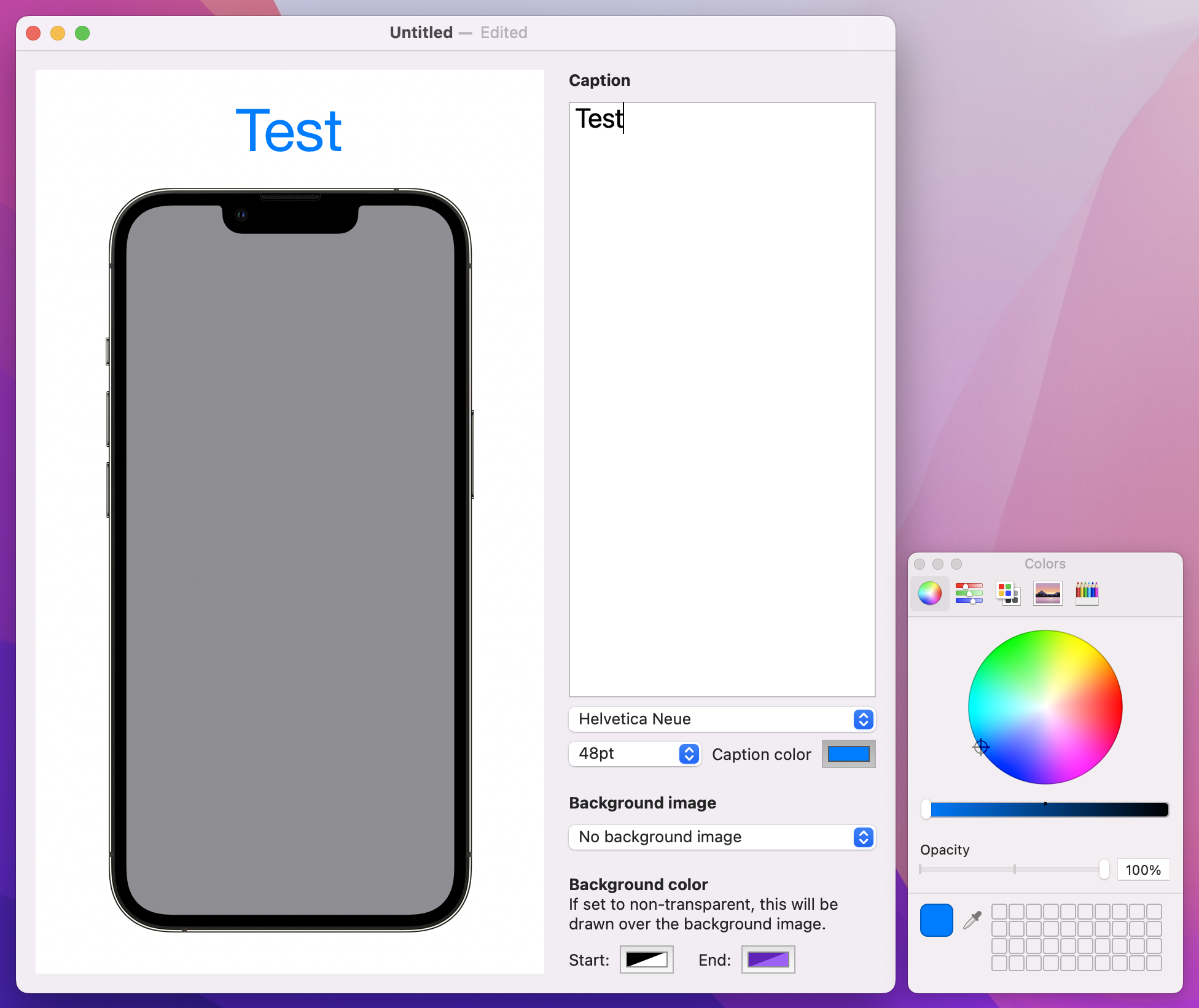
Adding a gradient is only slightly more complicated because it’s very similar to how we made a LinearGradient in project 9. It’s not identical: Canvas likes to deal in actual points rather than just “top” and “bottom”, but you can certainly figure out what it does just by reading the code.
Add this below the // add a gradient comment:
context.fill(fullSizePath, with: .linearGradient(Gradient(colors: [document.backgroundColorTop, document.backgroundColorBottom]), startPoint: .zero, endPoint: CGPoint(x: 0, y: size.height)))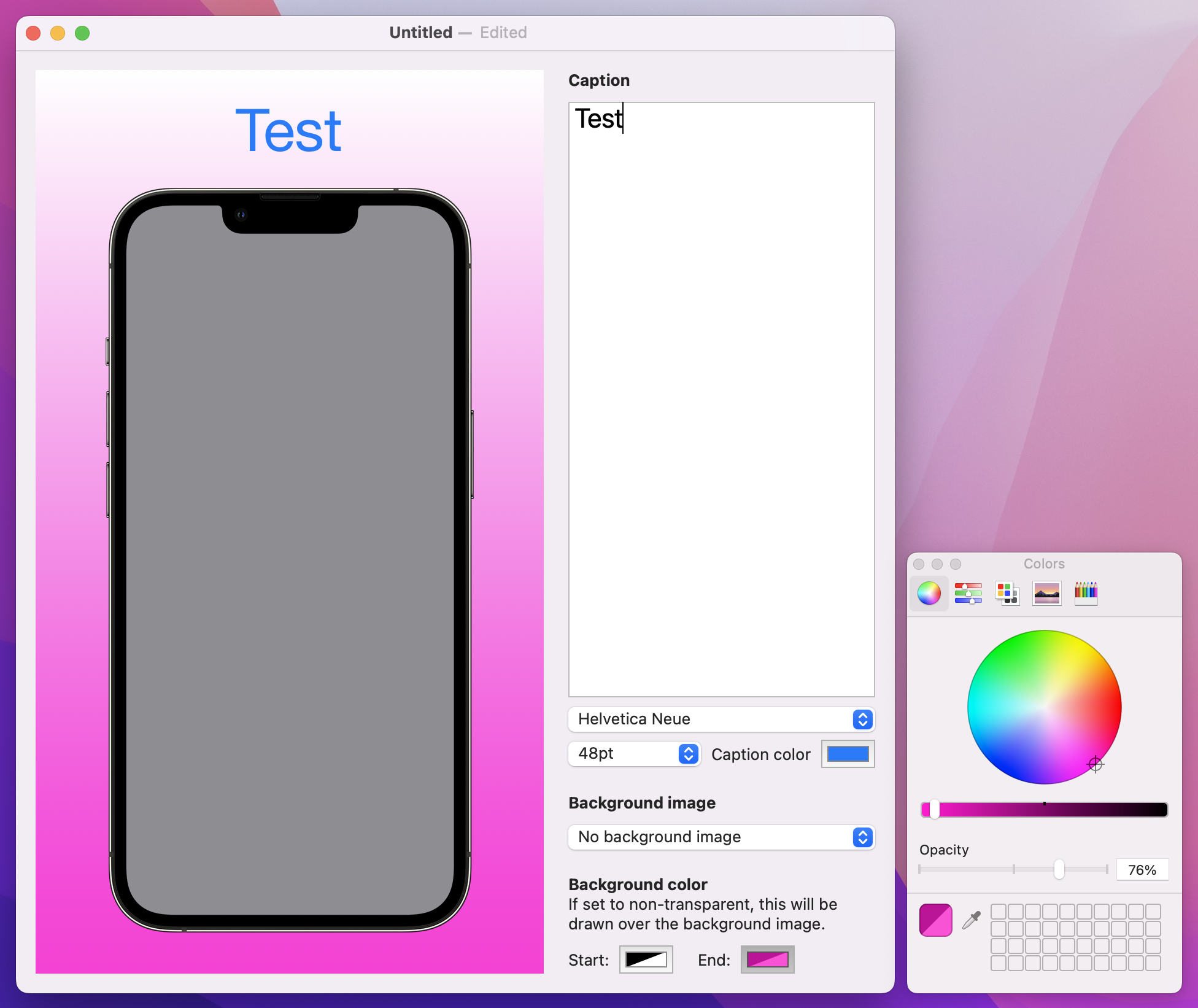
And that’s all it takes to get a linear gradient drawn over our background! As you can see, we’re making a gradient from the zero point down to the height of the canvas, passing in the two colors the user asked for.
So, it might have taken a lot of work just to get Color to play nicely with our document, but once it was done things really just fell into place thanks to ColorPicker – when SwiftUI is good it really is very good…
With the pain of Codable colors out of the way, I want to tackle a different problem: adding some shadows around the text, the device, or both. Adding a simple shadow is straightforward, but making it customizable presents some interesting challenges and it’s important you see them for yourself.
First, we’re going to add two properties to our document, one to store where the shadow is shown, and one to store its strength.
var dropShadowLocation = 0
var dropShadowStrength = 1
Second, we’re going to expose those properties in our SwiftUI interface in two interesting ways:
Stepper, because users are likely to want to move between values repeatedly until they find the one they like.You already met listStyle() for adjusting the way a List looks, and pickers work similarly – we can say pickerStyle(.segmented) to get a segmented control from your data.
Add this final section to your SwiftUI layout now, below the VStack for background color:
VStack(alignment: .leading) {
    Text("Drop shadow")
        .bold()

    Picker("Drop shadow location", selection: $document.dropShadowLocation) {
        Text("None").tag(0)
        Text("Text").tag(1)
        Text("Device").tag(2)
        Text("Both").tag(3)
    }
    .pickerStyle(.segmented)
    .labelsHidden()

    Stepper("Shadow radius: \(document.dropShadowStrength)pt", value: $document.dropShadowStrength, in: 1...20)
}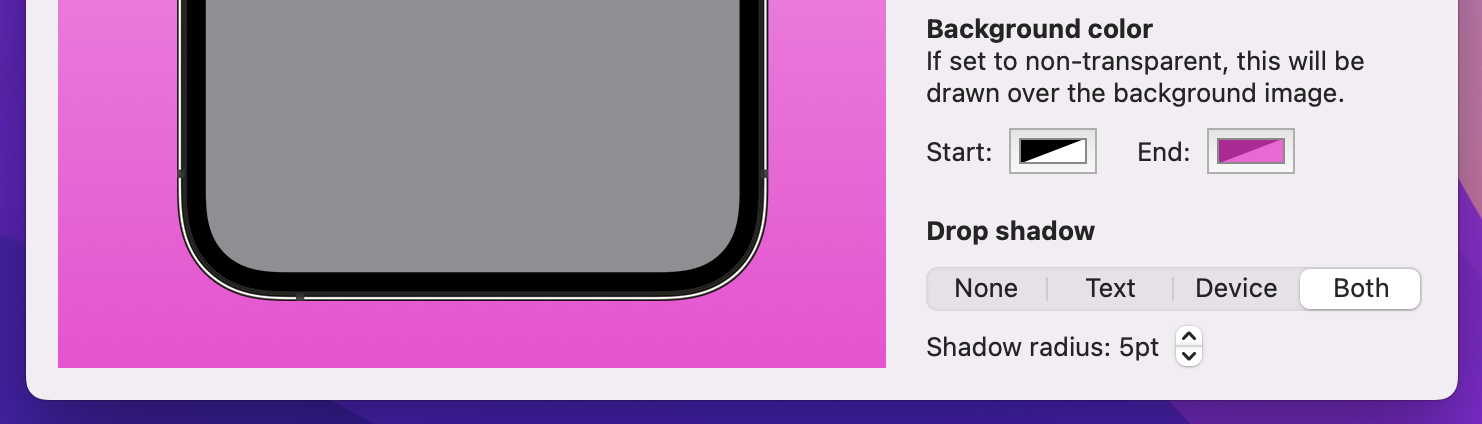
There are three important things in there I want to point out:
dropShadowLocation.Stepper view doesn’t show its value in its label by default, so I’ve used string interpolation to place it in there.Those two parts were pretty straightforward, but for a change it’s the rendering code that’s complicated.
First, rendering the text with a shadow should happen when dropShadowLocation is set to 1 or 3, and SwiftUI has a shadow() modifier that’s perfect here
Add this new modifier to the Text(document.caption) symbol in RenderView:
.shadow(color: document.dropShadowLocation == 1 || document.dropShadowLocation == 3 ? .black : .clear, radius: Double(document.dropShadowStrength))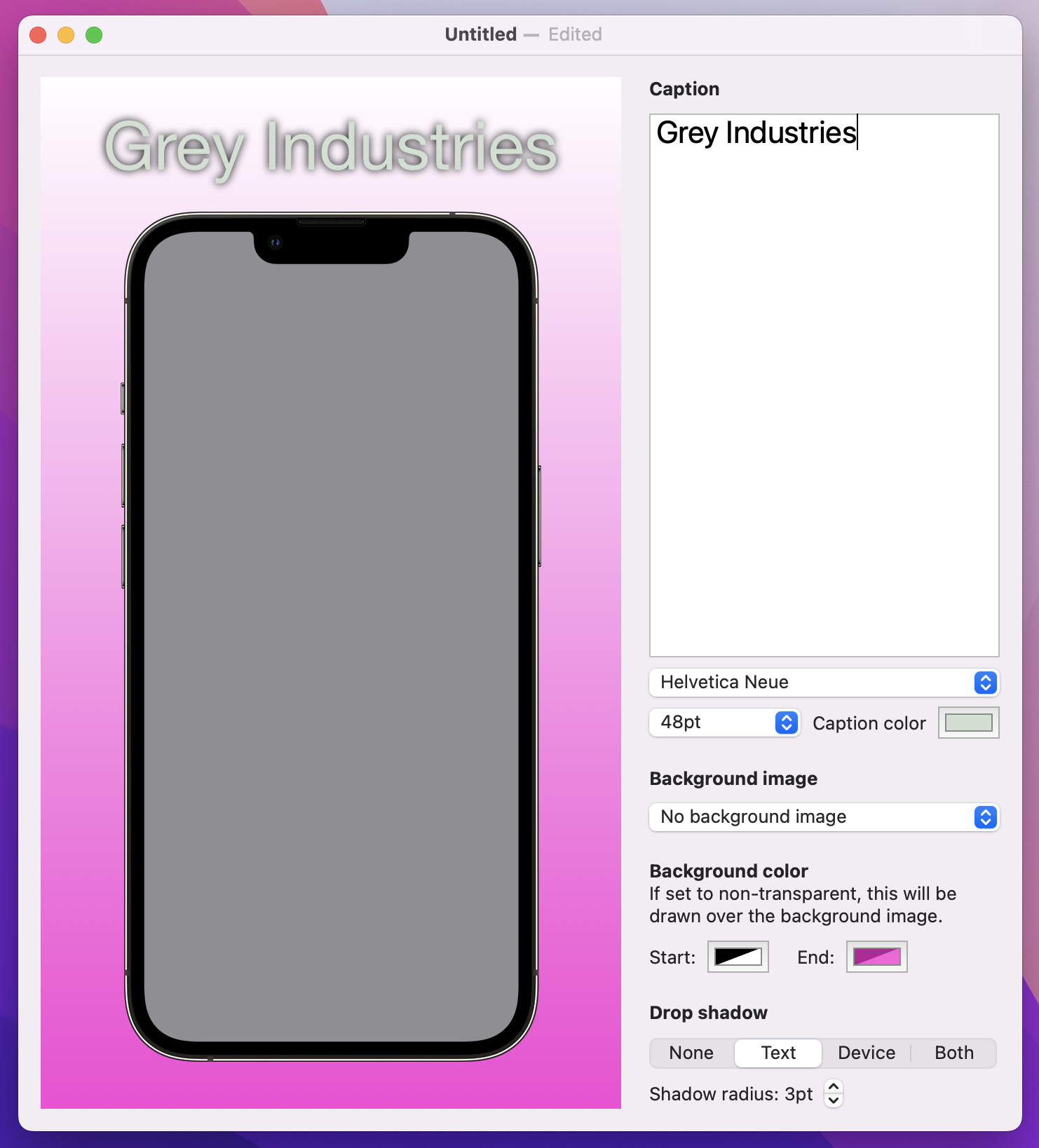
That uses a ternary conditional operator to check whether the shadow location is equal to 1 or 3: if it is then black is used for the shadow color, otherwise a clear color is used, both times with a radius from the document.
Give it a try and see what you think. Personally I think the shadow is a bit weak, and so I want to remind you of a neat trick in SwiftUI: you can repeat modifiers to amplify effects!
So, if you want to strengthen the shadow add a second modifier like the first:
Text(document.caption)
    .font(.custom(document.font, size: Double(document.fontSize)))
    .foregroundStyle(document.captionColor)
    .multilineTextAlignment(.center)
    .shadow(color: document.dropShadowLocation == 1 || document.dropShadowLocation == 3 ? .black : .clear, radius: Double(document.dropShadowStrength))
    .shadow(color: document.dropShadowLocation == 1 || document.dropShadowLocation == 3 ? .black : .clear, radius: Double(document.dropShadowStrength))
    .tag("Text")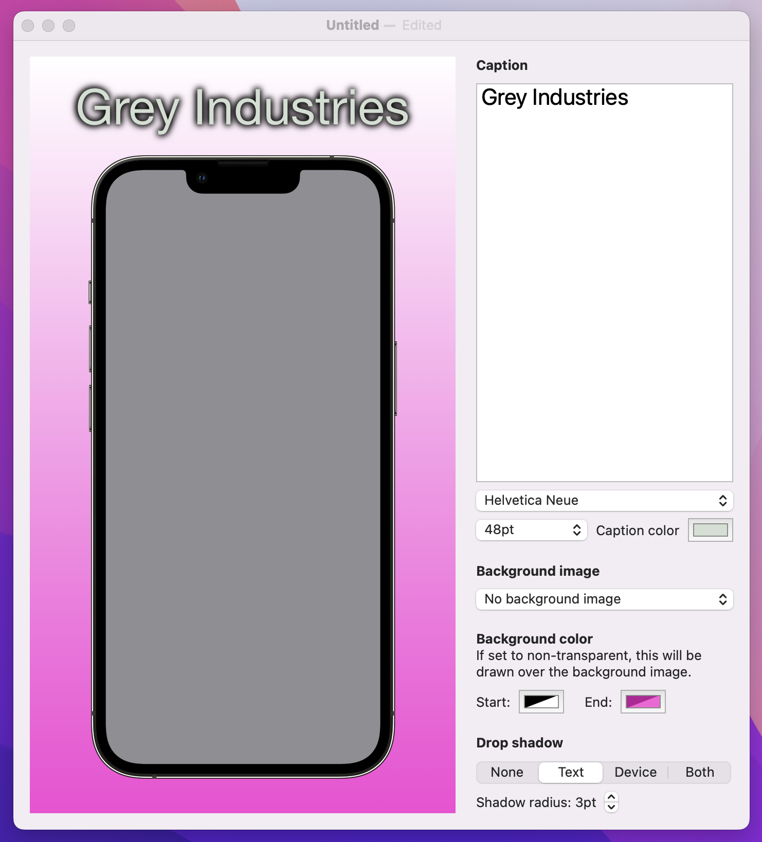
Tip: If you intend to do this, you might want to consider creating a textShadowColor computed property that wraps up the selection between black and clear.
The complicated part is how we add a shadow to our iPhone frame. The iPhone image is drawn inside the canvas rendering code, so we don’t have access to the shadow() modifier. However, we can call the addFilter() method on our graphics context, and that includes a huge range of filters including shadows.
Sounds easy, right? Well, let’s give it a quick try and you can see one of the problems for yourself – change the context.draw() line for the iPhone image to this, to force the shadow to be always present for trial purposes:
context.addFilter(.shadow(color: .black, radius: Double(document.dropShadowStrength)))
context.addFilter(.shadow(color: .black, radius: Double(document.dropShadowStrength)))
context.draw(Image("iPhone"), in: CGRect(origin: CGPoint(x: horizontalOffset, y: verticalOffset), size: phoneSize))
Tip: That uses the same shadow doubling as we used for the text, so the shadows match.
Run that code and see what you think – do you spot the problem? It’s particularly noticeable once you add a screenshot to the phone.
In case you’re staring blankly at your screen, let me help you out: because our iPhone frame is transparent, the shadow appears both inside and outside the device image, which makes no sense – yes, the device can cast a shadow onto the background, but it shouldn’t cast a shadow onto the screenshot.
The solution here is to draw the phone frame twice: once with a shadow, then again without a shadow, placing the screenshot rendering in the middle. This means the screenshot will overlap the shadowed phone, and the unshadowed phone will overlap the screenshot, producing exactly the right effect.
This leads to a second problem: adding a shadow uses the addFilter() method, but there’s no equivalent removeFilter() method – once the shadow is on, everything else we draw into this context has a shadow. So how can we draw the first iPhone frame with a shadow and everything after without?
Well, the graphics context for our canvas is a struct, and this is a place where Swift’s struct comes in really useful: because they are value types, you can take a copy of one and change it without affecting the original. In this instance it means we can take a copy of the graphics context, apply the shadow only to the copy, then draw there without affecting drawing in the original context.
So, to be clear:
dropShadowLocation is greater than 1, it means we need to shadow the device.addFilter() on it to add the shadows.draw() on that context copy, so the iPhone gets shadowed.It’s a sandwich: draw the phone, then the screenshot, then the phone again. Here’s how it looks in code:
if document.dropShadowLocation > 1 {
    var contextCopy = context
    contextCopy.addFilter(.shadow(color: .black, radius: Double(document.dropShadowStrength)))
    contextCopy.addFilter(.shadow(color: .black, radius: Double(document.dropShadowStrength)))
    contextCopy.draw(Image("iPhone"), in: CGRect(origin: CGPoint(x: horizontalOffset, y: verticalOffset), size: phoneSize))
}

if let screenshot = context.resolveSymbol(id: "Image") {
    let drawPosition = CGPoint(x: horizontalOffset + imageInsets.width, y: verticalOffset + imageInsets.height)
    let drawSize = CGSize(width: phoneSize.width - imageInsets.width * 2, height: phoneSize.height - imageInsets.height * 2)

    context.draw(screenshot, in: CGRect(origin: drawPosition, size: drawSize))
}

context.draw(Image("iPhone"), in: CGRect(origin: CGPoint(x: horizontalOffset, y: verticalOffset), size: phoneSize))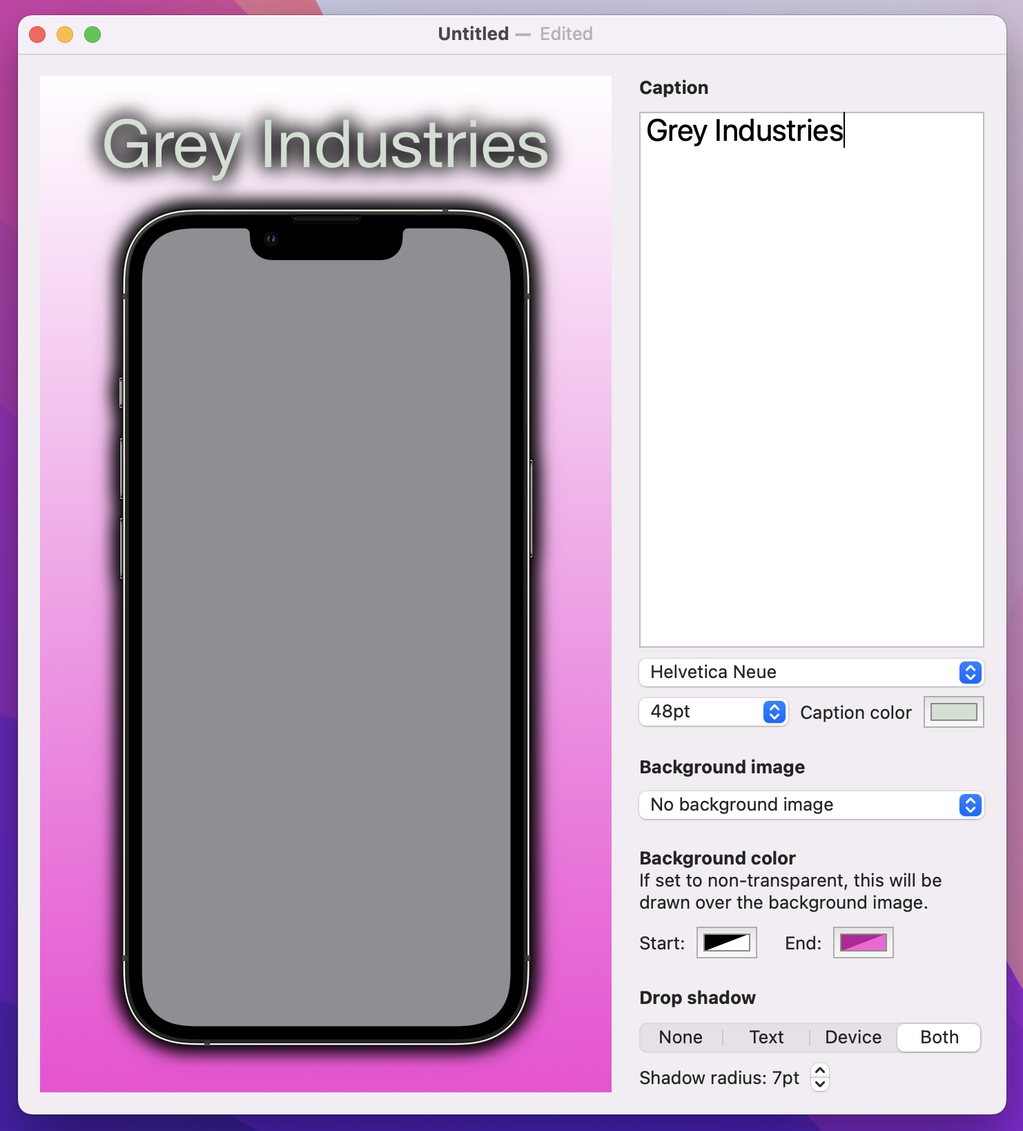
That produces the exact effect we want: the shadow falls outside the device but never inside. Perfect!
At this point our app is basically done, because the user can adjust the caption, screenshot, font, color, gradient, shadow, and more – you can make a huge variety of pictures. But what you can’t do is get the finished result out of the app, and for this app to really be useful we need to add exactly that.
One thing you’ll learn about building macOS apps is that there are multiple ways to achieve the same goal inside apps, and different users do things different ways. Our goal as app developers is to support all the approaches so that users feel comfortable in our app, which means we’re going to write code to do three things:
All three of these approaches rely on the same starting point: we need to write some code that converts RenderView into a PNG file. Part of this comes baked into SwiftUI, but it still takes a little extra work to make it work well.
Start by creating a new method in ContentView:
func createSnapshot() -> Data? {
}
We’re going to write that method in three parts, so I can explain as we go.
The first step is to create a new ImageRenderer instance, which is a SwiftUI class responsible for rendering views. We’ll pass it a new instance of our RenderView using the current document – add this to createSnapshot() now:
let renderer = ImageRenderer(content: RenderView(document: document))That line of code is correct, but you’ll immediately see an error message: Call to main actor-isolated initializer 'init(content:)' in a synchronous nonisolated context. This is Swift’s rather unhelpful way of saying “this method could be called on any task, but this code needs to be run on the main actor to avoid problems.”
If you remember back to project 7, I said this: “to avoid causing graphical corruption or destroying user data by accident, all our user interface work is through a single piece of code called the main actor.” This is the same thing we’re facing here: Swift needs to be certain that this ImageRenderer code will only ever be run on the main actor.
The fix here is to tell SwiftUI to run all code in this view on the main actor, like this:
@MainActor struct ContentView: View {That should clear the error message, allowing us to continue.
Anyway, ImageRenderer can provide an NSImage to us of the rendered view, but cunningly NSImage doesn’t offer any such modern functionality. Instead, it can give us a TIFF image, which is a rather unhelpful image format for any software written in the last decade or so.
However, it’s what we have to work with, so add this to the method next:
if let tiff = renderer.nsImage?.tiffRepresentation {
    // more code to come
} else {
    return nil
}
As you can see, if reading the TIFF representation fails we’ll just send back nil from this method, because it means the image rendering failed somehow.
The second piece of code we need to write is to create a bitmap representation of our data, which means we want the raw pixel data – add this in place of the // more code to come comment:
let bitmap = NSBitmapImageRep(data: tiff)
// even more code to come
At this point we’ve placed our SwiftUI view into an ImageRenderer, and converted that into a bitmap representation. The last step is to ask macOS to convert that to a Data instance with PNG as its internal format. It’s possible to add some extra metadata here at the same time if needed, but we’ll just add an empty dictionary – add this final line to the method now, in place of the // even more code to come line:
return bitmap?.representation(using: .png, properties: [:])That completes the method – it’s not terrifically complex.
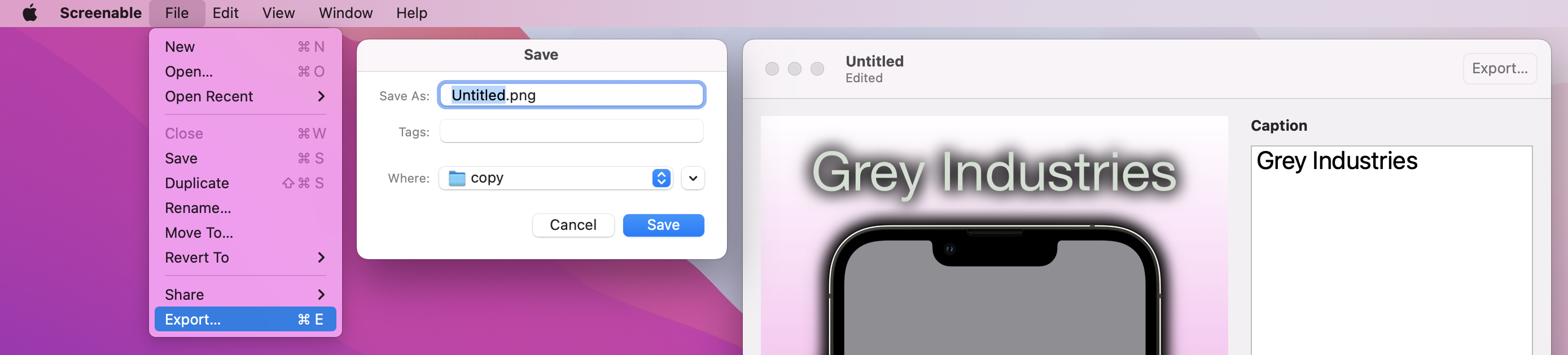
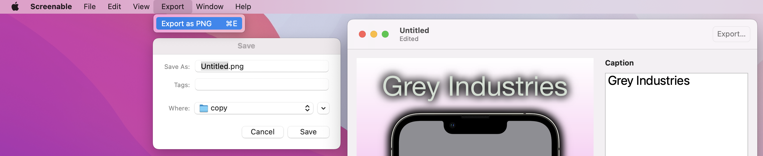
The next step is to write an export() method that called the snapshot method then gives the user the chance to save it. This uses the macOS API for selecting a file to save, NSSavePanel, which allows us to create a system-standard save panel trivially.
The process for saving is straightforward:
NSSavePanel instance.allowedContentTypes property for the kind of data you want to save, which for us will be [.png].begin() on the panel, passing in a function to run when the user has finished with it. This function must accept the result of the panel as its only parameter..OK we can attempt to read the save panel’s URL and write our PNG data there.This is one of the few parts of AppKit that don’t make me groan, so go ahead and add this method to ContentView now:
func export() {
    guard let png = createSnapshot() else { return }

    let panel = NSSavePanel()
    panel.allowedContentTypes = [.png]

    panel.begin { result in
        if result == .OK {
            guard let url = panel.url else { return }

            do {
                try png.write(to: url)
            } catch {
                print (error.localizedDescription)
            }
        }
    }
}
That’s all the boring set up work done, so now we get to the do the fun part: actually exporting our finished image!
Like I said, there are three ways we’re going to handle exporting: a menu item, drag and drop, and a toolbar button. We’ll tackle each of them in order, starting with the menu item.
This takes a little thinking, because the menu bar isn’t directly attached to one particular ContentView – menu items exist across the entire app, and macOS decides which window should respond to a menu item based on which one currently has focus.
This is accomplished by a classic Apple technology called the responder chain: macOS finds the most specifically focused thing it can, e.g. the text box that the user is currently typing into, and asks whether it can respond to a command. If it can then the command runs there, but if it can’t macOS will automatically go out one level and ask the view containing the text field whether it can handle the command. If that can’t do it then macOS broadens its search further and further, eventually asking the app delegate if it can handle the command, and if even that can’t do it then the command is just ignored.
Hopefully you can see why it’s called the responder chain: the message effectively gets passed up and up through the chain of our user interface, until eventually either something says “hey, I can handle that,” or it gets ignored entirely.
We can send any message we went into the responder chain, then ask any part of our SwiftUI view hierarchy to watch for that message. The only drawback is that it needs a sprinkle of @objc and #selector, but only a tiny bit – it’s so small I feel certain you won’t mind!
First, we need to create an @objc protocol that describes all the commands we want to send throughout our app. We only have one here, to export our snapshot, so we just need one command – you can put this into ScreenableApp.swift if you like, or make a dedicated AppCommands.swift file if that’s what you prefer:
@objc protocol AppCommands {
    func export()
}
Second, we need to watch for that command arriving, and call export() when we see it. Remember, this will only be caught by the window that currently has focus, so users won’t see one save panel appear for each window they currently have open.
To catch the export() command and immediately call the local export() method, add this modifier to ContentView below the padding:
.onCommand(#selector(AppCommands.export)) { export() }And third, in ScreenableApp.swift we need to use the commands() modifier to attach a new menu item.
Back in project 1 I showed you how to remove any menu items you didn’t want, but this is the first time we’re adding something from scratch so I want to show you two different approaches. Regardless of which approach you choose, though, the actual functionality is the same: call NSApp.sendAction() with your command as its first parameter and nil as the other two parameters. This will broadcast the command to the responder chain, which will pick it up and do the rest for us.
The first method I want to demonstrate is for when you want to piggyback a menu item onto an existing main menu group, e.g. File or Edit. To do this, you should use a CommandGroup with some kind of position, like this:
DocumentGroup(newDocument: ScreenableDocument()) { file in
    ContentView(document: file.$document)
}
.commands {
    CommandGroup(after: .saveItem) {
        Button("Export…") {
            NSApp.sendAction(#selector(AppCommands.export), to: nil, from: nil)
        }
        .keyboardShortcut("e")
    }
}
That will add the Export menu item to the File menu, which I think is probably best in this case. The keyboardShortcut() modifier tells SwiftUI to activate this when Cmd+E is pressed – you can attach custom modifier key if you want, but Cmd is assumed if you don’t say otherwise.
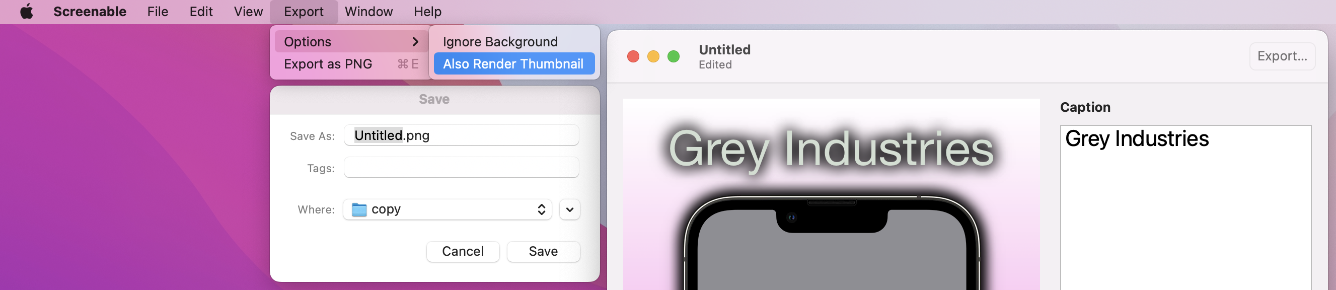
As an alternative, you can also create a wholly new top-level menu for your need. For example, if you wanted to allow export in several different formats, you might prefer to have Export as a top-level menu, with “Export as PNG”, “Export as JPEG”, etc, as menu items in there.
To try this approach instead, use CommandMenu instead of CommandGroup, giving it a name to show in the menu bar. You can then go ahead and add as many buttons as you want there, optionally using Divider() to add a separator where needed.
DocumentGroup(newDocument: ScreenableDocument()) { file in
    ContentView(document: file.$document)
}
.commands {
    CommandMenu("Export") {
        Button("Export as PNG") {
            NSApp.sendAction(#selector(AppCommands.export), to: nil, from: nil)
        }
        .keyboardShortcut("e")
    }
}
You can give even go deeper if you need to, by adding submenus inside your menus. This is done using Menu views with more buttons, so for example we might want to have some inline options to configure our export options:
.commands {
    CommandMenu("Export") {
        Menu("Options") {
            Button("Ignore Background") {
                // action code
            }

            Button("Also Render Thumbnail") {
                // action code
            }
        }

        Button("Export as PNG") {
            // action code
        }
        .keyboardShortcut("e")
    }
}
All of these menu variations are important to know, so try them both and see which you prefer!
The second export option is the ability to drag straight from our render view to the desktop or some other application. SwiftUI has a really great API here using its draggable() modifier, which just needs be given some kind of shareable data and it will take care of the rest.
We’re going to implement this in two steps, with the first one being a new method called snapshotToURL() that calls createSnapshot() and writes its output to a file. We need to create that finished file somewhere on disk, but we don’t want it to be visible to the user. So, we’ll create it in the user’s temporary directory – a place that is automatically cleaned up by the system.
Add this method now:
func snapshotToURL() -> URL {
    let url = URL.temporaryDirectory.appending(path: "ScreenableExport").appendingPathExtension("png")
    try? createSnapshot()?.write(to: url)
    return url
}
The second step of implementing draggable() is trivial, because we can just call snapshotToURL() there. So, please go ahead and add this modifier to your ContentView, next to the existing dropDestination() modifier:
.draggable(snapshotToURL())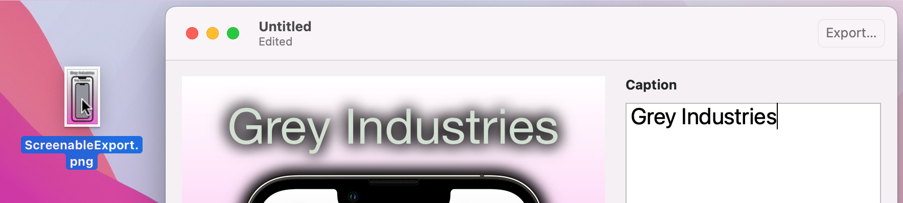
With that in place we can now drag and drop to the rendered image, which I think is a really smooth experience.
The final export option is to add a toolbar button, which we could do using a new modifier called toolbar() and a simple button that calls export(). Add this to the main HStack for our view body:
.toolbar {
    Button("Export", action: export)
}
And that works – you could definitely use that if you want.
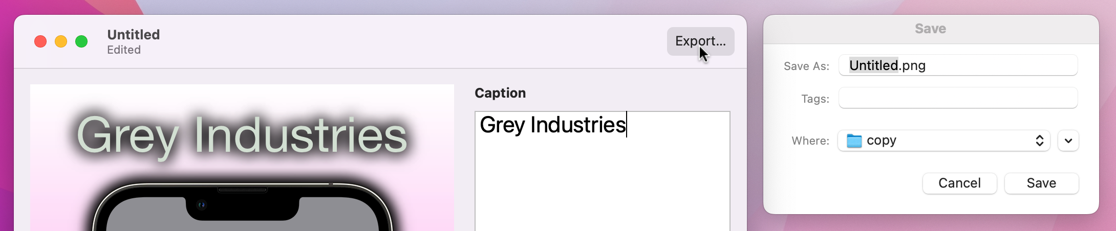
However, SwiftUI provides a better solution called ShareLink, which adds a sharing icon that is able to share our exported URL through AirDrop, iMessage, and more. I don’t think it’s a full replacement for having a dedicated Export button, though, because calling export() means we get the system-standard save panel for writing to the desktop. So, try them both and see which one you prefer – or maybe go with both!
Change your toolbar() modifier to this:
.toolbar {
    Button("Export", action: export)
    ShareLink(item: snapshotToURL())
}
As you can see, we can provide our new URL directly to the ShareLink view to have it work seamlessly.
What did we learn? What didn’t we learn, more like – we covered FileDocument, Canvas, TextEditor, Stepper, ColorPicker, toolbars, and menu items, plus lots of new modifiers such as multilineTextAlignment(), shadow(), labelsHidden(), draggable(), dropDestination(), and more. I promised you something big, and I hope you feel proud of just how much this app does.
Yes, setting up the initial document took some time, but once that was done so many other things feel into place quickly – and of course we also get the great benefits of document-based apps, including version control, sharing, and more. I mentioned undo and redo working in the very beginning, but now that we’ve added more to our UI I hope you try it again and see how it applies to all the changes in our app not just those in the TextEditor.
There are so many ways you could improve this app, and I encourage you to experiment:
There’s so much room to have fun with this app, and doing so will help you learn so much more than just following my code!
If you’d like a bigger challenge, I think an app this good deserves some user-customizable options for default font, font size, background image, and shadow strength. You should implement this using the Settings scene like we saw back in project 2, using @AppStorage for each of the values you want to track.
This is partly about duplicating a subsection of ContentView for the values we want to customize, but to make your options actually do something you need to modify the ScreenableDocument struct to read the values back out from UserDefaults with code like this:
var font = UserDefaults.standard.string(forKey: "Font") ?? "Helvetica Neue"
var fontSize = UserDefaults.standard.integer(forKey: "FontSize")
var backgroundImage = UserDefaults.standard.string(forKey: "BackgroundImage") ?? ""
var dropShadowStrength = UserDefaults.standard.integer(forKey: "ShadowStrength")
Tip: We can’t use @AppStorage here, because these values need to be used with Codable alongside the rest of our document.
But be careful: code like that will introduce a small bug! Unless the user specifically provides a value, new documents will get the font size and shadow strength of 0, both of which shouldn’t be allowed.
To fix this, you need to do something that is perfectly sensible, but sounds like a typo: you need to register default defaults. That is, you need to register some default values for our default keys, so that if you read one that has no value our default gets sent back instead.
This is done by passing a dictionary of keys and values into UserDefaults.standard.register(), which isn’t hard. What is a little trickier is deciding where to do this, because it needs to happen immediately – we need to register our default defaults before any other code is run, and do so every time the app is launched.
There are a few potential places where this code could go, but honestly the simplest thing to do is add an empty initializer to your ScreenableApp struct like this:
init() {
    let dict = [
        "FontSize": 12,
        "ShadowStrength": 1
    ]

    UserDefaults.standard.register(defaults: dict)
}
That registers our default defaults every time the app runs. If the user actually sets some defaults those won’t be overridden by the default defaults – these are just fallbacks in case no other value is available.
Copyright © 2023 Paul Hudson, hackingwithswift.com.
You should follow me on Twitter.