In this technique project we’re going to explore how SwiftUI handles layout. Some of these things have been explained a little already, some of them you might have figured out yourself, but many more are things you might just have taken for granted to this point, so I hope a detailed exploration will really shed some light on how SwiftUI works.
Along the way you’ll also learn about creating more advanced layout alignments, building special effects using GeometryReader, and more – some real power features that I know you’ll be keen to deploy in your own apps.
Go ahead and create a new macOS project using the App template, naming it LayoutAndGeometry. You’ll need an image in your asset catalog in order to follow the chapter on custom alignment guides, but it can be anything you want – it’s just a placeholder really.
All SwiftUI layout happens in three simple steps, and understanding these steps is the key to getting great layouts every time. The steps are:
Behind the scenes, SwiftUI performs a fourth step: although it stores positions and sizes as floating-point numbers, when it comes to rendering SwiftUI rounds off any pixels to their nearest values so our graphics remain sharp.
Those three rules might seem simple, but they allow us to create hugely complicated layouts where every view decides how and when it resizes without the parent having to get involved.
To demonstrate these rules in action, I’d like you to modify the default SwiftUI template to add a background() modifier, like this:
struct ContentView: View {
    var body: some View {
        Text("Hello, World!")
            .background(.red)
    }
}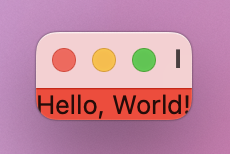
You’ll see the background color sits tightly around the text itself – it takes up only enough space to fit the content we provided.
Now, think about this question: how big is ContentView? As you can see, the body of ContentView – the thing that it renders – is some text with a background color. And so the size of ContentView is exactly and always the size of its body, no more and no less. This is called being layout neutral: ContentView doesn’t have any size of its own, and instead happily adjusts to fit whatever size is needed.
One key difference in the way frames are handled on macOS compared to iOS is that macOS thinks in terms of windows, whereas iOS generally thinks in terms of screens. This most commonly manifests itself in the way macOS resizes its windows down to fit their contents, whereas on iOS of course the screen size is physically fixed. As a result, it’s common to add extra resizing rules in macOS apps – to say a view has maximum width and/or height of infinity so that it doesn’t force the window down to a small size.
Back in project 3 I explained to you that when you apply a modifier to a view we actually get back a new view type called ModifiedContent, which stores both our original view and its modifier. This means when we apply a modifier, the actual view that goes into the hierarchy is the modified view, not the original one.
In our simple background() example, that means the top-level view inside ContentView is the background, and inside that is the text. Backgrounds are layout neutral just like ContentView, so it will just pass on any layout information as needed – you can end up with a chain of layout information being passed around until a definitive answer comes back.
If we put this into the three-step layout system, we end up with a conversation a bit like this:
So, when we say Text("Hello, World!").background(.red), the text view becomes a child of its background. SwiftUI effectively works its way from bottom to top when it comes to a view and its modifiers.
Now consider this layout:
Text("Hello, World!")
    .padding(20)
    .background(.red)
This time the conversation is more complicated: padding() no longer offers all its space to its child, because it needs to subtract 20 points from each side to make sure there’s enough space for the padding. Then, when the answer comes back from the text view, padding() adds 20 points on each side to pad it out, as requested.
So, it’s more like this:
If you remember, the order of our modifiers matters. That is, this code:
Text("Hello, World!")
    .padding()
    .background(.red)
And this code:
Text("Hello, World!")
    .background(.red)
    .padding()
Yield two different results.
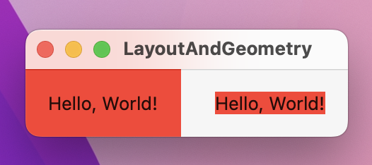
Hopefully now you can see why: background() is layout neutral, so it determines how much space it needs by asking its child how much space it needs and using that same value. If the child of background() is the text view then the background will fit snugly around the text, but if the child is padding() then it receives back the adjusted values that including the padding amount.
There are two interesting side effects that come as a result of these layout rules.
First, if your view hierarchy is wholly layout neutral, then it will automatically take up all available space. For example, shapes and colors are layout neutral, so if your view contains a color and nothing else it will automatically fill the window like this:
var body: some View {
    Color.red
}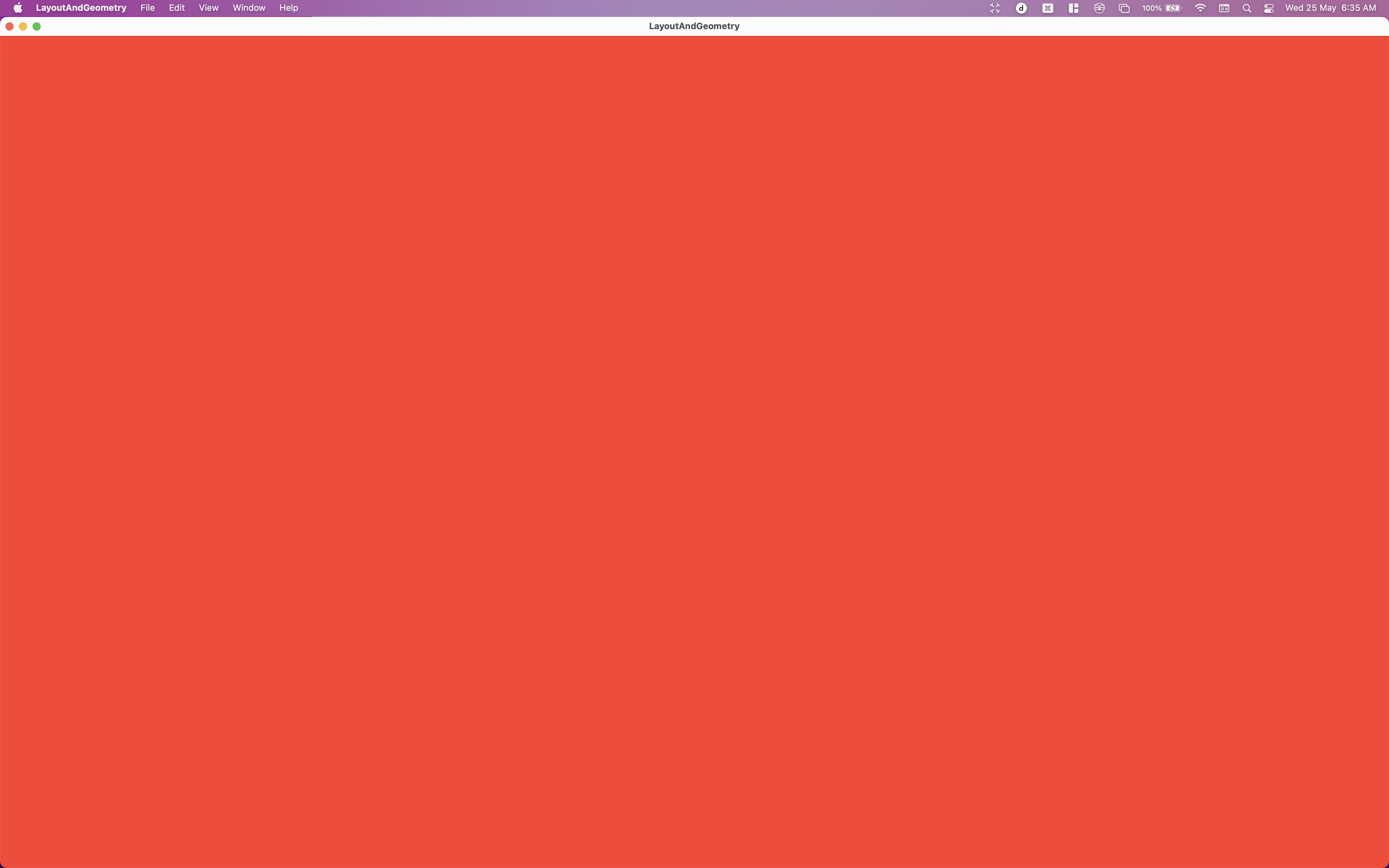
Remember, Color.red is a view in its own right, but because it is layout neutral it can be drawn at any size. When we used it inside background() the abridged layout conversation worked like this:
The second interesting side effect is one we faced earlier: if we use frame() on an image that isn’t resizable, we get a larger frame without the image inside changing size. This might have been confusing before, but it makes absolute sense once you think about the frame as being the parent of the image:
ContentView offers the frame the whole window.When you listen to Apple’s own SwiftUI engineers talk about modifiers, you’ll hear them refer them to as views – “the frame view”, “the background view”, and so on. I think that’s a great mental model to help understand exactly what’s going on: applying modifiers creates new views rather than just modifying existing views in-place.
SwiftUI gives us a number of valuable ways of controlling the way views are aligned, and I want to walk you through each of them so you can see them in action.
The simplest alignment option is to use the alignment parameter of a frame() modifier. Remember, a text view always uses the exact width and height required to show its text, but when we place a frame around it that can be any size. As the parent doesn’t have a say in the final size of the child, code like this will create a 300x300 frame with a smaller text view centered inside it:
Text("Live long and prosper")
    .frame(width: 300, height: 300)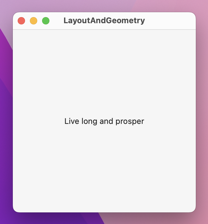
If you don’t want the text to be centered, use the alignment parameter of the frame(). For example, this code places the view in the top-left corner when running on a left-to-right environment
.frame(width: 300, height: 300, alignment: .topLeading)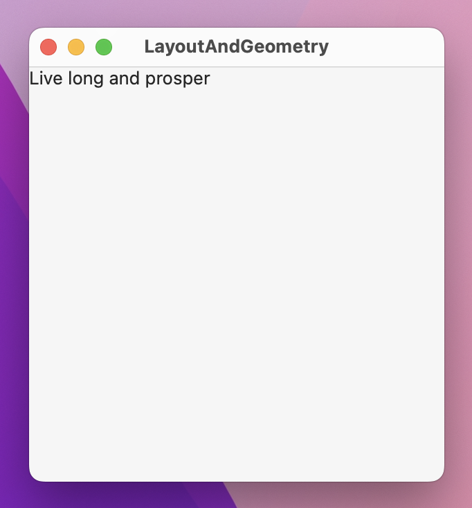
You can then use offset(x:y:) to move the text around inside that frame.
The next option up is to use the alignment parameter of a stack. For example, here are four text views of varying sizes arranged in a HStack:
HStack {
    Text("Live")
        .font(.caption)
    Text("long")
    Text("and")
        .font(.title)
    Text("prosper")
        .font(.largeTitle)
}
.padding(50)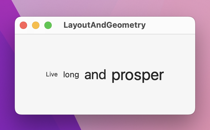
We haven’t specified an alignment there, so they will be centered by default. That doesn’t look great, so you might think to align them all to one edge to get a neater line, like this:
HStack(alignment: .bottom) {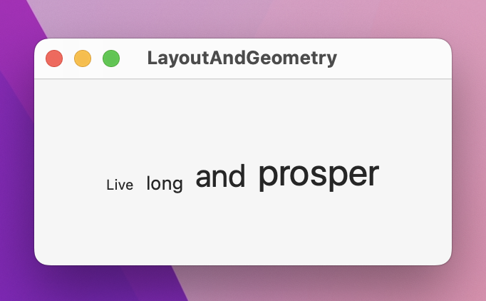
However, that also looks bad: because each of the text views has a different size, they also have a different baseline – that’s the name for where letters such as “abcde” sit on a line, which excludes letters that go below the line such as “gjpy”. As a result, the bottom of the small text sits lower than the bottom of the bigger text.
Fortunately, SwiftUI has two special alignments that align text on the baseline of either the first child or the last child. This will cause all views in a stack to be aligned on a single unified baseline, regardless of their font:
HStack(alignment: .lastTextBaseline) {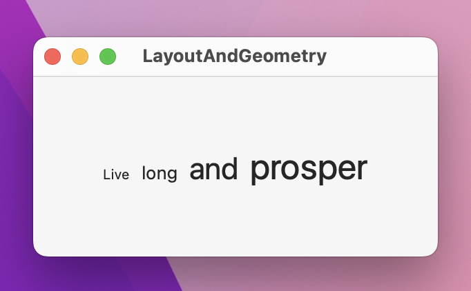
Moving on, for more fine-grained control we can customize what “alignment” means for each individual view. To get a really good idea of how this works we’re going to start with this code:
struct ContentView: View {
    var body: some View {
        VStack(alignment: .leading) {
            Text("Hello, world!")
            Text("This is a longer line of text")
        }
        .background(.red)
        .frame(width: 400, height: 400)
        .background(.blue)
    }
}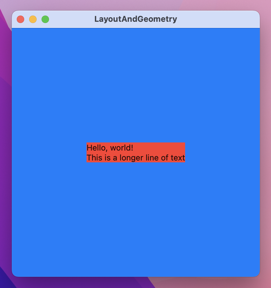
When that runs you’ll see the VStack sits tightly around its two text views with a red background. The two text views have different lengths, but because we used the .leading alignment they will both be aligned to their left edge in a left-to-right environment. Outside of that there’s a larger frame that has a blue background. Because the frame is larger than the VStack, the VStack is centered in the middle.
Now, when the VStack comes to aligning each of those text views, it asks them to provide their leading edge. By default this is obvious: it uses either the left or right edge of the view, depending on the system language. But what if we wanted to change that – what if we wanted to make one view have a custom alignment?
SwiftUI provides us with the alignmentGuide() modifier for just this purpose. This takes two parameters: the guide we want to change, and a closure that returns a new alignment. The closure is given a ViewDimensions object that contains the width and height of its view, along with the ability to read its various edges.
By default, the .leading alignment guide for a view is its leading alignment guide – I know that sounds obvious, but its effectively equivalent to this:
VStack(alignment: .leading) {
    Text("Hello, world!")
        .alignmentGuide(.leading) { d in d[.leading] }
    Text("This is a longer line of text")
}
We could rewrite that alignment guide to use the view’s trailing edge for its leading alignment guide, like this:
VStack(alignment: .leading) {
    Text("Hello, world!")
        .alignmentGuide(.leading) { d in d[.trailing] }
    Text("This is a longer line of text")
}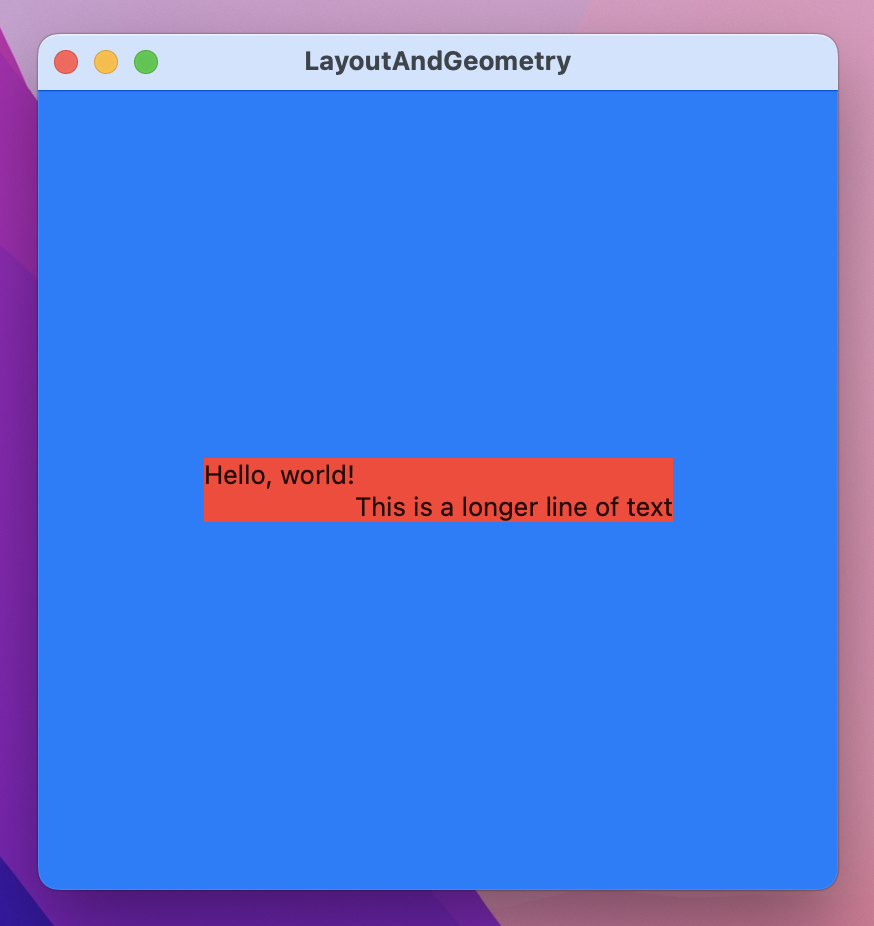
And now you’ll see why I added colors: the first text view will move to the left so that its right edge sits directly above the left edge of the view below, the VStack will expand to contain it, and the whole thing will still be centered within the blue frame.
This result is different from using the offset() modifier: if you offset a text its original dimensions don’t actually change, even though the resulting view is rendered in a different location. If we had offset the first text view rather than changing its alignment guide, the VStack wouldn’t expand to contain it.
Although the alignment guide closure is passed your view’s dimensions, you don’t need to use them if you don’t want to – you can send back a hard-coded number, or create some other calculation. For example, this creates a tiered effect for 10 text views by multiplying their position by -10:
VStack(alignment: .leading) {
    ForEach(0..<10) { position in
        Text("Number \(position)")
            .alignmentGuide(.leading) { _ in Double(position) * -10 }
    }
}
.background(.red)
.frame(width: 400, height: 400)
.background(.blue)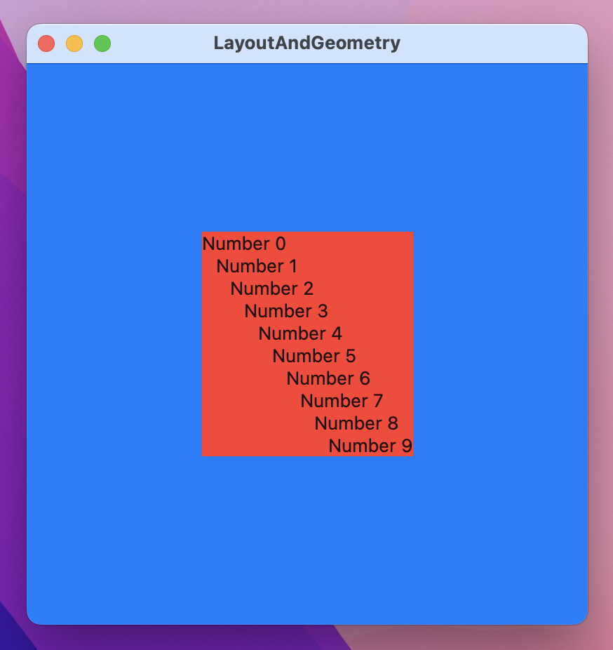
For complete control over your alignment guides you need to create a custom alignment guide. And I think that deserves a mini chapter all of its own…
SwiftUI gives us alignment guides for the various edges of our views (.leading, trailing, top, and so on) plus .center and two baseline options to help with text alignment. However none of these work well when you’re working with views that are split across disparate views – if you have to make two views aligned the same when they are in entirely different parts of your user interface.
To fix this, SwiftUI lets us create custom alignment guides, and use those guides in views across our UI. It doesn’t matter what comes before or after these views; they will still line up.
For example, here’s a layout that shows my Twitter account name and my profile picture on the left, and on the right shows “Full name:” plus “Paul Hudson” in a large font:
struct ContentView: View {
    var body: some View {
        HStack {
            VStack {
                Text("@twostraws")
                Image("paul-hudson")
                    .resizable()
                    .frame(width: 64, height: 64)
            }

            VStack {
                Text("Full name:")
                Text("PAUL HUDSON")
                    .font(.largeTitle)
            }
        }
        .frame(width: 800, height: 800)
    }
}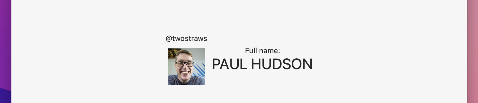
If you want “@twostraws” and “Paul Hudson” to be vertically aligned together, you’ll have a hard time right now. The horizontal stack contains two vertical stacks inside it, so there’s no built-in way to get the alignment you want – things like HStack(alignment: .top) just won’t come close.
To fix this we need to define a custom layout guide. This should be an extension on either VerticalAlignment or HorizontalAlignment, and be a custom type that conforms to the AlignmentID protocol.
When I say “custom type” you might be thinking of a struct, but it’s actually a good idea to implement this as an enum instead as I’ll explain shortly. The AlignmentID protocol has only one requirement, which is that the conforming type must provide a static defaultValue(in:) method that accepts a ViewDimensions object and returns a CGFloat specifying how a view should be aligned if it doesn’t have an alignmentGuide() modifier. You’ll be given the existing ViewDimensions object for the view, so you can either pick one of those for your default or use a hard-coded value.
Let’s write out the code so you can see how it looks:
extension VerticalAlignment {
    struct MidAccountAndName: AlignmentID {
        static func defaultValue(in d: ViewDimensions) -> CGFloat {
            d[.top]
        }
    }

    static let midAccountAndName = VerticalAlignment(MidAccountAndName.self)
}
You can see I’ve used the .top view dimension by default, and I’ve also created a static constant called midAccountAndName to make the custom alignment easier to use.
Now, I mentioned that using an enum is preferable to a struct, and here’s why: we just created a new struct called MidAccountAndName, which means we could (if we wanted) create an instance of that struct even though doing so doesn’t make sense because it doesn’t have any functionality. If you replace struct MidAccountAndName with enum MidAccountAndName then you can’t make an instance of it any more – it becomes clearer that this thing exists only to house some functionality.
Regardless of whether you choose an enum or a struct, its usage stays the same: set it as the alignment for your stack, then use alignmentGuide() to activate it on any views you want to align together. This is only a guide: it helps you align views along a single line, but doesn’t say how they should be aligned. This means you still need to provide the closure to alignmentGuide() that positions the views along that guide as you want.
For example, we could update our Twitter code to use .midAccountAndName, then tell the account and name to use their center position for the guide. To be clear, that means “align these two views so their centers are both on the .midAccountAndName guide”.
Here’s how that looks in code:
HStack(alignment: .midAccountAndName) {
    VStack {
        Text("@twostraws")
            .alignmentGuide(.midAccountAndName) { d in d[VerticalAlignment.center] }
        Image("paul-hudson")
            .resizable()
            .frame(width: 64, height: 64)
    }

    VStack {
        Text("Full name:")
        Text("PAUL HUDSON")
            .alignmentGuide(.midAccountAndName) { d in d[VerticalAlignment.center] }
            .font(.largeTitle)
    }
}
.frame(width: 800, height: 800)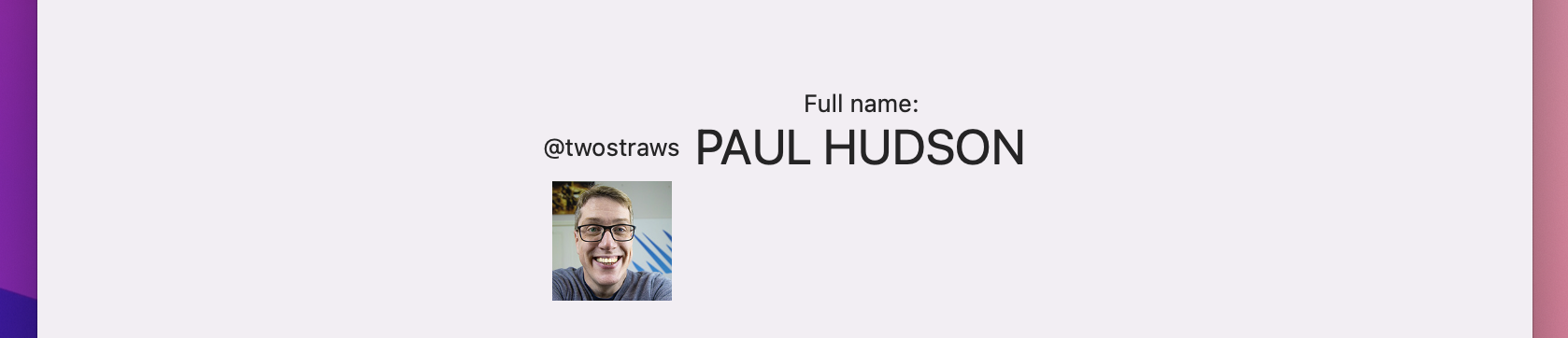
That will make sure they are vertically aligned regardless of what comes before or after. I suggest you try adding some more text views before and after our examples – SwiftUI will reposition everything to make sure the two we aligned stay that way.
SwiftUI gives us two ways of positioning views: absolute positions using position(), and relative positions using offset(). They might seem similar, but once you understand how SwiftUI places views inside frames the underlying differences between position() and offset() become clearer.
A simple SwiftUI view looks like this:
struct ContentView: View {
    var body: some View {
        Text("Hello, world!")
    }
}
SwiftUI offers the full available window space to ContentView, which in turn passes it on to the text view. The text view automatically uses only as much as space as its text needs, so it passes that back up to ContentView, which is always and exactly the same size as its body (so it directly fits around the text). As a result, SwiftUI shrinks the entire window down to the size of its text.
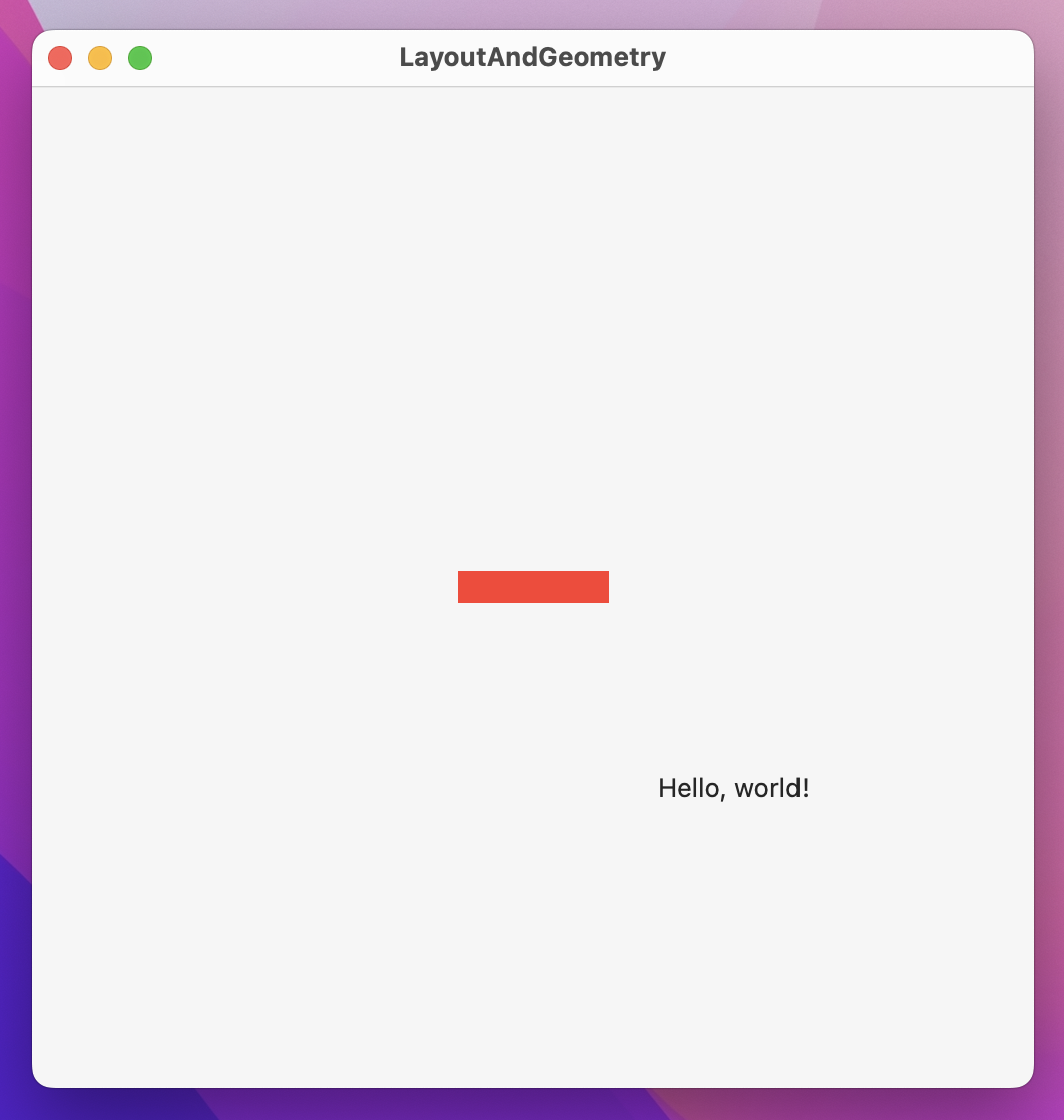
If you want to absolutely position a SwiftUI view you should use the position() modifier like this:
Text("Hello, world!")
    .position(x: 100, y: 100)
    .frame(width: 500, height: 500)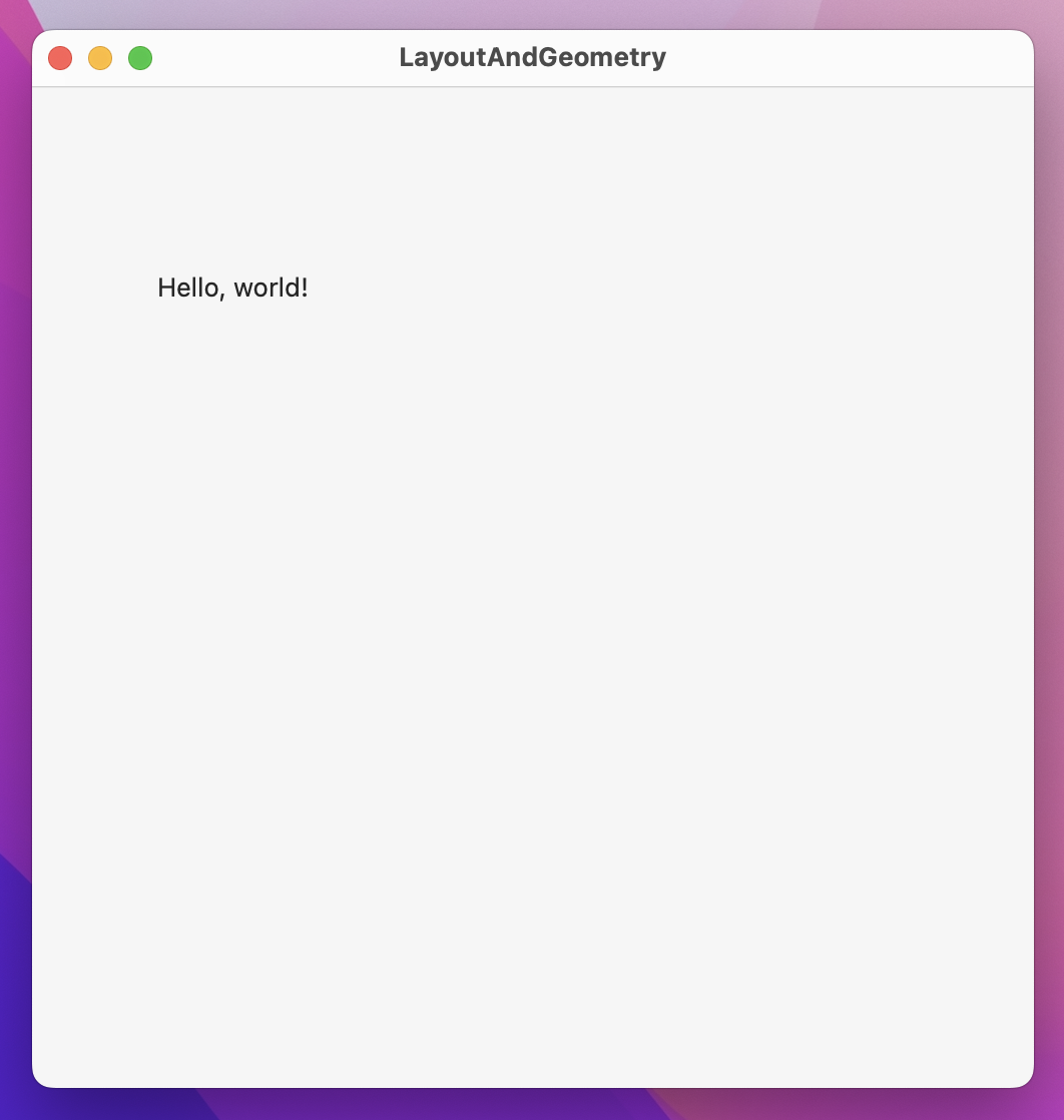
That will position the text view at x:100 y:100 within its parent. Now, to really see what’s happening here I want you to add a background color:
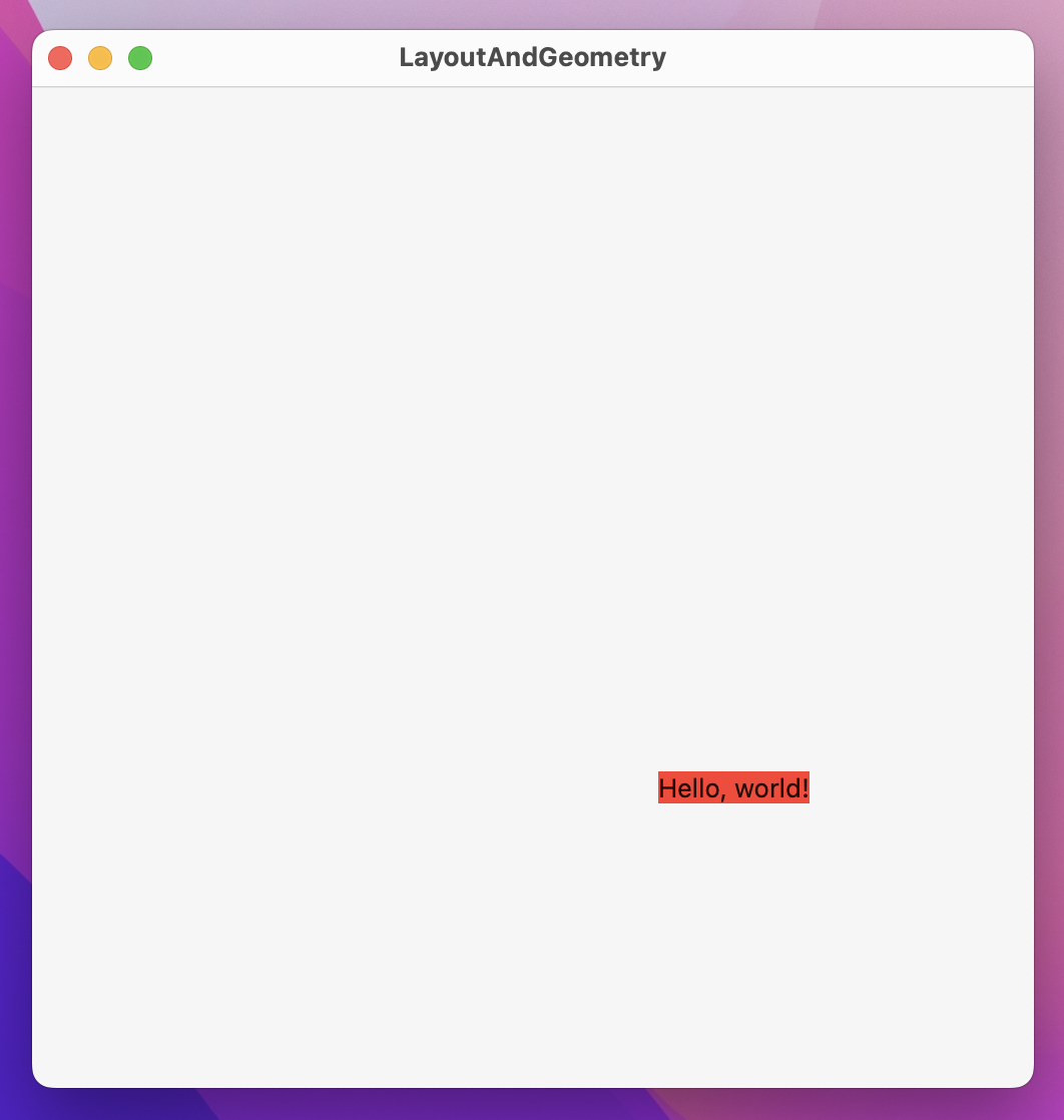
Text("Hello, world!")
    .background(.red)
    .position(x: 100, y: 100)
    .frame(width: 500, height: 500)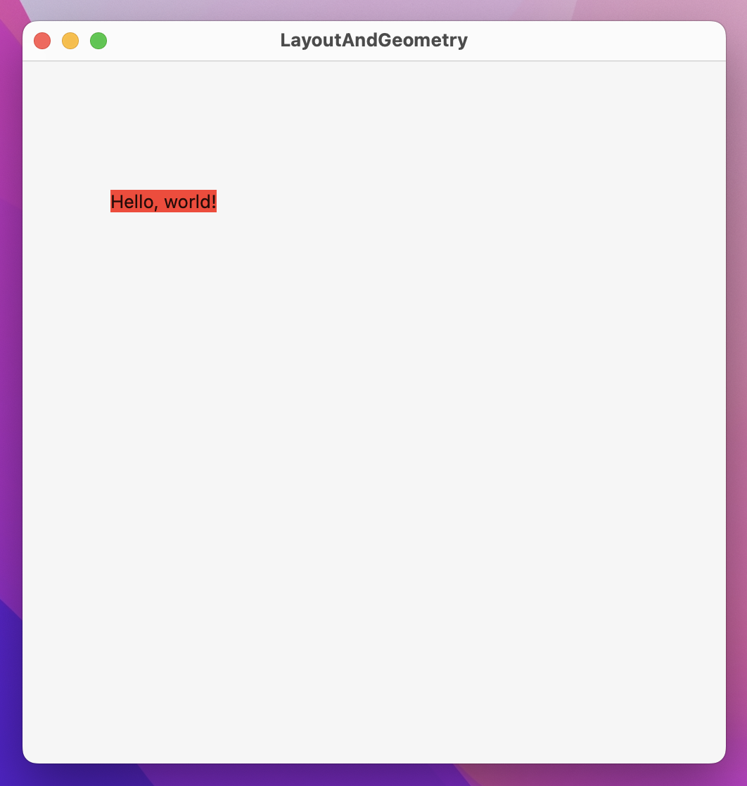
You’ll see the text has a red background tightly fitted around it. Now try moving the background() modifier below the position() modifier, like this:
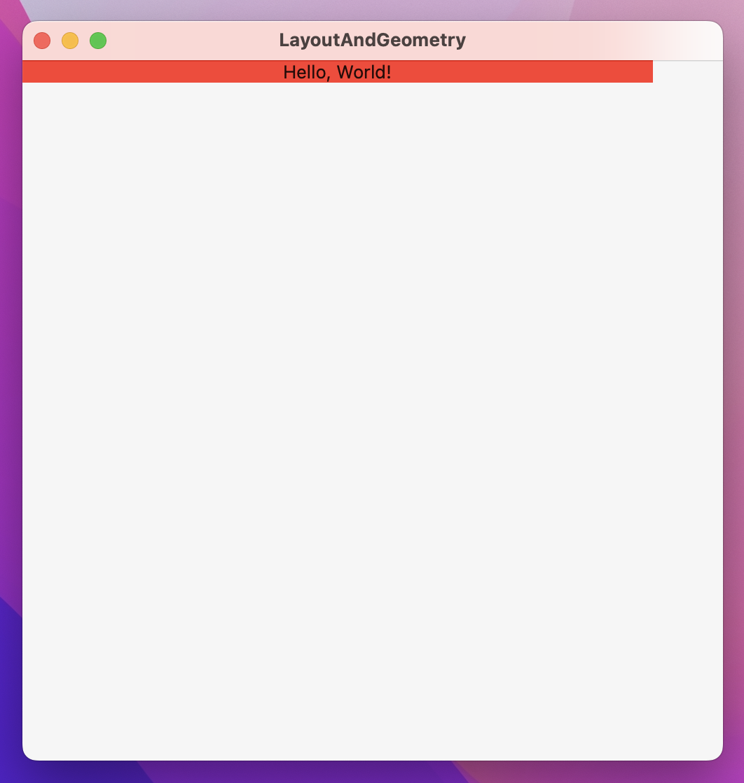
Text("Hello, world!")
    .position(x: 100, y: 100)
    .background(.red)
    .frame(width: 500, height: 500)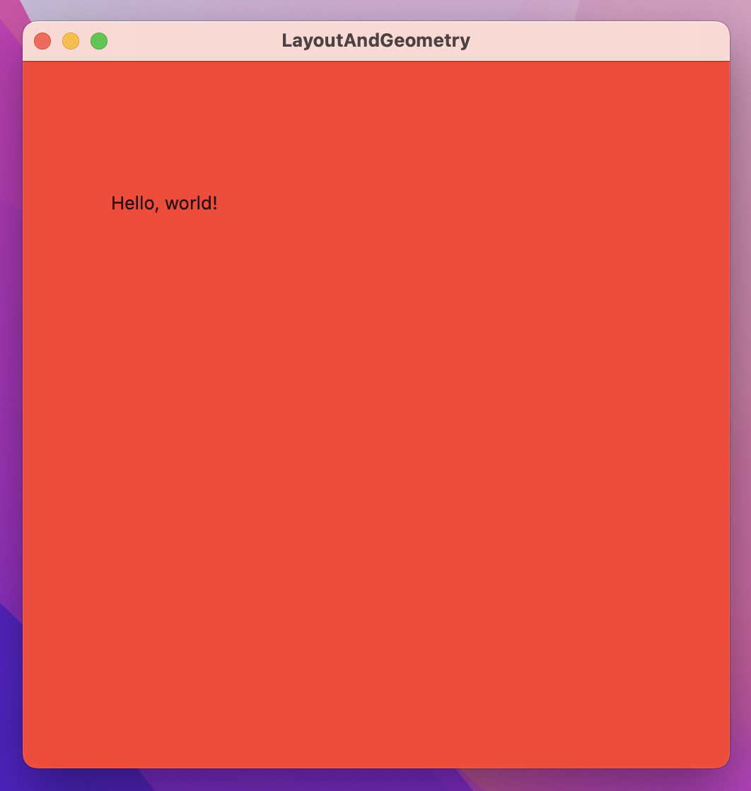
Now you’ll see the text is in the same location, but the whole window is colored red.
To understand what’s happening here you need to remember the three step layout process of SwiftUI:
So, the parent is responsible for positioning the child, not the child. This causes a problem, because we’ve just told our text view to be at an exact position – how can SwiftUI resolve this?
The answer to this is also why our background() color made the whole window red: when we use position() we get back a new view that takes up all available space, so it can position its child (the text) at the correct location.
When we use text, position, then background the position will take up all available space so it can position its text correctly, then the background will use that size for itself. When we use text, background, then position, the background will use the text size for its size, then the position will take up all available space and place the background in the correct location.
When discussing the offset() modifier earlier, I said “if you offset some text its original dimensions don’t actually change, even though the resulting view is rendered in a different location.” With that in mind, try running this code:
var body: some View {
    Text("Hello, world!")
        .offset(x: 100, y: 100)
        .background(.red)
        .frame(width: 500, height: 500)
}
You’ll see the text appears in one place and the background in another. I’m going to explain why that is, but first I want you to think about it yourself because if you understand that then you really understand how SwiftUI’s layout system works.
When we use the offset() modifier, we’re changing the location where a view should be rendered without actually changing its underlying geometry. This means when we apply background() afterwards it uses the original position of the text, not its offset. If you move the modifier order so that background() comes before offset() then things work more like you might have expected, showing once again that modifier order matters.
SwiftUI’s GeometryReader allows us to use its size and coordinates to determine a child view’s layout, and it’s the key to creating some of the most remarkable effects in SwiftUI.
You should always keep in mind SwiftUI’s three-step layout system when working with GeometryReader: parent proposes a size for the child, the child uses that to determine its own size, and parent uses that to position the child appropriately.
In its most basic usage, what GeometryReader does is let us read the size that was proposed by the parent, then use that to manipulate our view. For example, we could use GeometryReader to make a text view have 90% of all available width regardless of its content:
struct ContentView: View {
    var body: some View {
        GeometryReader { geo in
            Text("Hello, World!")
                .frame(width: geo.size.width * 0.9)
                .background(.red)
        }
        .frame(width: 500, height: 500)
    }
}
That geo parameter that comes in is a GeometryProxy, and it contains the proposed size, any safe area insets that have been applied to handle things like the notch in the MacBook Pro, plus a method for reading frame values that we’ll look at in a moment.
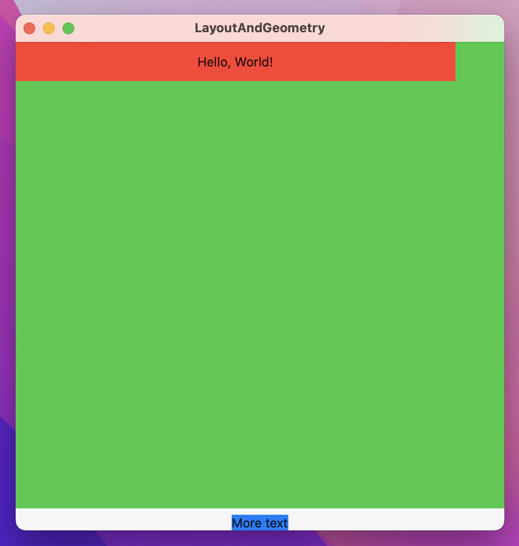
GeometryReader has an interesting side effect that might catch you out at first: the view that gets returned has a flexible preferred size, which means it will expand to take up more space as needed. You can see this in action if you place the GeometryReader into a VStack then put some more text below it, like this:
struct ContentView: View {
    var body: some View {
        VStack {
            GeometryReader { geo in
                Text("Hello, World!")
                    .frame(width: geo.size.width * 0.9, height: 40)
                    .background(.red)
            }

            Text("More text")
                .background(.blue)
        }
        .frame(width: 500, height: 500)
    }
}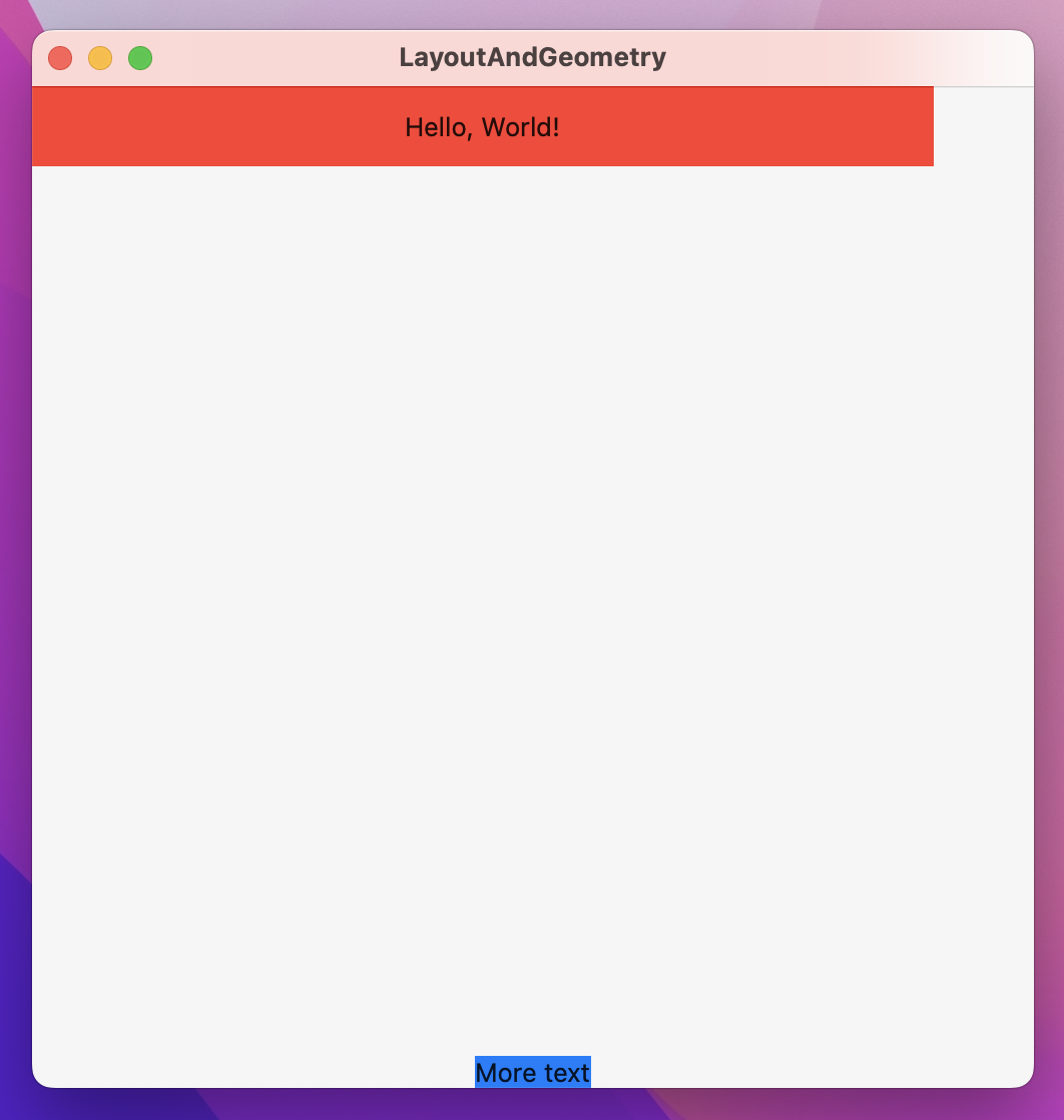
You’ll see “More text” gets pushed right to the bottom of the window, because the GeometryReader takes up all remaining space. To see it in action, add background(.green) as a modifier to the GeometryReader and you’ll see just how big it is. Note: This is a preferred size, not an absolute size, which means it’s still flexible depending on its parent.
When it comes to reading the frame of a view, GeometryProxy provides a frame(in:) method rather than simple properties. This is because the concept of a “frame” includes X and Y coordinates, which don’t make any sense in isolation – do you want the view’s absolute X and Y coordinates, or their X and Y coordinates compared to their parent?
SwiftUI calls these options coordinate spaces, and those two in particular are called the global space (measuring our view’s frame relative to the whole window), and the local space (measuring our view’s frame relative to its parent). We can also create custom coordinate spaces by attaching the coordinateSpace() modifier to a view – any children of that can then read its frame relative to that coordinate space.
To demonstrate how coordinate spaces work, we could create some example views in various stacks, attach a custom coordinate space to the outermost view, then add an onTapGesture to one of the views inside it so it can print out the frame globally, locally, and using the custom coordinate space.
Try this code:
struct OuterView: View {
    var body: some View {
        VStack {
            Text("Top")
            InnerView()
                .background(.green)
            Text("Bottom")
        }
    }
}

struct InnerView: View {
    var body: some View {
        HStack {
            Text("Left")
            GeometryReader { geo in
                Text("Center")
                    .background(.blue)
                    .onTapGesture {
                        print("Global center: \(geo.frame(in: .global).midX) x \(geo.frame(in: .global).midY)")
                        print("Custom center: \(geo.frame(in: .named("Custom")).midX) x \(geo.frame(in: .named("Custom")).midY)")
                        print("Local center: \(geo.frame(in: .local).midX) x \(geo.frame(in: .local).midY)")
                    }
            }
            .background(.orange)
            Text("Right")
        }
    }
}

struct ContentView: View {
    var body: some View {
        OuterView()
            .background(.red)
            .coordinateSpace(name: "Custom")
    }
}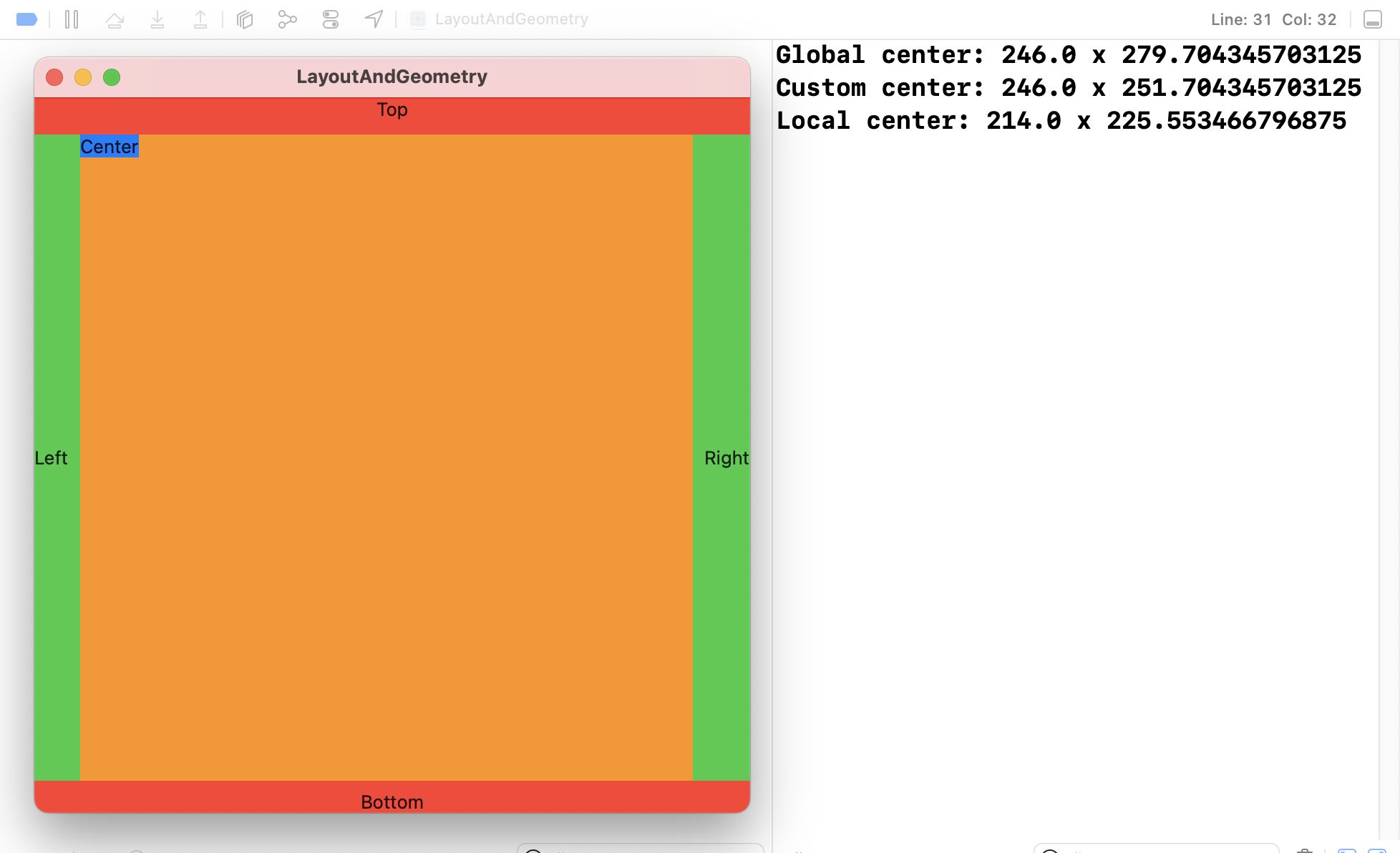
The output you get when that code runs depends on the window size you have, but here’s what I got:
Those sizes are mostly different, so hopefully you can see the full range of how these frame work:
OuterView because we attach it in ContentView. This number matches the global position because OuterView runs edge to edge horizontally.OuterView.GeometryReader.GeometryReader.Which coordinate space you want to use depends on what question you want to answer:
When we use the frame(in:) method of a GeometryProxy, SwiftUI will calculate the view’s current position in the coordinate space we ask for. However, as the view moves those values will change, and SwiftUI will automatically make sure GeometryReader stays updated.
Previously we used DragGesture to store a width and height as an @State property, because it allowed us to adjust other properties based on the drag amount to create neat effects. However, with GeometryReader we can grab values from a view’s environment dynamically, feeding in its absolute or relative position into various modifiers. Even better, you can nest geometry readers if needed, so that one can read the geometry for a higher-up view and the other can read the geometry for something further down the tree.
To try some effects with GeometryReader, we could create a spinning helix effect by creating 50 text views in a vertical scroll view, each of which having an infinite maximum width so they take up all the window space, then apply a 3D rotation effect based on their own position.
Start by making a basic ScrollView of text views with varying background colors:
struct ContentView: View {
    let colors: [Color] = [.red, .green, .blue, .orange, .pink, .purple, .yellow]

    var body: some View {
        ScrollView {
            ForEach(0..<50) { index in
                GeometryReader { geo in
                    Text("Row #\(index)")
                        .font(.title)
                        .frame(maxWidth: .infinity)
                        .background(colors[index % 7])
                }
                .frame(height: 40)
            }
        }
    }
}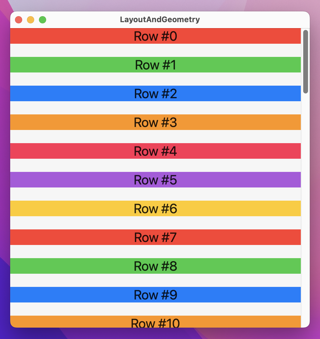
To apply a helix-style spinning effect, place this rotation3DEffect() directly below the background() modifier:
.rotation3DEffect(.degrees(geo.frame(in: .global).minY / 5), axis: (x: 0, y: 1, z: 0))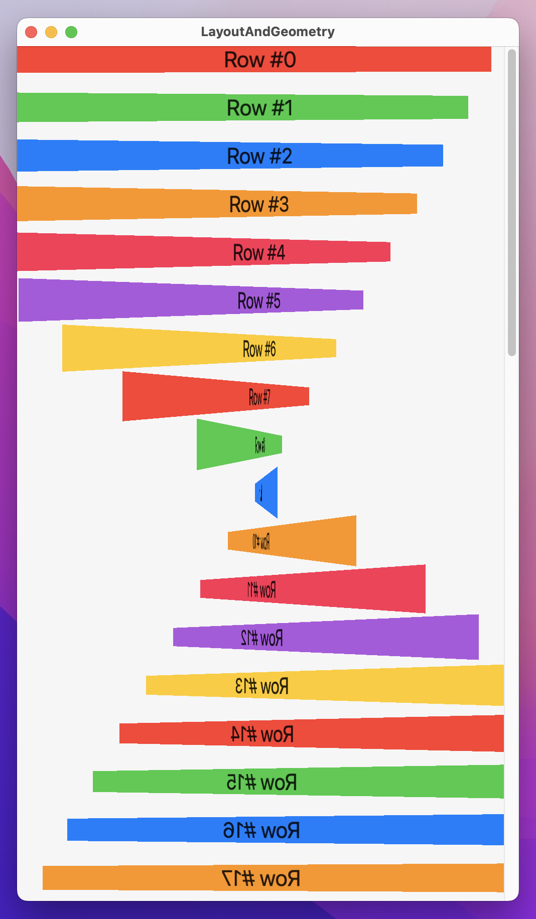
When you run that back you’ll see that text views at the bottom of the window are flipped, those at the center are rotated about 90 degrees, and those at the very top are normal. More importantly, as you scroll around they all rotate as you move in the scroll view.
That’s a neat effect, but it’s also problematic because the views only reach their natural orientation when they are at the very top – it’s really hard to read. To fix this, we can apply a more complex rotation3DEffect() that subtracts half the height of the main view, but that means using a second GeometryReader to get the size of the main view:
struct ContentView: View {
    let colors: [Color] = [.red, .green, .blue, .orange, .pink, .purple, .yellow]

    var body: some View {
        GeometryReader { fullView in
            ScrollView {
                ForEach(0..<50) { index in
                    GeometryReader { geo in
                        Text("Row #\(index)")
                            .font(.title)
                            .frame(maxWidth: .infinity)
                            .background(colors[index % 7])
                            .rotation3DEffect(.degrees(geo.frame(in: .global).minY - fullView.size.height / 2) / 5, axis: (x: 0, y: 1, z: 0))
                    }
                    .frame(height: 40)
                }
            }
        }
    }
}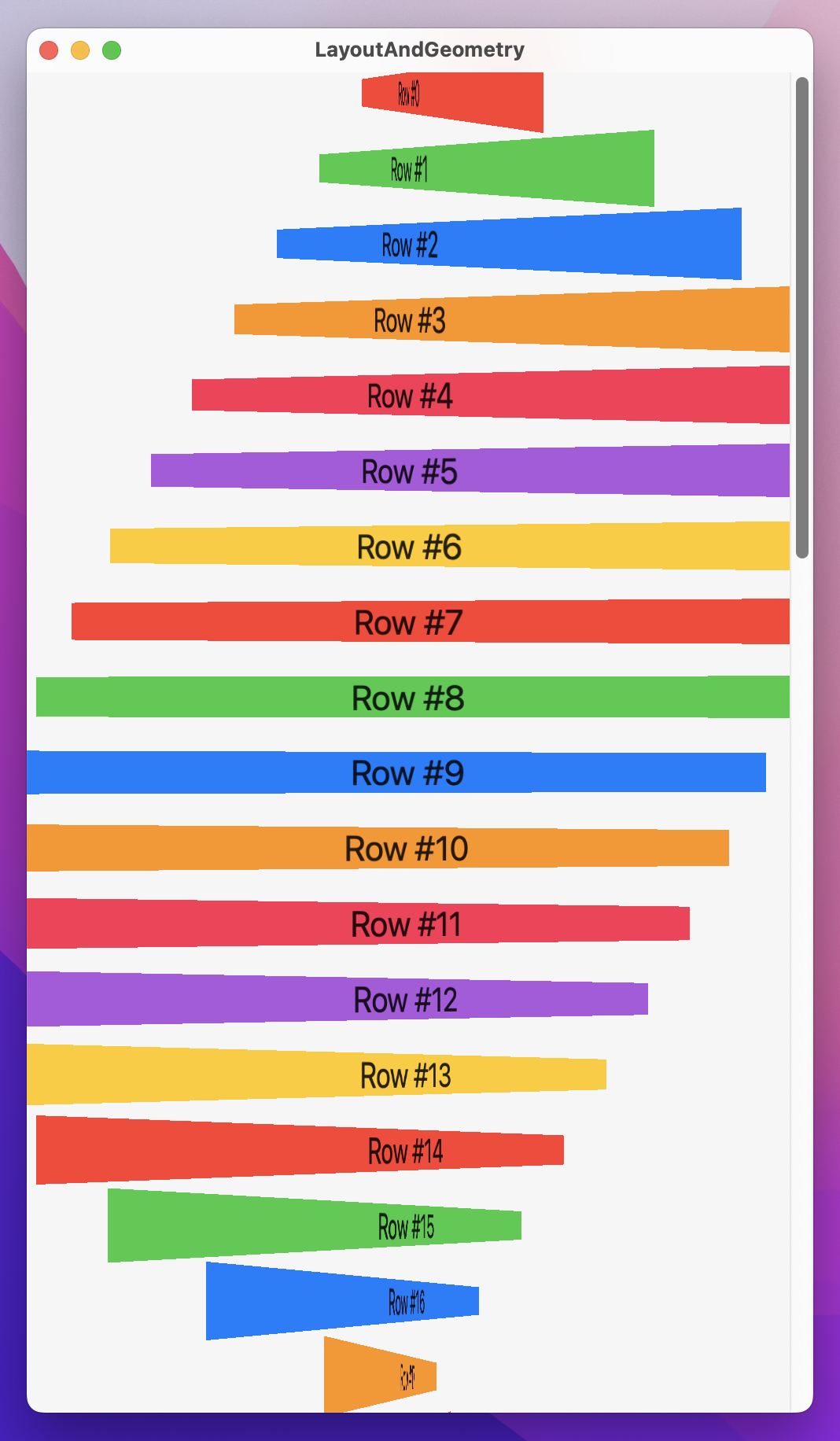
With that in place, the views will reach a natural orientation nearer the center of the window, which will look better.
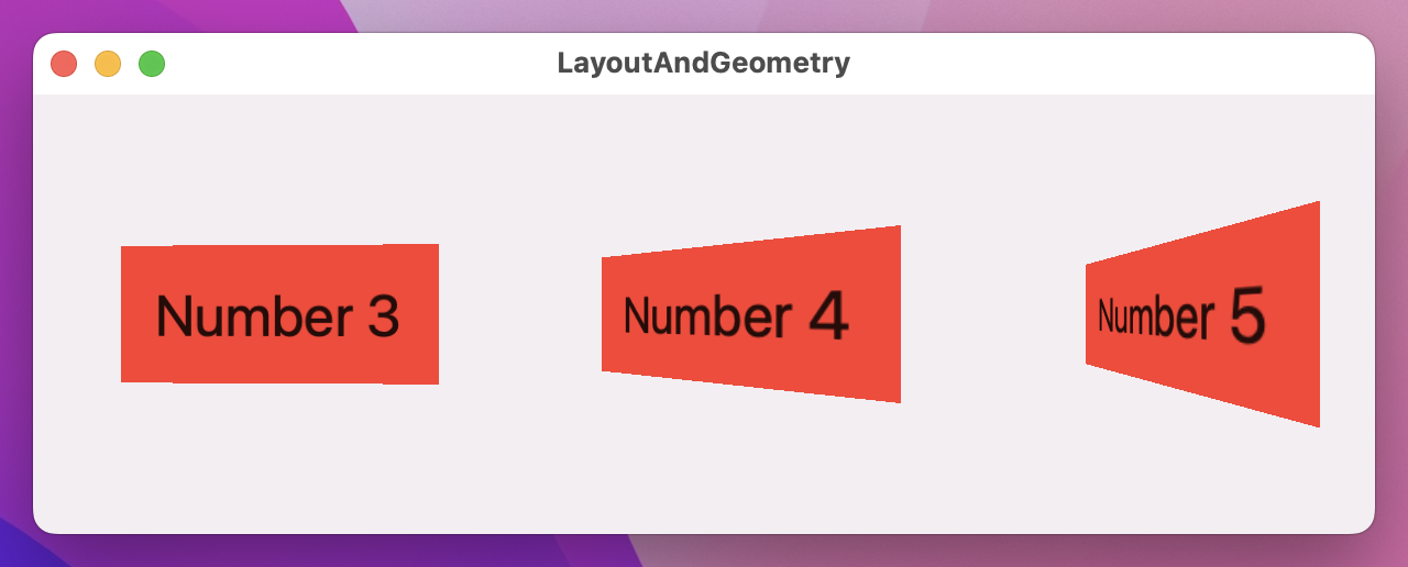
We can use a similar technique to create CoverFlow-style scrolling rectangles:
struct ContentView: View {
    var body: some View {
        ScrollView(.horizontal, showsIndicators: false) {
            HStack(spacing: 0) {
                ForEach(1..<20) { num in
                    GeometryReader { geo in
                        Text("Number \(num)")
                            .font(.largeTitle)
                            .padding()
                            .background(.red)
                            .rotation3DEffect(.degrees(-geo.frame(in: .global).minX) / 8, axis: (x: 0, y: 1, z: 0))
                            .frame(width: 200, height: 200)
                    }
                    .frame(width: 200, height: 200)
                }
            }
        }
    }
}
There are so many interesting and creative ways to make special effects with GeometryReader – I hope you can take the time to experiment!
I hope this smaller technique project proved a welcome break after our long app projects, but I hope even more that you’re really starting to have a good mental model of how SwiftUI’s layout system works. That three step layout system might sound simple, but it takes time to fully understand the ramifications it has.
As for GeometryReader, it’s one of those things you can get by perfectly fine without even thinking about, and that’s fine. But when you want to add a little pizazz to your designs – when you want to really bring something to life as the user interacts with it – GeometryReader is a fast and flexible fix that offers a huge amount of power in only a handful of lines of code.
Here are three challenges for you to complete to experiment with your knowledge of GeometryReader.
First, put your ContentView back to the spinning color rows example we had:
struct ContentView: View {
    let colors: [Color] = [.red, .green, .blue, .orange, .pink, .purple, .yellow]

    var body: some View {
        GeometryReader { fullView in
            ScrollView(.vertical) {
                ForEach(0..<50) { index in
                    GeometryReader { geo in
                        Text("Row #\(index)")
                            .font(.title)
                            .frame(maxWidth: .infinity)
                            .background(colors[index % 7])
                            .rotation3DEffect(.degrees(geo.frame(in: .global).minY - fullView.size.height / 2) / 5, axis: (x: 0, y: 1, z: 0))
                    }
                    .frame(height: 40)
                }
            }
        }
    }
}
With that done:
Color(hue:saturation:brightness:) initializer, feeding in varying values for the hue.Each of those will require a little trial and error from you to find values that work well. Regardless, you should use max() to handle the scaling so that views don’t go smaller than half their size, and use min() with the hue so that hue values don’t go beyond 1.0.
Copyright © 2023 Paul Hudson, hackingwithswift.com.
You should follow me on Twitter.