In this project you'll produce an application that lets users scroll through a list of images, then select one to view. It's deliberately simple, because there are many other things you'll need to learn along the way, so strap yourself in – this is going to be long!
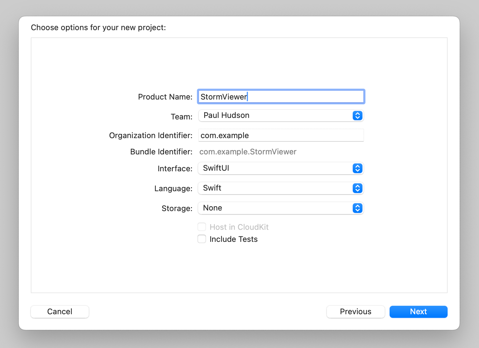
Let’s get started: launch Xcode, and choose "Create a new project" from the welcome screen. You’ll be asked to choose a template for the new project, so please choose macOS > App, then click Next.
For Product Name enter StormViewer, then make sure you have Swift selected for language and SwiftUI for interface. This screen contains some checkboxes that affect what kind of template you’re given. None of the projects in this book use these features, so leave them all unchecked.
One of the fields you'll be asked for is "Organization Identifier", which is a unique identifier usually made up of your personal website domain name in reverse. For example, I would use com.hackingwithswift if I were making an app. You'll need to put something valid in there if you're deploying to devices, but otherwise you can just use com.example.
Now click Next again and you'll be asked where you want to save the project – your desktop is fine. Once that's done, you'll be presented with the example project that Xcode made for you.
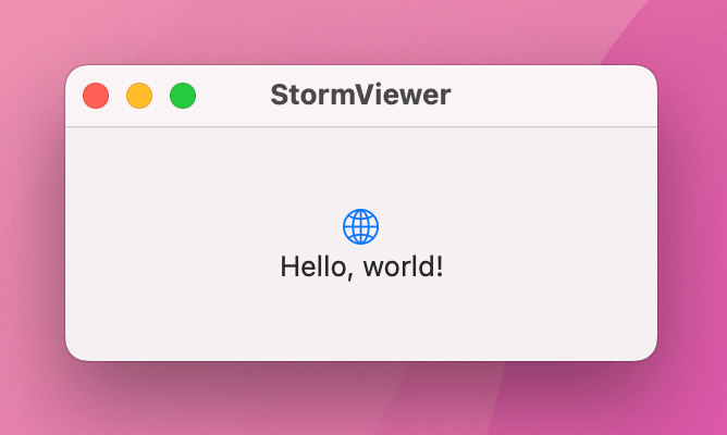
The first thing we need to do is make sure you have everything set up correctly, and that means running the project as-is: look for the Play triangle button near the top-left of the Xcode window, and click it now. This will compile your code, which is the process of converting it to instructions that your computer can understand, then launch the app.
As you'll see when you interact with the app, our “app” just shows a small window saying “Hello, world!” with a globe icon above it – it does nothing at all, at least not yet. You can resize it, move it around, minimize it, or even make it full screen; it's just a regular macOS app window.
You'll be starting and stopping projects a lot as you learn, so there are three basic tips you need to know:
This project is all about letting users select images to view, so you're going to need to import some pictures. You should have downloaded the project files for this book already, but if you haven’t please get them from here: https://github.com/twostraws/macOS
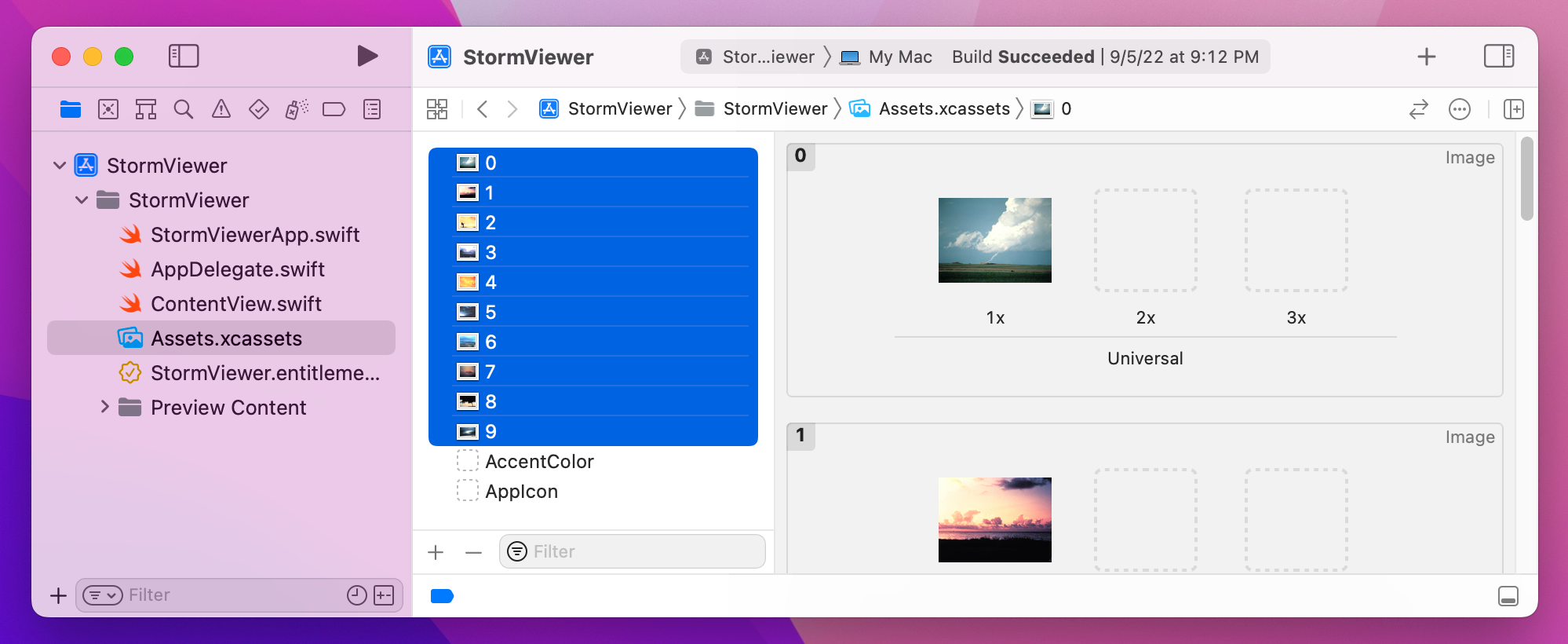
If you look in the project1-files directory you’ll see the collection of JPEG files that we’ll be using for this project. These need to be copied into your project, but in a very precise way thanks to the way macOS handles image assets.
On the left of your Xcode window you’ll see a list of files in your project, one of which is called “Assets.xcassets”. This is your asset catalog, which is where you need to store all the images you want to use in your project. When Xcode builds the project this asset catalog is automatically built too, and it optimizes the images for maximum performance when you deploy through the App Store.
Select the asset catalog now, and you should see a couple of placeholder assets like “AppIcon” and “AccentColor”. I’d like you to drag all 10 image assets from Finder into the asset catalog now, which means they are ready for us to use in the project.
Now that we have some data to work with, I want you to open ContentView.swift so we can start using it. This file is the default in all SwiftUI projects on all platforms, and provides a simple SwiftUI layout that produces the “Hello, world!” text you saw earlier.
You should see something like this:
struct ContentView: View {
    var body: some View {
        VStack {
            Image(systemName: "globe")
                .imageScale(.large)
                .foregroundStyle(.tint)
            Text("Hello, world!")
        }
        .padding()
    }
}
There are lots of small but important things in there, so let me break it down quickly:
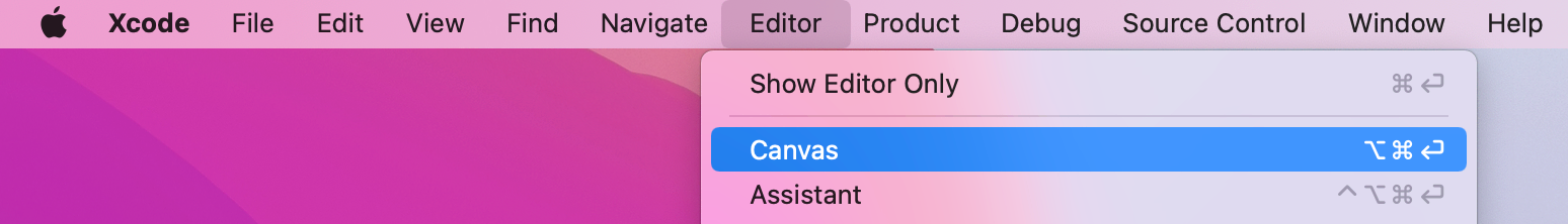
ContentView. All our SwiftUI layouts are structs because behind the scenes these are simpler and faster for the system to create and manage.View protocol. In SwiftUI anything that renders content must conform to the View protocol so that it can tell SwiftUI what it draws.body, which is the only requirement of the View protocol. This is where you create your layouts.some View, which means “this view will itself return some sort of views” – it might be images, text, sliders, buttons, and so on, but ultimately every view must return something to draw.VStack – a vertical stack of child views – that contains an image and some text.imageScale() to make the image larger, foregroundStyle() to make the image a different color, and padding() to add some spacing around a view so that other views don’t butt up directly against it. In SwiftUI we call these modifiers, because they modify the way our views look or work. It’s common to have many modifiers stacked up for a single view.Below that view struct is more code that creates a preview of your view, and is designed to show you a live preview of your layouts while you work – that’s the canvas on the right of your code. You can show or hide this canvas by going to the Editor menu and clicking Canvas.
Over time you’ll learn more about how these work and what their subtleties are, but for now you know enough to continue.
Now, in this app we’re going to show a list of pictures for the user to choose from, then show individual pictures zoomed large when one is chosen. This split approach is a very common layout on macOS: you see it in Finder, in Apple Music, in Keynote, and even in Xcode, so it makes sense to tackle it first.
In SwiftUI, we can get this horizontal split behavior using a new view type called HSplitView. When you place one of these, you can go ahead and add two child views to represent the left and right side of your split.
So, we might start with something like this:
struct ContentView: View {
    var body: some View {
        HSplitView {
            Text("Left")
            Text("Right")
        }
    }
}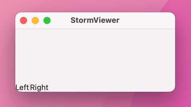
That creates the HSplitView with Left and Right text views inside. If you run the app you’ll see both text views should appear, although it’s not really apparent what the split view is actually adding here.
To make things significantly better, we’re going to add a modifier to each of those text views called frame(). You already met the padding() modifier, which adds a fixed amount of space around a view, but frame() lets us provide rules for how big each view should be. Sometimes these rules are fixed – “I want this text view to be exactly 200 points wide”, for example, but you can also provide minimum and maximum values to allow for flexibility.
Here we’re going to make both our text views have completely flexible width and height – modify your code to this:
HSplitView {
    Text("Left")
        .frame(maxWidth: .infinity, maxHeight: .infinity)

    Text("Right")
        .frame(maxWidth: .infinity, maxHeight: .infinity)
}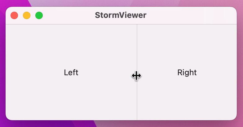
And now when you run the app again things should look a lot better because you can drag the splitter pane that divides the two pieces of text, adjusting how much space each side gets inside the window.
All our work so far has led to something that looks only fractionally different from the gray window we had straight out of the Xcode template. However, things are about to get a bit more interesting: we’re going to start showing some dynamic information in our user interface.
We’re going to start with the left-hand pane of our split view first. This is going to contain a list of pictures for the user to choose from, and in SwiftUI that’s handled by a component called List.
Lists can work with a fixed range of data for times when you want to display static data, they can use ranges when you need to repeat something multiple times, or they can use wholly dynamic data such as a list of student names in a classroom.
Let’s try each of those out there so you can see how they work, starting with static data. Replace your “Left” text view and its frame() modifier with this:
List {
    Text("Row 1")
    Text("Row 2")
    Text("Row 3")
    Text("Row 4")
    Text("Row 5")
}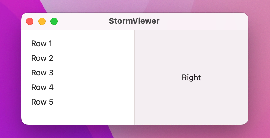
Unlike Text, List doesn’t need a frame() modifier because it automatically resizes to take up all the available space.
Now let’s try recreating the same list using a range:
List(1..<6) { number in
    Text("Row \(number)")
}
What’s happening here is quite complex behind the scenes: List takes a closure as its last parameter, which will be called once for every row in the list and is our chance to decide what should go in each row – that’s what the number in is telling us.
When that new code runs it will produce exactly the same list as the static version, except obviously it’s a lot less code!
Let’s look at the third example now: displaying names from an array. First, add this new property to the ContentView struct:
let names = ["Amy", "Charles", "Jake", "Rosa"]Now change your List code to this:
List(names, id: \.self) { name in
    Text(name)
}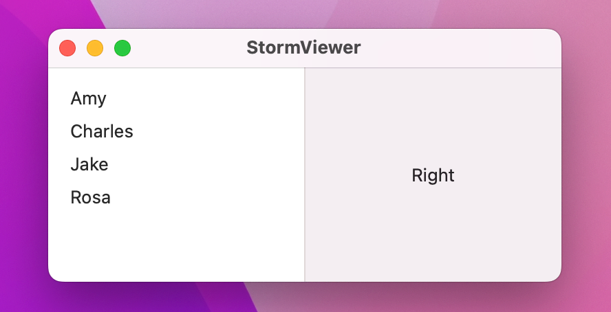
That’s a bit similar to the range List, but there’s an important change: id: \.self. This is important, and in fact it’s so important it deserves some bold:
This is important.
When we create fixed views – when we type HSplitView with a List inside, then some Text, etc – SwiftUI can see at compile time exactly how our view hierarchy looks, which means it knows exactly which views are where.
In comparison, when we create dynamic views – when we loop over an array, for example – then SwiftUI doesn’t have all the information at compile time, it just knows there will be some number of views being laid out when the code runs.
In order to make sure all its animations work correctly, so that it can insert new rows in the list if a new name got added at runtime for example, SwiftUI needs to know how to identify each dynamic view uniquely. In the future I’ll show you how to create unique identifiers for your data, but here we have a simple array of strings – the only thing about each string that makes it unique is the string itself.
So, when we say List(names, id: \.self) we’re telling SwiftUI to create one row in our list for each of the names, and to give each of those rows the identifier of the name itself. With that in place, SwiftUI can now identify each part of our view hierarchy uniquely, which is exactly what it wants.
Note: By using \.self for the identifier, we’ve told SwiftUI that every one of our strings will be unique. If you try to add multiple instances of the same name it will almost certainly lead to problems in the future.
Each of those three ways of creating a list is important, and you’ll definitely be using all three extensively in the future.
You’ll also find you can combine them – you can create some rows as static, then loop over some dynamic data, then create some more static rows, and so on. This is made possible through a special view type called ForEach, which works much like the dynamic List: provide it with an array of data to loop over, along with an identifier so it knows what makes each item unique, plus a function to run for each item.
For example, we could mix static and dynamic data like this:
struct ContentView: View {
let names = ["Amy", "Charles", "Jake", "Rosa"]
var body: some View {
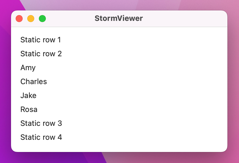
List {
Text("Static row 1")
Text("Static row 2")
ForEach(names, id: \.self) { name in
Text(name)
}
Text("Static row 3")
Text("Static row 4")
}
}
}
You’ll find ForEach is useful in lots of other places where you want to repeatedly create views – more on that later!
When you set up this project you should have copied the image assets I provided for you into your asset catalog. Well, now it’s time to put them to use and show them inside our list.
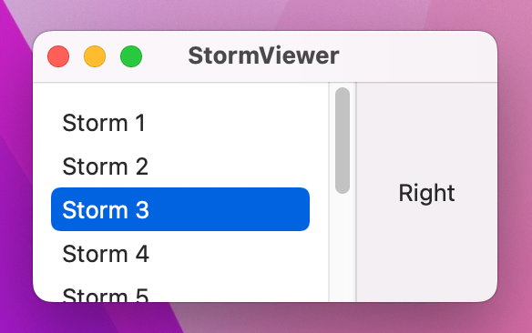
You’ve already seen how List can be created using a range, and because our images are numbered 1 through 10 we can use exactly that approach to show them all.
Replace your existing List code with this:
List(0..<10) { number in
    Text("Storm \(number + 1)")
}
That will show 10 rows, one for each storm file we added. If you run the app now you’ll see them all, but you’ll also notice you can’t actually select any of the rows – this is because we haven’t told SwiftUI that selection is even possible.
There’s a saying among SwiftUI developers that our “views are a function of their state,” but while that’s only a handful of words it might be quite meaningless to you at first.
If you were playing a fighting game, you might have lost a few lives, scored some points, collected some treasure, and perhaps picked up some powerful weapons. In programming, we call these things state – the active collection of settings that describe how the game is right now.
When we say SwiftUI’s views are a function of their state, we mean that the way your user interface looks – the things people can see and what they can interact with – are determined by the state of your program. For example, they can’t click Continue until they have entered their name in a text field.
Because program state directly affects what’s shown in your user interface, SwiftUI needs to know exactly what state you’re working with so it can watch for changes and update things as needed. This is all done using a property wrapper, which is an extra piece of code that sits around any one of your properties to add bonus functionality – in this case it’s functionality that lets SwiftUI watch for changes and update your view whenever the view changes.
In this program we need some state to track which row is currently selected, so add this now:
@State private var selectedImage: Int?That does several things all in one, so let’s break it down:
@State property wrapper marks a piece of program state that we want to change as our program runs.private to re-enforce that.selectedImage, which makes sense because it will track the image number that is selected.Just adding the new property isn’t enough to attach it to our List, though. For that we need another important feature of SwiftUI: two-way bindings.
Two-way bindings allow information to flow in two ways: from our property to the user interface, or from the user interface back to the property. In the case of our list, that means changing our property using something like selectedImage = 5 will cause the selected row to change in the UI as well, but also that clicking on a different row in the UI will cause the property’s value to be updated.
Two-way bindings in SwiftUI are marked with dollar signs before their property names, so let’s go ahead and bind the selection of our list to the selectedImage property – change your List code to this:
List(0..<10, selection: $selectedImage) { number inIf you run the app now you’ll see things are moving on, because you can now select any of the rows to have them be highlighted, or click on some empty space on the list to deselect them all.
Believe it or not, this project is almost finished! The last step is to respond to the user selecting a picture in the list and showing the relevant image in the right-hand pane of our split view.
Making this work means meeting another new SwiftUI view, along with two new modifiers. However, along the way you’ll get a much better idea of how SwiftUI responds to state changes, and why it makes our life so much easier.
Right now the right-hand side of our split view just says “Right”, but really that needs to say something more sensible – that text will be shown when the app first runs, before the user has selected any image, so a little prompt is much more useful.
Change it to this:
Text("Please select an image")
    .frame(maxWidth: .infinity, maxHeight: .infinity)
Now for the important part: when the user does select an image, we need to replace that text with the actual image they chose. This can be done with SwiftUI’s Image view, but the real question is how we know which to show – the image or the text.
Well, our selectedImage property is an optional integer, so the answer here is straightforward: if we can read a value from that property then we should be showing the image, otherwise we should be showing the text. This can be done with if let to unwrap the optional safely, so put this around your current Text prompt:
if let selectedImage = selectedImage {
    Image(String(selectedImage))
} else {
    // "Please select an image" text
}
Our selectedImage property is an integer, but SwiftUI’s Image view wants an asset name to load, so we need to convert that integer to a string. When that code runs SwiftUI will automatically look in the asset catalog for a file matching our selected number – it ignores any file extension, which means loading 1 will load our 1.png picture.
If you run the app now you’ll see something quite surprising happens: when you select a picture, the size of your window will jump to something quite different, and it’s possible the whole list on the left of the split view will disappear.
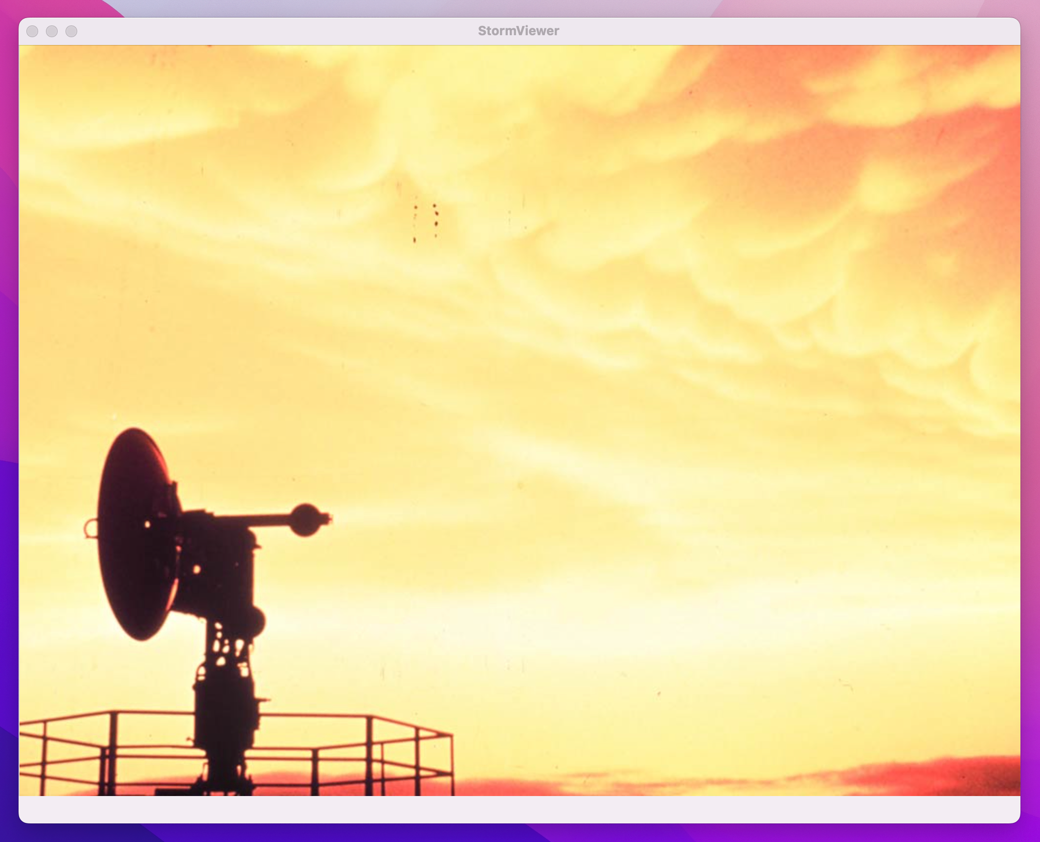
This happens because SwiftUI automatically adjusts its user interface to fit the size of its content. In this case our List has a flexible width and height by default, but the new Image that gets shown has a fixed size of whatever dimensions the image file has. So, when SwiftUI has to show the image it will first reduce the amount of space allocated to the List so that it can show more of the image, but when it runs out of space there it will just make the window larger.
This isn’t a great result: making the list disappear is a pretty grim user experience, but then forcing the window to a large size is pretty bad too.
To fix this we need to add some extra modifiers to our views, starting with the List. Like I said, this has a flexible width and height by default, but we can override that to set a minimum width or even an exact width if we want.
In this situation I think an exact width works best, because we know how much space is needed. So, add a frame() modifier to the list, like this:
List(0..<10, selection: $selectedImage) { number in
    Text("Storm \(number + 1)")
}
.frame(width: 150)
Now the window size will still jump around as different images are shown – the last image is particularly wide, for example – but at least the list never disappears now.
Next we’re going to make the image resizable, so it will take up as much space as there is currently available in the window rather than forcing it all to resize. This is done using the resizable() modifier for images, like this:
Image(String(selectedImage))
    .resizable()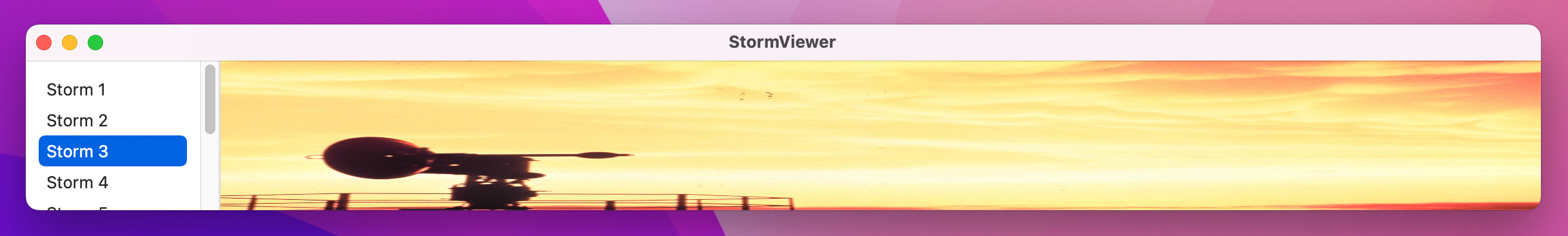
That’s fixed the window sizing problem, but if you look carefully you’ll notice it introduces a new problem: the images get squashed now! The resizable() modifier tells SwiftUI that our image has a flexible width and height, allowing it to take up all the available space in our UI. However, that also means it will stretch to fit that space even when that means changing the aspect ratio of the image – it can now be really tall and thin, for example, even though the original image wasn’t that shape.
To fix this we need another modifier. Remember when I said, “it’s common to have many modifiers stacked up for a single view”? Well, here’s a good example of that – we just stack up the modifiers to create the exact effect we want.
In this case the modifier is called scaledToFit(), which means the storm image will retain its original aspect ratio while also being resizable. In practice, this means most of the time there will be some blank space either above and below the image, or to its left and right, depending on the available space.
Change your image code to this:
Image(String(selectedImage))
.resizable()
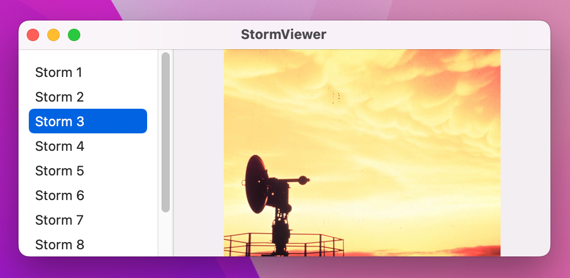
.scaledToFit()Press Cmd+R to run the app again and you should see it all behave much better – that was pretty easy, I think!
This project is done and you could stop here if you wanted. Alternatively, we can make a few small tweaks that make the whole project feel a bit more polished.
First, you might notice that you can resize the window down to almost nothing at all, which is strange. It’s common practice to enforce a sensible minimum size for your windows to avoid this problem, which in this case means attaching a minimum width and height for our split view – add this frame() to your HSplitView:
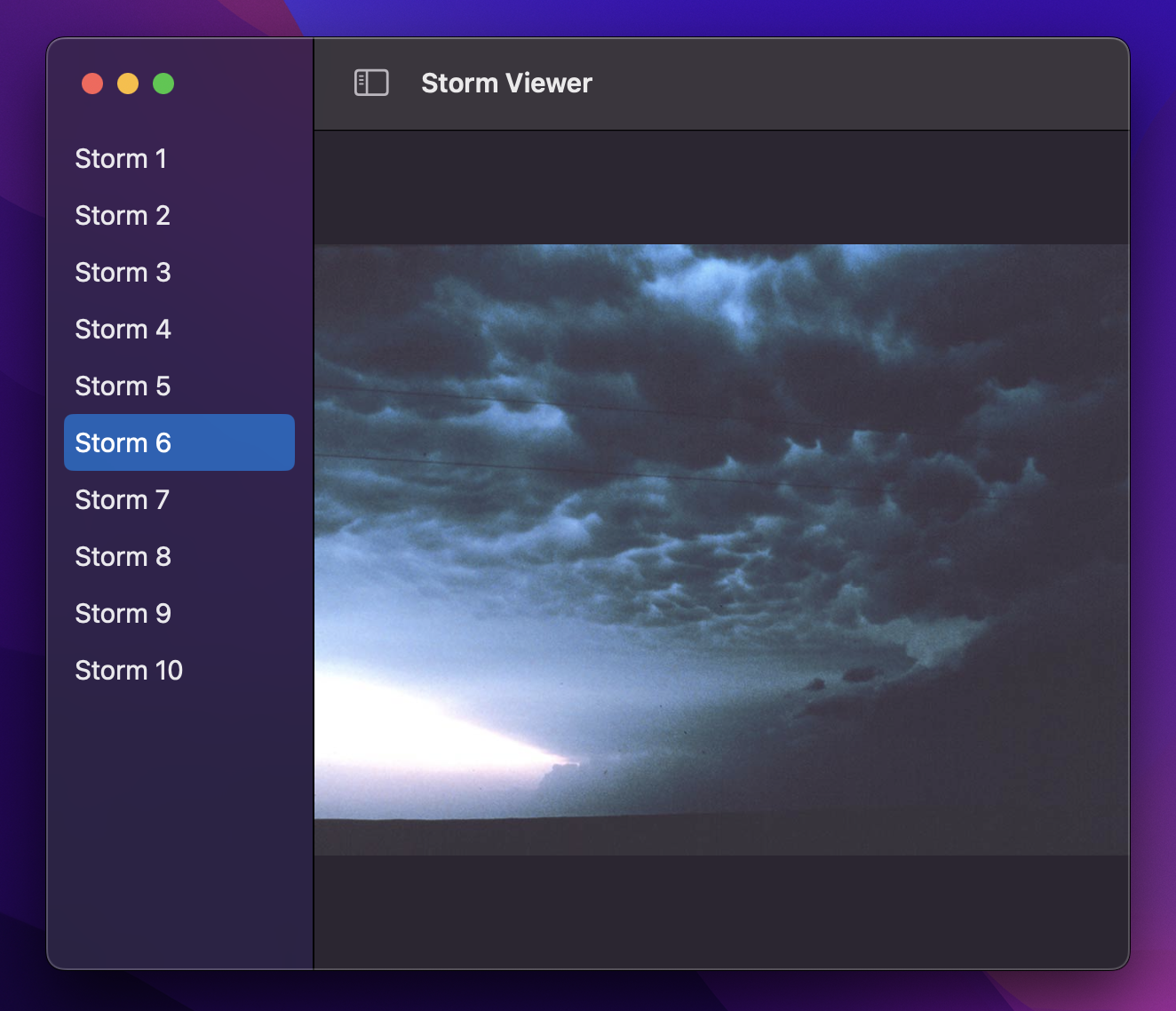
.frame(minWidth: 480, minHeight: 320)Second, compare the window title bar in our app against the window title in Xcode, Finder, and other apps – do you notice how our title bar goes all the way to the left-hand edge, whereas in the other apps the list view on the left reaches the very top of the window?
We can get the identical behavior in our app by replacing our HSplitView with a more advanced view type called NavigationSplitView. This is one of two common ways of handling navigation in SwiftUI, and allows us to present two pieces of data at the same time: a sidebar of information on the left, and detail content on the right. Think of the way Notes and Mail work for example – you select a note or an email from a list, and read its contents separately. There are many places where you’ll specifically want HSplitView rather than hierarchical navigation, but here it makes complete sense.
Making a NavigationSplitView means providing at least two closures to present the sidebar and the detail content respectively, which looks like this:
NavigationSplitView {
    // sidebar content
} detail: {
    // detail content
}
For this project, our sidebar content is the List showing the available storm pictures, and our detail content is the if let block showing either an image or a prompt to select an image, like this:
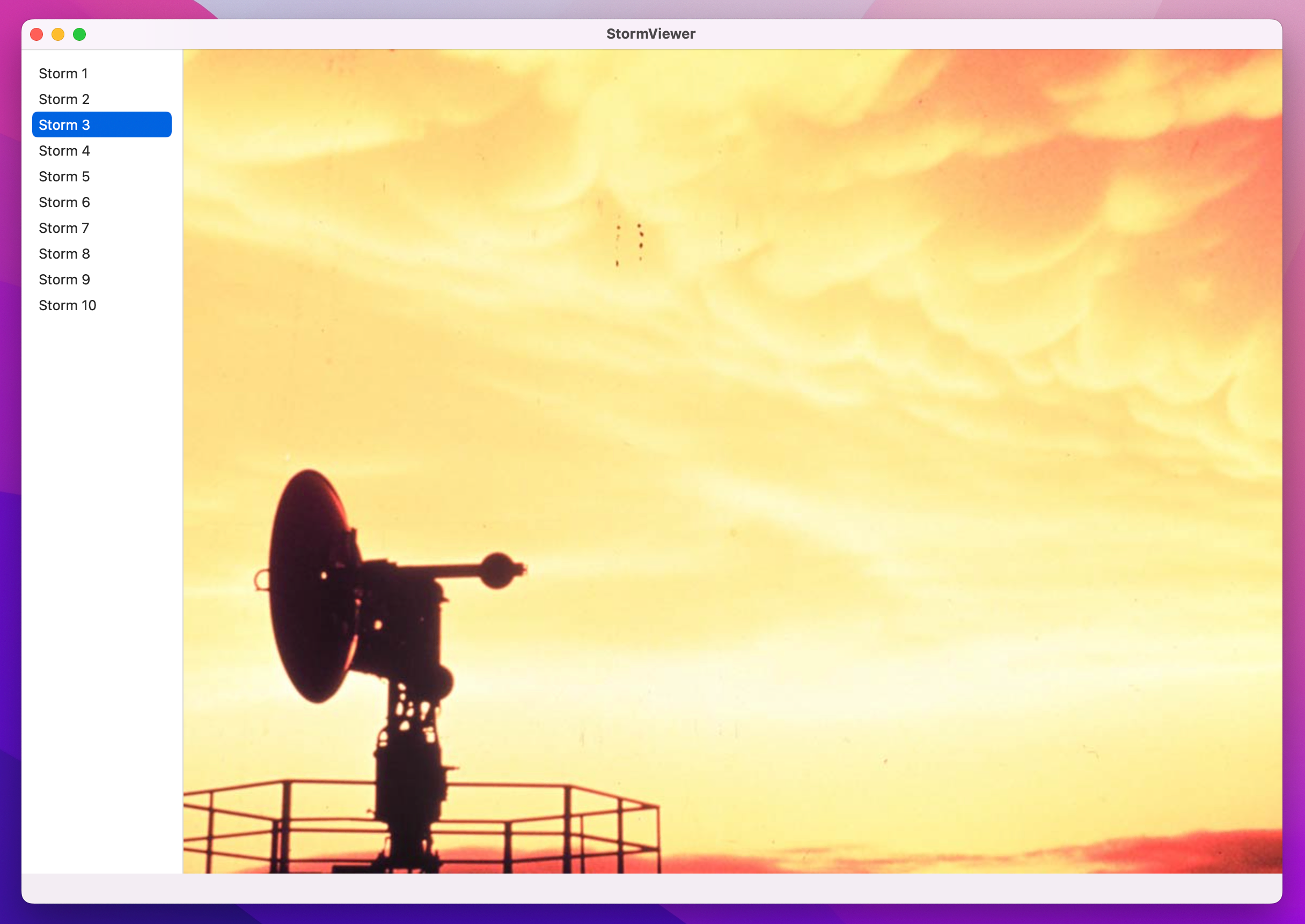
NavigationSplitView {
    List(0..<10, selection: $selectedImage) { number in
        Text("Storm \(number + 1)")
    }
    .frame(width: 150)
} detail: {
    if let selectedImage = selectedImage {
        Image(String(selectedImage))
            .resizable()
            .scaledToFit()
    } else {
        Text("Please select an image")
            .frame(maxWidth: .infinity, maxHeight: .infinity)
    }
}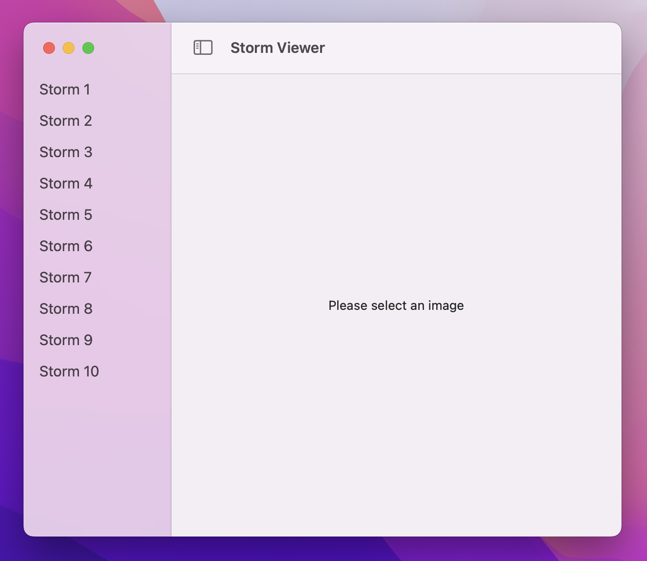
Yes, that’s all it takes – when you run the app again you’ll still see we get a vertical splitter between our views, but now our list will reach right to the top of the window.
You might also notice three further smaller changes, both of which happened automatically when we switched to NavigationSplitView:
This happens because NavigationSplitView does something that HSplitView can’t: it assigns meaning to our views. When you have a simple split view you’re just telling macOS that two views should be side by side, but with a navigation split view you’re explicitly creating a primary/secondary layout – the view on the left contains a list of options, and selecting one of those options shows it in detail in the view on the right.
Now that we’re using NavigationSplitView, SwiftUI automatically recognizes that our list view is the primary view for our window, so it gives it a special style called sidebar. You can get this same behavior with HSplitView if you want by adding the .listStyle(.sidebar) modifier to your list, but that’s done automatically with NavigationSplitView – SwiftUI silently adapts the way the list looks based on how it’s used, which is really helpful.
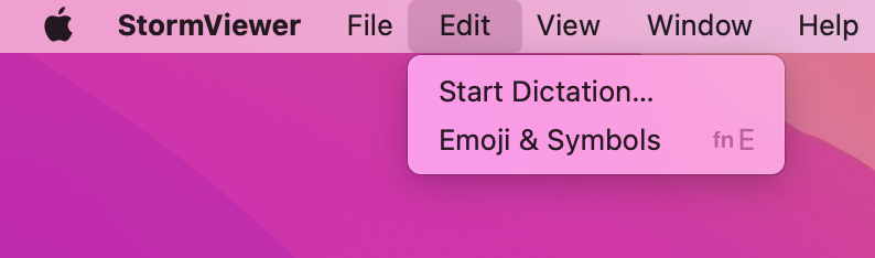
Third, the menu bar at the top of the screen: it’s full of junk items that don’t mean anything for this app, like File > New, Edit > Undo, and View > Show Tab Bar. We don’t want to get rid of all of these, but we can get certainly clean it up a lot.
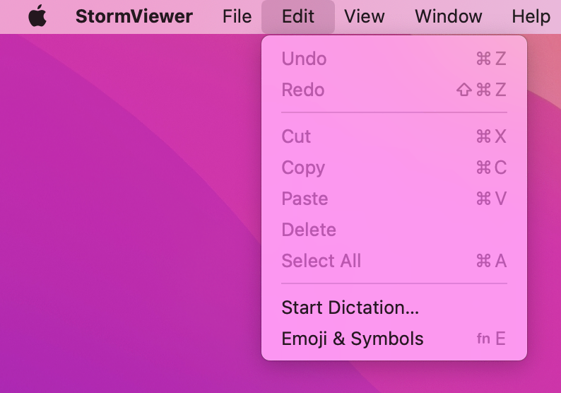
SwiftUI calls each of these menus commands, and how they are shown to the user depends on which platform your code is running on – on iPad they become keyboard shortcuts, for example. Here on macOS they become menu bar items, and if we ask SwiftUI to replace various built-in command groups with empty commands then it will take the hint and hide those menu options entirely.
This is all done inside StormViewerApp.swift, which is the other file that was created alongside ContentView.swift when we made the project. This contains the code required to create our initial window and show the ContentView struct inside there, but it’s also the right place to configure our global menu items.
I’d like you to change the WindowGroup code to add a new commands() modifier, like this:
WindowGroup {
    ContentView()
}
.commands {
    CommandGroup(replacing: .newItem) { }
    CommandGroup(replacing: .undoRedo) { }
    CommandGroup(replacing: .pasteboard) { }
}
That replaces the New, Undo/Redo, and Cut/Copy/Paste menu items with nothing at all, meaning that they will be removed from the menu entirely.
That didn’t fix everything, though: you’ll still see View > Show Tab Bar present, which is just useless in this app. To fix that we need another new SwiftUI modifier called onAppear(), which allows us to run some code of our choosing when our ContentView struct is first shown to the user.
What code? Well, sadly hiding the macOS tab system is something that SwiftUI isn’t capable of doing at this time, but fortunately AppKit can - that’s Apple’s older user interface framework. SwiftUI on Mac is built on top of AppKit, which means we can reach down into AppKit whenever we need to fix a shortcoming in SwiftUI.
In this case that shortcoming is hiding the tab behavior built into macOS apps, and it takes just one line of code inside the onAppear() modifier. Staying in StormViewerApp.swift, modify the ContentView code to this:
ContentView()
    .onAppear {
         NSWindow.allowsAutomaticWindowTabbing = false
     }
That NSWindow part comes from AppKit – “NS” is short for NeXTStep, which is a discontinued operating system from the late 90s. You might wonder why it’s cropping up here, and the answer is roughly as follows:
So, when you see NSWindow you’re literally looking at code that was written in the 90s, albeit highly evolved.
Like I said earlier, reaching down into AppKit is something we can do whenever we need to fix some kind of shortcoming in SwiftUI – something AppKit can do that SwiftUI can’t. Every year Apple improves SwiftUI to reduce the number of places this is needed, but you’ll still see some from time to time.
The last change we’re going to make is small but important. To see why it’s needed, try this: run the app, then click the red traffic light button in the window to close it. What now? The app is still running – you’ll still see the StormViewer menu in the top-left corner of your window – but you can’t see the window any more because it’s closed.
To fix this, we’re going to tell macOS that when the last (well, only) window is closed, it’s our signal to terminate the app. This is actually pretty trivial in macOS, and in fact just takes one line of code because we want to move from a window group – an application that supports many windows being open at the same time – to just a single window.
This means changing the following code:
WindowGroup {To this:
Window("Storm Viewer", id: "main") {That does multiple things at the same time:
That’s it! Small tweaks, I think, but all contribute to making the app look and work much more like all the other macOS apps.
Important: Lots of the projects in this book work better with Window rather than WindowGroup, but I’m not going to keep repeating myself – switch to it wherever you think it works best!
This wasn’t a complex project, but you did learn a lot about the basics of SwiftUI: views, modifiers, @State, two-way bindings, and more.
You also had your first taste of some of the most important SwiftUI views: Text, Image, and NavigationSplitView are extremely common in macOS apps, and we’ll be coming back to them repeatedly in future projects.
Don’t worry if you’re feeling a bit hazy on things like the @State property wrapper – we’ll be using that in almost every project here, so by the end of the book you’ll feel right at home!
We haven’t covered dark mode here, and in fact won’t be covering it at all. This isn’t because I want to short-change you, or because I think dark mode isn’t interesting. Instead, it’s because we’ve already added support for dark mode without doing any work! If you don’t believe me, try it now: change your Mac’s theme from light to dark or vice versa and you’ll see our app automatically re-theme itself to match.
This is made possible because SwiftUI’s default colors all adapt automatically based on the appearance mode you have selected. We haven’t specified any text colors at all, so by default SwiftUI will use dark text in light mode and light text in dark mode – without us needing to do anything!
In fact, every project in this book looks and works great in both light and dark theme thanks to the power of macOS – there’s nothing we need to do.
Copyright © 2023 Paul Hudson, hackingwithswift.com.
You should follow me on Twitter.